


THE CLIENT’S NEEDS
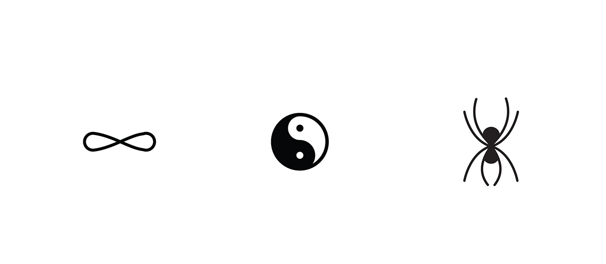
The client wanted a logo that unified the Infinite sign, the Yin & Yang symbol and the mystical Spider with mindfulness, focus and health growth.
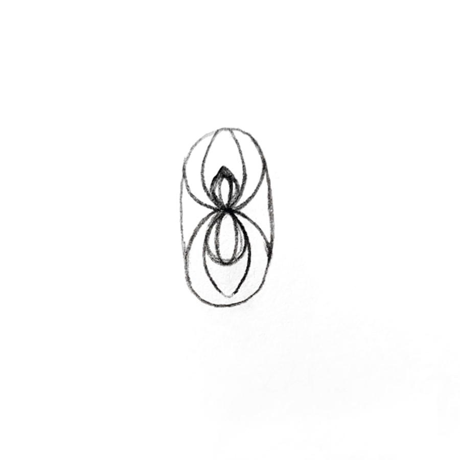
INITIAL SKETCHING
We started the sketching around those three shapes, but after a few tries we determined that we were working too literal. The client was looking for something more symbolic and meaningful.
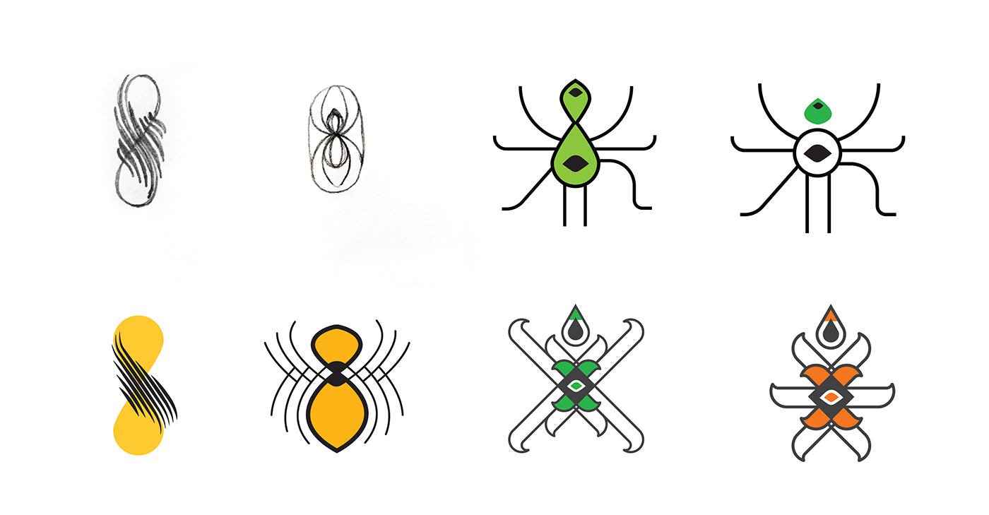
DESIGN DEVELOPMENT & COMPLETION
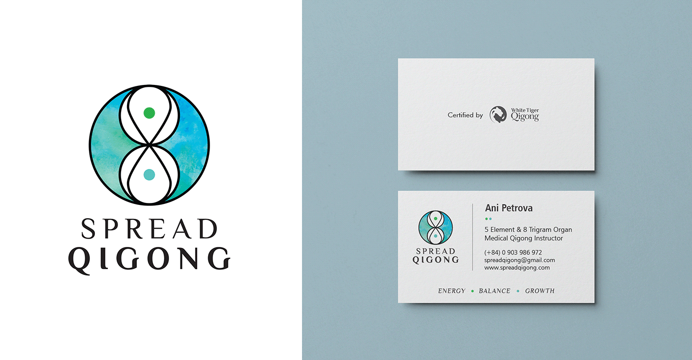
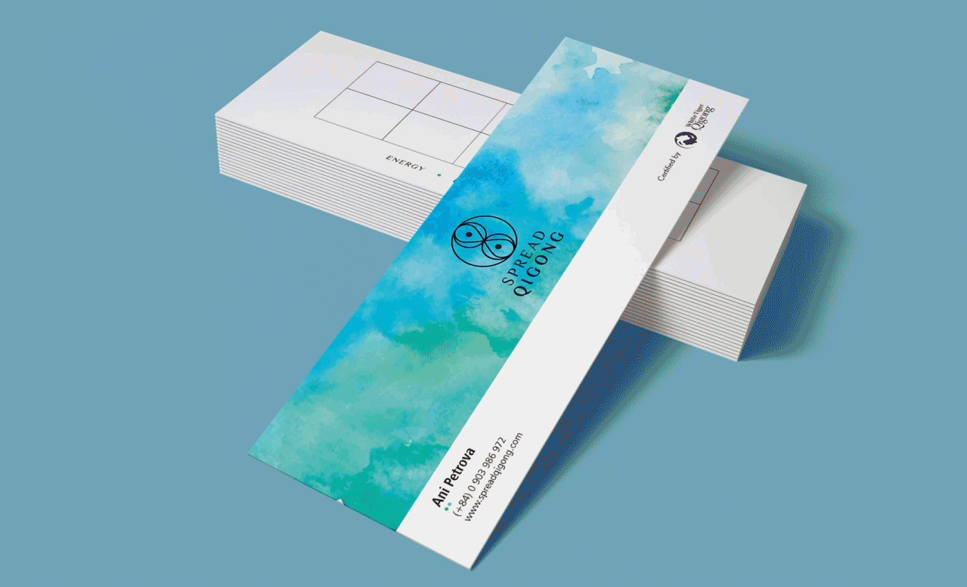
We went back to the sketch board and decided to create something more metaphoric, the final logo combines all three shapes in an elegant way.
The colors are chosen in relation with the Nature as this ancient Daoist practice are to be 'Close to Nature' and follow Nature rules and path. The Green is the deep forest, the Wood Element and the Blue presents the Water Element. It's all about the Yin & Yang, the softness of the water and the hardness of the tree trunk.
We also designed their stationery, advertisement flyers and their website spreadqigong.com
Website Home Page & Qigong Introduction Video


