Donald & Jane is the eponymous company name for a jewelry collection. Playing multiple roles as brand designer, company co-founder and jewelry designer, I'm able to craft the brand in an agile way; it's a work in progress.

Because the jewelry collection plays with contrasts—rough and smooth, light and dark, organic and industrial, aged and bright, whimsical and serene—the identity embodies that same spirit. Sketching, discovery, experimentation and a balance of the ancient with the modern are hallmarks of our work.
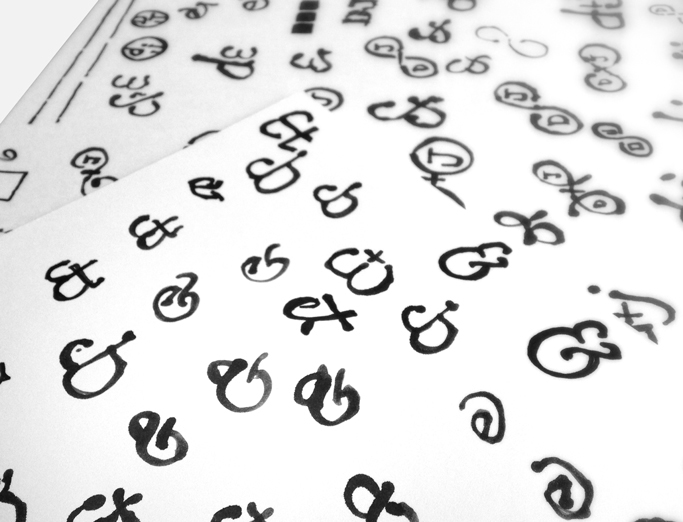
Despite exporations into clever company names, we ultimately decided on our first names (Think Dolce & Gabbana!). But "D" and "J" are two of the least interesting letterforms in the alphabet. The ampersand became the focus instead, which has its benefits. Alone, it can be seen as a clasp or link in a chain. With its box, a pendant, and the perfect shape for a signature stamp in the jewelry.
Hand-drawn, the symbol highlights the simple tools, traditional techniques and gestural spirit of the jewelry. The font, Syntax, is both elegant and human with an old-world, yet modern, feel. The color palette represents the combination of gold and oxidized silver used in the jewelry.

The ampersand lends itself to pattern, which can be applied in a number of ways, including printed tissue paper for packaging or booth display graphics.
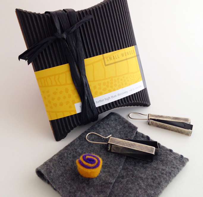
Until we can produce a custom gift box, a temporary packaging solution adds a measure of delight for anyone ordering from the shop. Handmade pillowboxes in black corrugated cardboard are wrapped with a belly band. A felt envelope protects the jewelry and adds another layer of discovery.

The website is currently a full-screen photo slideshow only, with a link to an off-site shop. Simple, clean photography allows the work to be featured prominently and without distraction.


Template for e-mail updates (left) and display card for jewelry show (right). The identity components are easy to use, consisting of a limited palette, clean product photography, jewelry sketches or logo patterns and asymmetrical compositions.


