P R O J E C T -
遠百信義A13《波寶島-海底童樂園》|牆面&商品設計
Far Eastern Xinyi A13 《Popoland - Children’s Undersea Paradise》| Wall & Product Design
- - -
臺灣 \ 遠東百貨 \ 信義A13 \ 佈置 \ 商品 \ 插畫 \ 設計
臺灣 \ 遠東百貨 \ 信義A13 \ 佈置 \ 商品 \ 插畫 \ 設計
Taiwan \ Far Eastern Department Stores \ Xinyi A13
Decoration \ Product \ Illustration \ Design
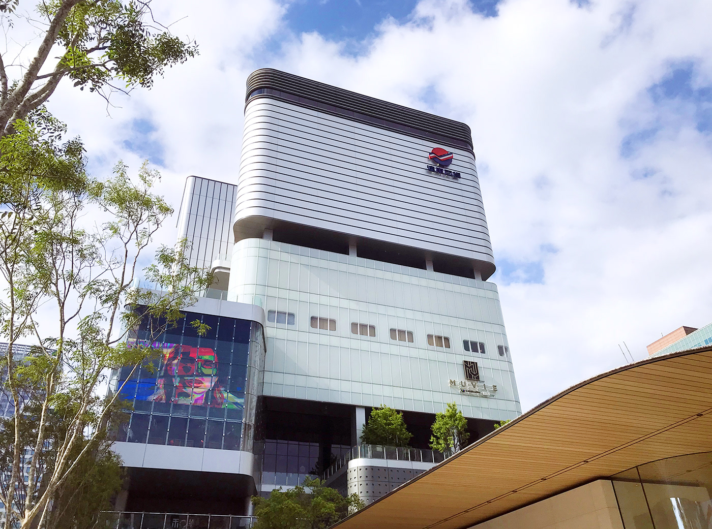
遠東百貨是臺灣一家連鎖百貨公司,主要為經營買賣各項百貨商品、餐飲娛樂等。2020年進駐台北市信義區的全新第五代店《遠百信義A13》,主打全台唯一「全客層智能商場」、整體為科技感十足的建築風格。本次與我們合作的《5F-美學童樂園》,主要提供豐富的婦嬰兒童用品、兒童益智玩具,是假日父母帶小孩出遊的好選擇。
Far Eastern Department Store is a chain department store in Taiwan, mainly for merchandising, catering and entertainment. In 2020, the new fifth-generation store, "Far Eastern Xinyi A13", entered Xinyi District in Taipei, aiming to become a high-tech customer experience shopping mall that applies to a broader audience. The overall architectural style is full of technological feature. This time, we cooperated with the 《5F-Aesthetic Children's Paradise》, where it mainly provides diverse products for maternity, infant and children. With all kinds of educational toys, it’s also a good place for parents to spend time with their kids on weekends.

合作需求 / Cooperation Needs
《5F-美學童樂園》會推出各種主題視覺,為樓層增添許多有趣元素,吸引父母及孩子前往走走。今年4月份的主題為海洋風,《美學童樂園》希望位於5樓的休息區,能夠將波寶與海洋結合,呈現出如波寶潛入海底探險的有趣景象,另外,也希望我們設計一款作為家長申辦「兒童卡」的回饋贈品。
《5F-Aesthetic Children's Paradise》 launches different themed visuals, adding many interesting elements to the floor, attracting parents and children to visit around. The theme of April this year is ocean. 《Aesthetic Children's Paradise》 hopes that the lounge area on the 5th floor can combine Popo with the ocean, presenting an interesting scene like Popo diving into the sea. In addition, they also like us to design a gift product for parents who apply for a "Children's Card".


設計概念 - 兒童卡贈品
Design Concept - Gift product for Children’s Card
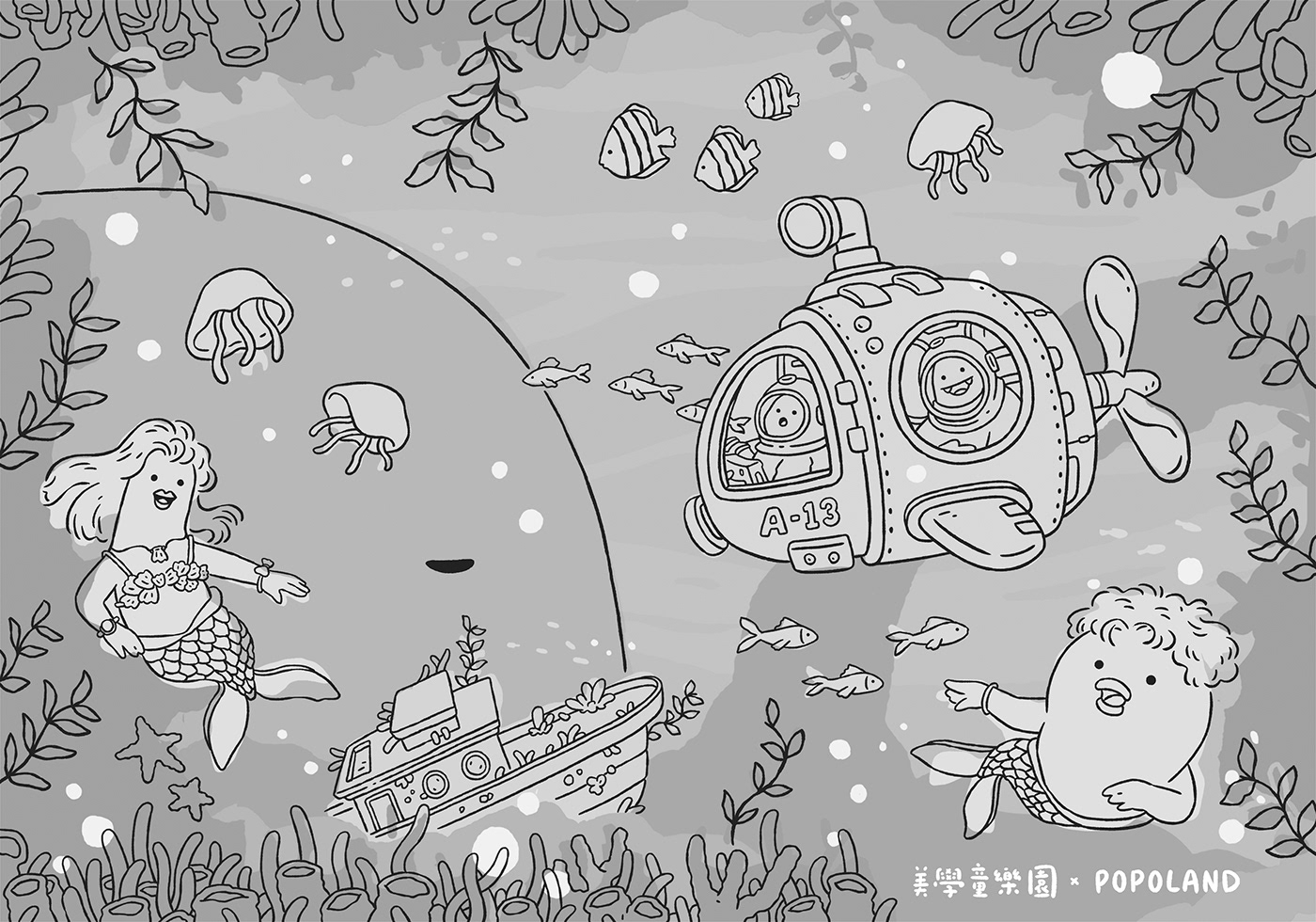
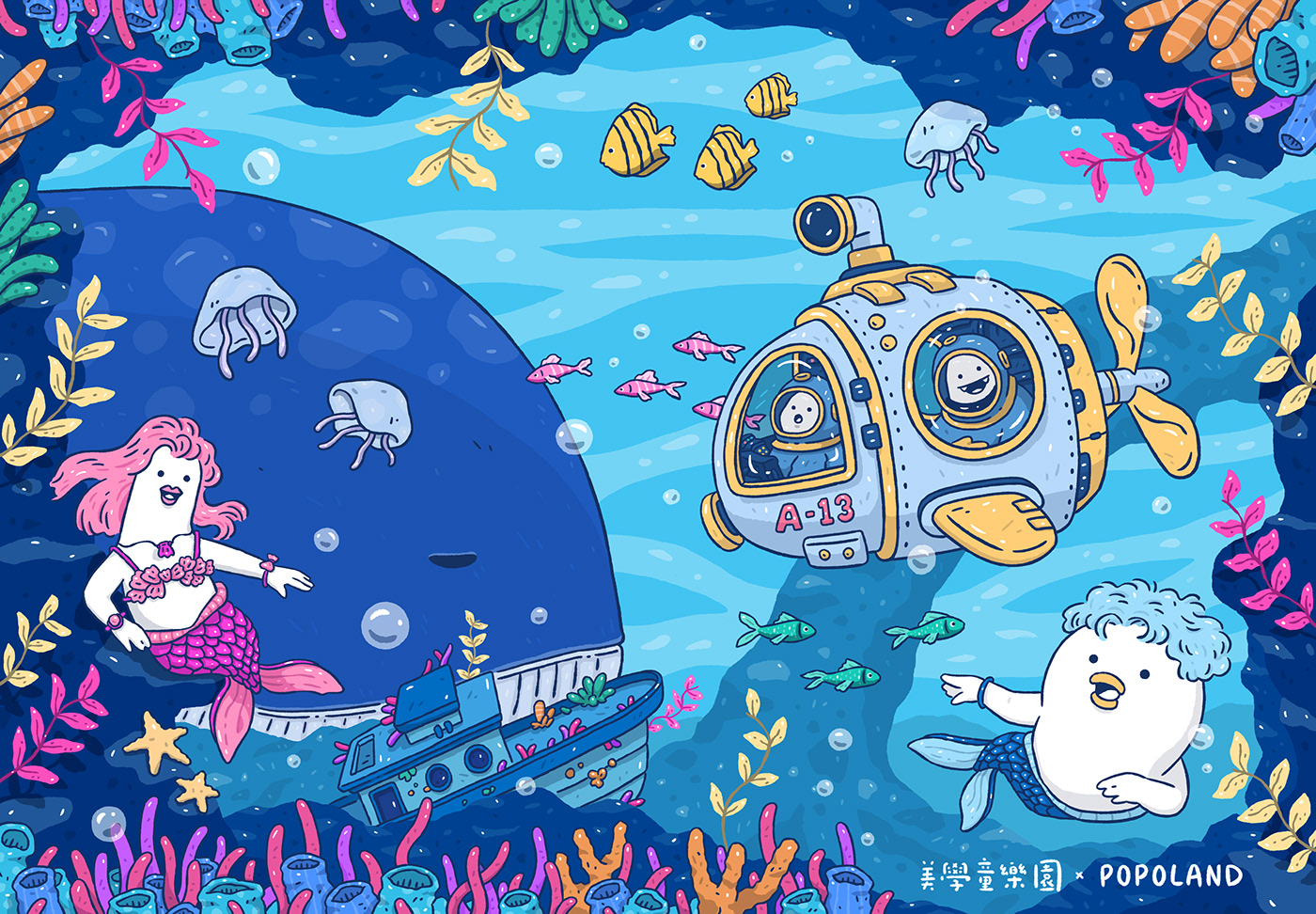
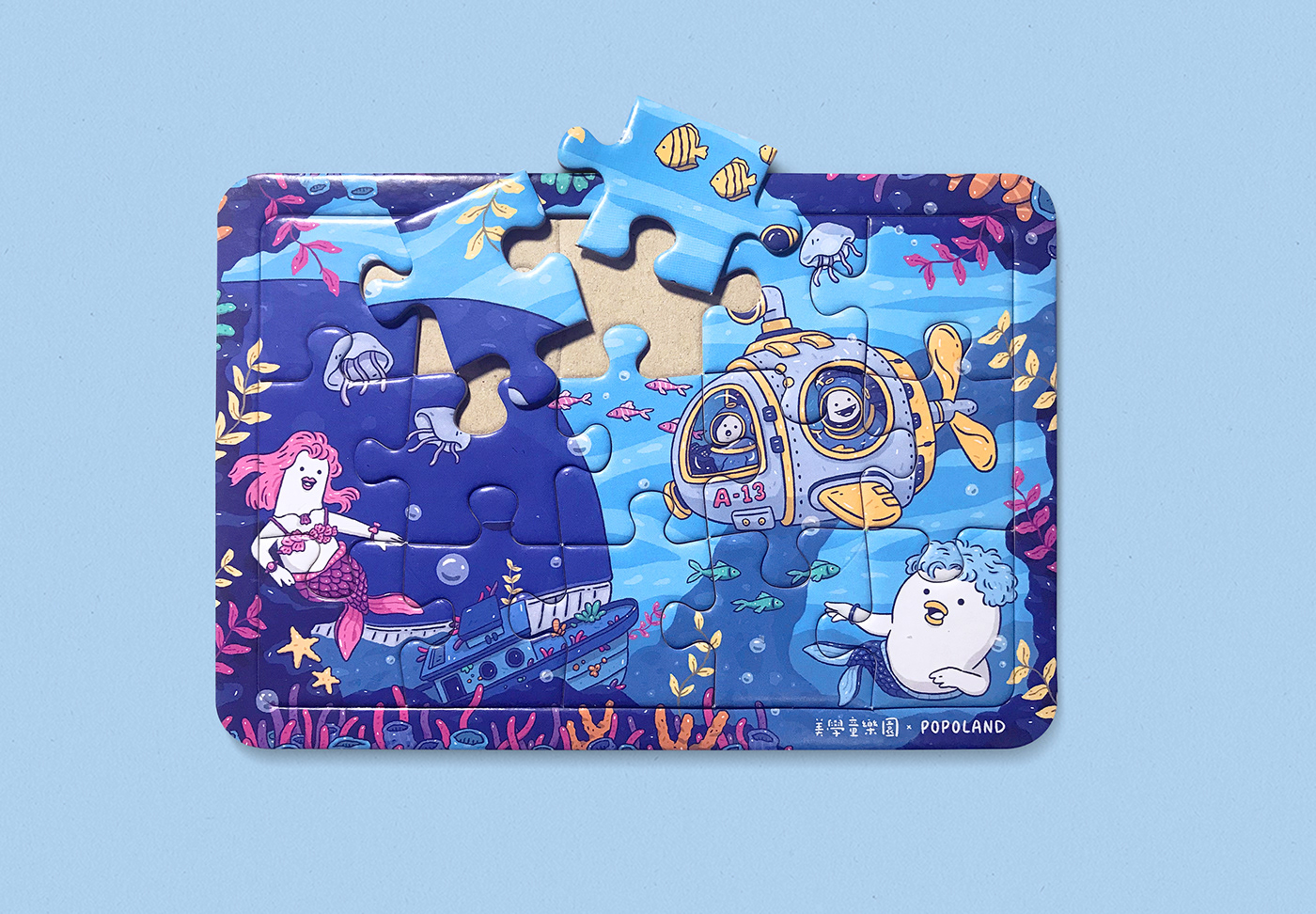
我們思考要選擇何種商品時,優先條件有兩點:「能夠展示我們的插畫作品」以及「讓孩子有興趣而且是有益的」,很快地,我們便決定製作適合孩子使用的益智玩具 - 拼圖。「有什麼元素會是孩子們會喜歡的呢?」這是發想中重複自我詢問的問題,經過不斷討論與篩選,最後挑選出大小朋友都喜歡的鯨魚、人魚(波寶魚?)、潛水艇為主要元素,並向外延伸出如魚群、珊瑚、海草、漁船等,形成場景色彩更加豐富鮮豔的海底世界。
When we were thinking about which products to pick, there were two main requirements: it should be able to show our illustration and it should be interesting and useful for kids. Soon, we decided to make educational products suitable for children, Puzzles.
"What are the elements that children will like?" This is a question we asked ourselves repeatedly. After continuous discussion and selection, we finally selected whales, mermaids(Popo fish), and submarines to be the main elements, and extends outwards such as shoal of fish, corals, seaweeds, and fishing boats, etc., forming an underwater world with richer and brighter scenes.
1. 初稿 / First Draft -

2.線稿 / Outline Sketch -
3. 色稿 / Color Draft


4. 成品 / Complete

設計概念 - 休息區牆面佈置
Design Concept - Wall layout for the lounge area
休息區有兩個佈置重點,分別為「兒童互動牆」和「長排座位」,這部分較困難的部分在於,我們要從現有佈置的角度思考如何加入海洋及波寶元素,並在有限經費中,與現成佈置產生有趣且不違和的構圖與互動。
The lounge area has two main parts, “children’s interactive wall”and "long row of seats". The difficult part lies in the fact that we have to find ways to integrate ocean and Popo elements into the existing layout while maintaining the fun aspect.
A. 兒童互動牆 / Children’s interactive wall
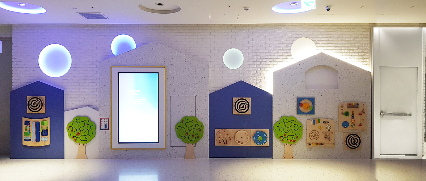
1. 初稿 / First Draft -
我們先挑出潛水員與人魚(波寶魚?)作為佈置的主要角色,設計出與佈置有自然互動的姿勢與表情
We first selected the diver and the mermaid (Popo fish?) as the main characters of the layout, and design postures and expressions that go along with the existing layout.

然後加入魚群、珊瑚,將他們擺放在適合的位置,這裡有個巧思,由於現場有兩面現成的藍色牆面,因此我們嘗試將這裡的物件,設計出類似反轉顏色的效果,看起來滿好玩的。
Then we added fish, corals and placed them in suitable positions. There is an interesting ingenuity here, since there are two ready-made blue walls on the scene, we tried to design the objects here to resemble inverted colors. The result looks fun.

最初看到這面牆時,我們思考要如何將這面「白色」的牆,佈置得讓人覺得身在「藍色」的海底世界?總不可能將這面牆都用藍色珍珠板遮蓋住。在好幾次前往現場觀察與討論後,我們決定:那就讓泡泡佈滿整個休息區,圍繞孩子們吧!
When we first saw this wall, we thought about how to arrange this "white" wall so that people feel like we are in a "blue" underwater world. It is impossible to cover this wall with blue pearl panels. After going to the scene several times to observe and discuss, we decided to let bubbles fill the lounge area and surround the children!

牆面上方剛好有四個現成的圓形裝飾,我們很快就想到能加入波寶的表情,剛好這些裝飾有不停變換燈色的效果,現場看應該會更有趣。最後再放上主題招牌,這面牆的初步設計就完成了!
There are four ready-made circular decorations just above the wall. We soon thought that we could add Popo's expressions. The result looks very interesting with the light changing effect of those circular decorations. Finally, put the theme signboard, and the preliminary design of this wall is completed.

2.線稿 / Outline Sketch -

3. 色稿 / Color Draft

B. 長排座位 / Long row of seats

1. 初稿 / First Draft -
這面玻璃簡單許多,唯一要注意的是物件盡量設計在玻璃周圍,不要遮蓋住靠近中間的視野。我們設計出讓人魚(波寶魚?)倚靠在窗邊的模樣,兩側則加入4隻正在觀察他們的波寶潛水員。
Right behind this long row of seats is a large glass. The design for this glass is much simpler. We have to focus on designing the elements around the sides instead of center, so we don’t block the view. We designed the mermaids (Popo fish?) leaning against the window, and on both sides were added 4 Popo divers who were observing them.

然後再加入一些魚群、珊瑚、泡泡,畫面就變得很豐富了。
Last, we added some fish, corals, and bubbles as a final touch to enhance the details.


2.線稿 / Outline Sketch -

3. 色稿 / Color Draft

4. 成品 / Complete


//
POPOLAND 波寶島
Mail - popolandart@gmail.com
Instagram - www.instagram.com/popoland_art
Facebook - www.facebook.com/popolandart
Website - www.popolandart.com


