


Summary
The Australian National University (ANU) is, as the name suggests, Australia's national education institution - established by order of Parliament in 1946. Based in our capital Canberra, ANU graduates and academics play an important role in leading Australia's contributions to the world - from shaping policy with government to pioneering research initiatives with the world's best minds. It's currently the country's #1 university (QS World Rankings), enrols 20,000+ students a year and count 6 Nobel Laureates as alumni.
Brief
Presenting a clear and unified identity across the ANU ecosystem of its many schools, colleges, institutions and initiatives was a key challenge with the brand update when showcasing a broad array of offerings. This was particularly important in building recognition amongst domestic and international students, where the brand competes amongst some of the oldest institutions in the world. It was also clear that the stories of the integral research and initiatives that underpin ANU needed to be uncovered and told.
Presenting a clear and unified identity across the ANU ecosystem of its many schools, colleges, institutions and initiatives was a key challenge with the brand update when showcasing a broad array of offerings. This was particularly important in building recognition amongst domestic and international students, where the brand competes amongst some of the oldest institutions in the world. It was also clear that the stories of the integral research and initiatives that underpin ANU needed to be uncovered and told.
Our task was to address these challenges through an evolution of their existing brand - refining core elements, bringing cohesion to their brand architecture and identity system, and establishing a clear brand narrative and tone of voice.
Solution
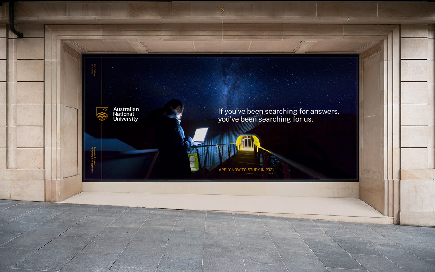
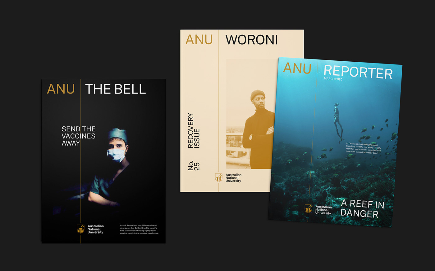
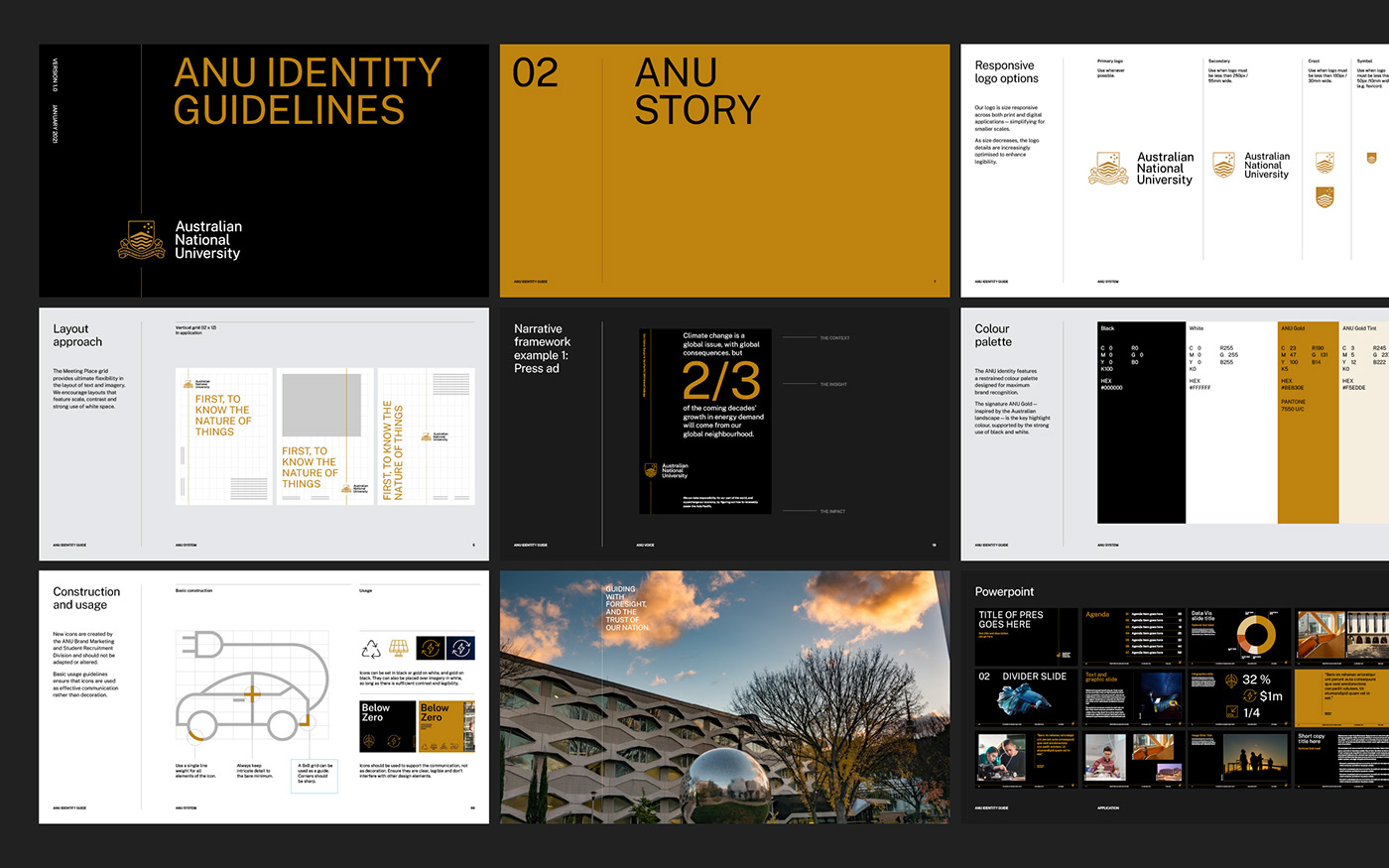
A foundational principle we established early on was the idea of creating an identity that had the flexibility and credibility to tell stories - to make visible the sometimes invisible work that happens each day at ANU. For this, we took inspiration from journalism, adding an editorial lens to all aspects of the identity. This would allow us to focus on creating a system that celebrated, uncovered and documented the important research and people of ANU - ultimately serving as a key differentiator amongst their competitors.
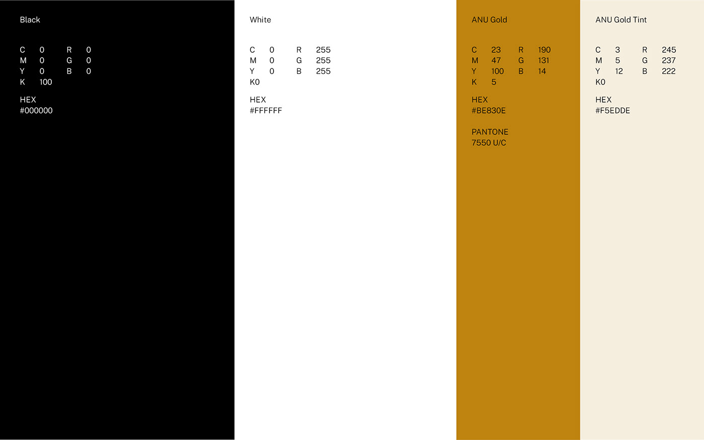
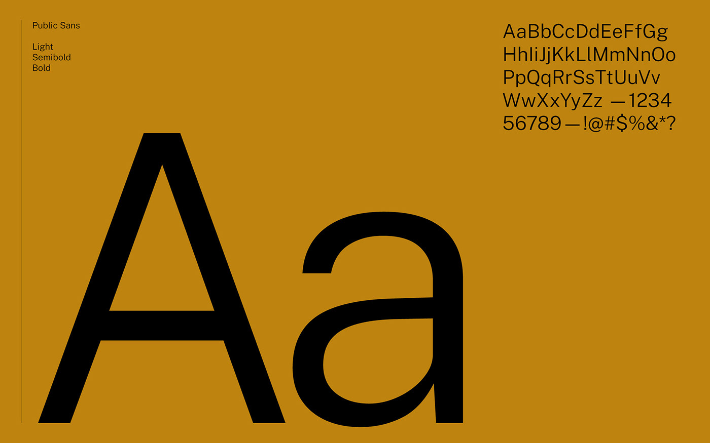
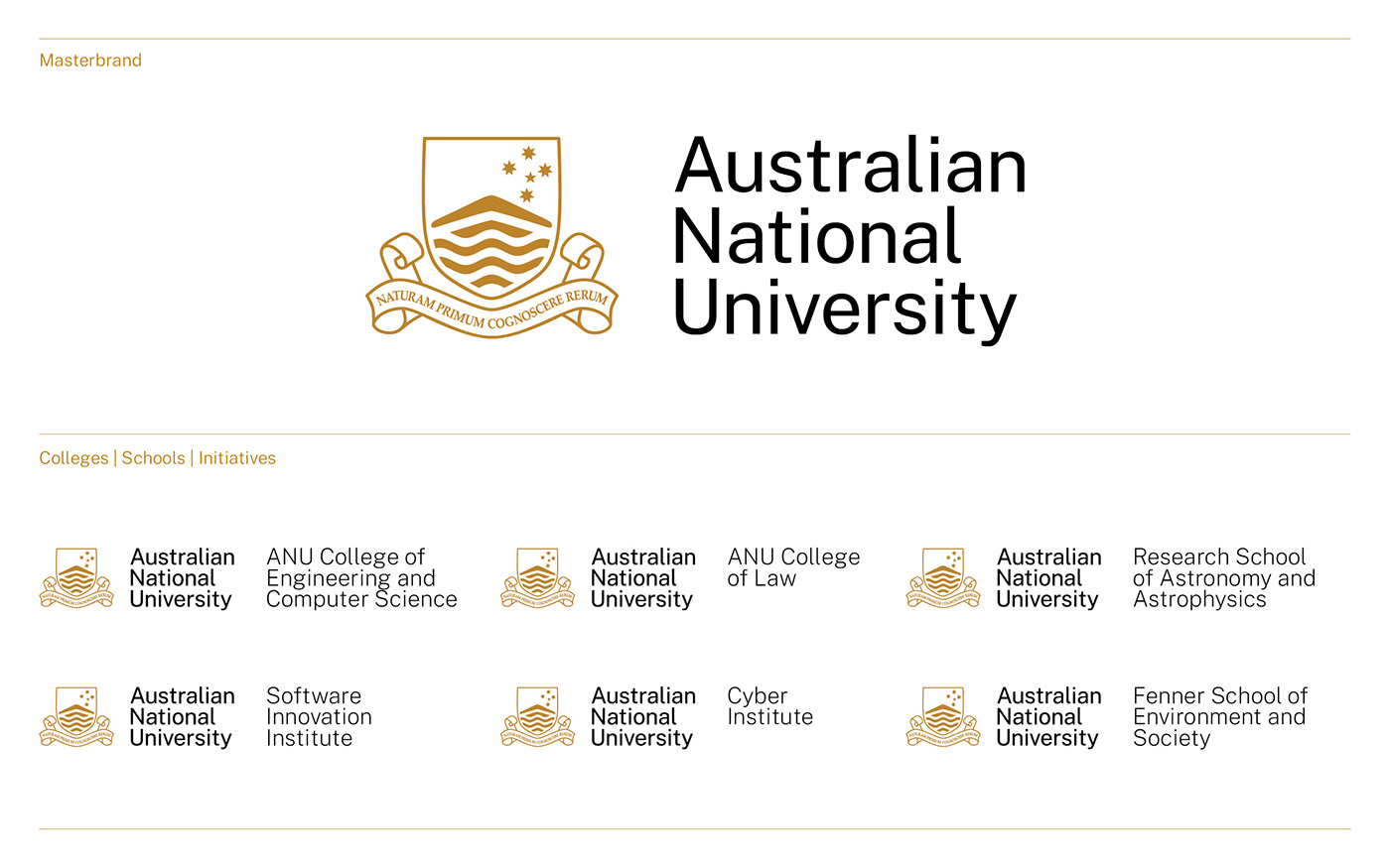
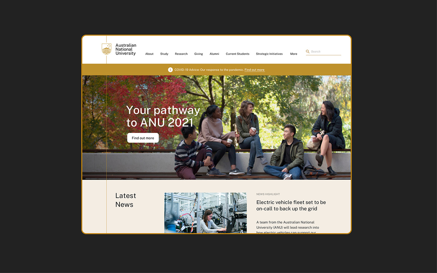
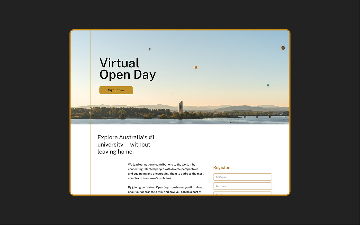
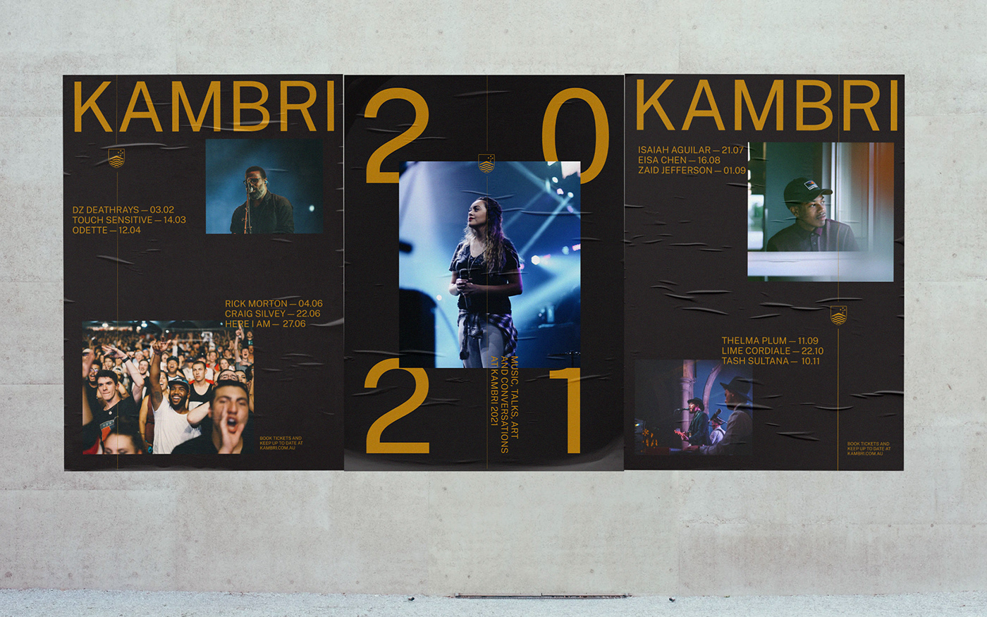
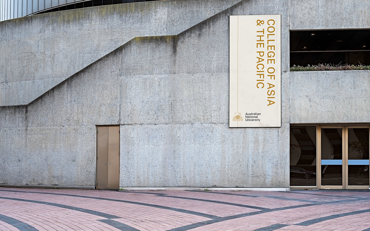
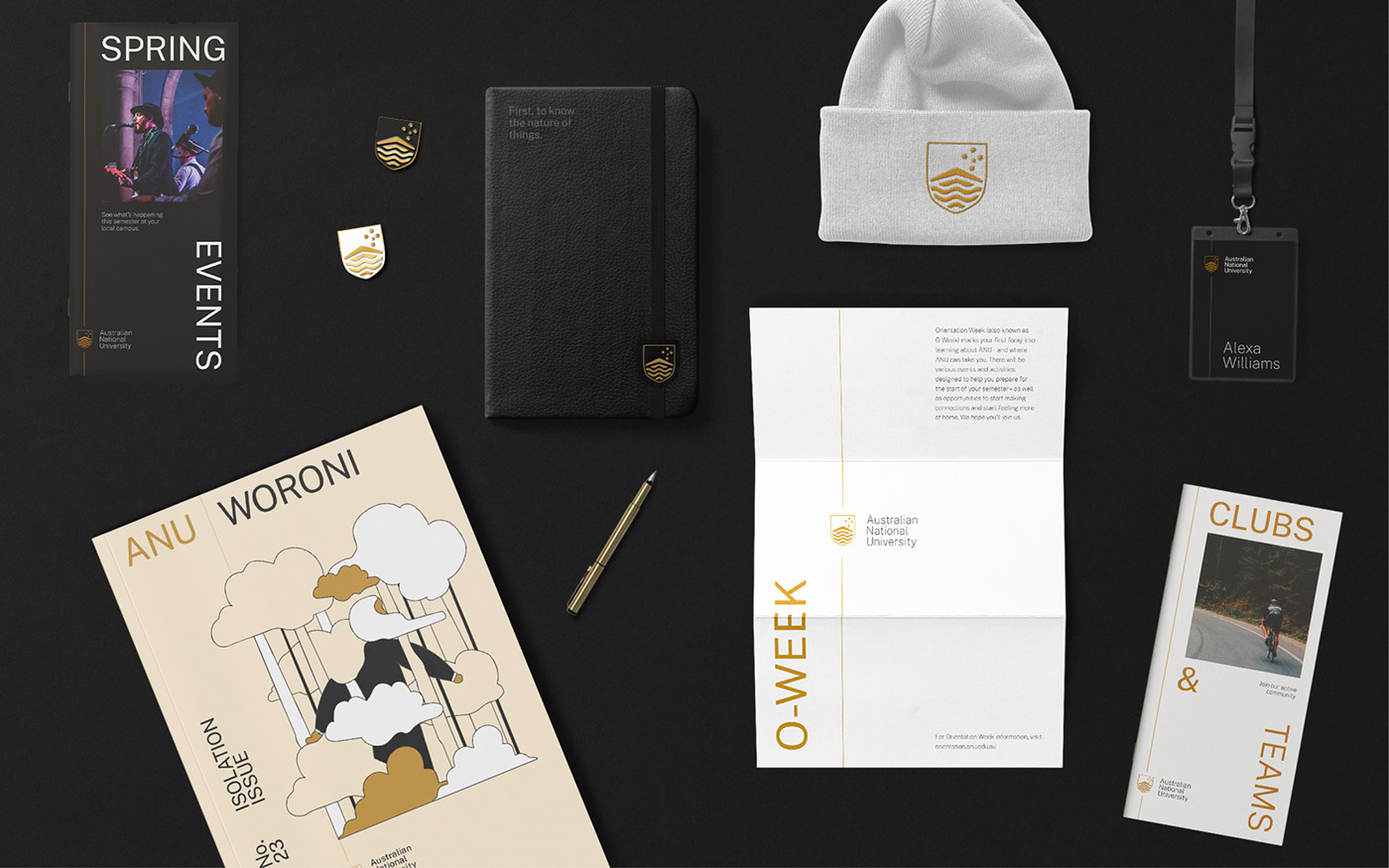
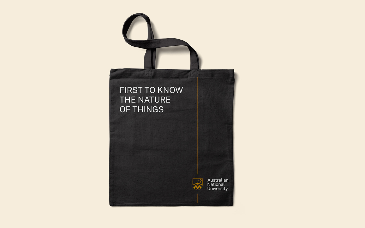
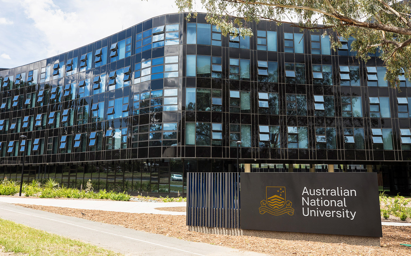
For our core elements, we worked to optimise each. The crest, a consistent symbol for ANU over the past 75 years, was redrawn and refined to be responsive across digital and print sizes. The colour palette was updated, taking inspiration from the Australian landscape and fauna. A new, accessible typeface was introduced as well as a new iconography and illustration style. Photography further emphasised our editorial lens, encouraging the team to take a National Geographic approach to telling stories through imagery
The unifying structure of the design system draws inspiration from Canberra’s ancient tradition (and current role) as a meeting place, emphasising the University’s role as a facilitator of the ‘meetings of minds’ – bringing together diverse perspectives and unmatched talents from around the world, and uniting them with a shared purpose. It's flexible, easy to use and serves as a recognisable, consistent element across the brand
Underpinning the brand is a robust strategic framework and verbal identity, built from a new brand narrative that allows ANU to express their national role, mission, and path into the future. The design system is built around the revised brand architecture, with comprehensive rules, lockups and guidance that ensure each entity always builds equity back to the masterbrand.
The new, refreshed identity has afforded ANU the opportunity to reflect on their history, speak to thousands of members and prospective students, and highlight what it is that sets them apart from other universities, reinforcing their standing within their communities.
Team
Design: Ryan Curtis, Olivia King, Kinal Ladha, Jason Little, Fauzima Fazilat Rafiq, Pete Conforto
Writing: Mat Groom
Motion: Atsaya Gabiryalpillai
Writing: Mat Groom
Motion: Atsaya Gabiryalpillai

