


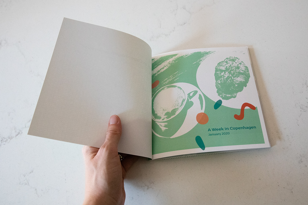
As a companion to a previous project, I created a photo journal of another favorite vacation, this one to Copenhagen. I created the book with the same intent of capturing photos and memories, but I wanted this journal to be distinct with different styles, size, and colors. I wanted the book to convey information in a whimsical and light-hearted manner, consistent with our emotions about the trip, and combine photographs, stories, illustrations, and scanned images of paper goods, like ticket stubs.

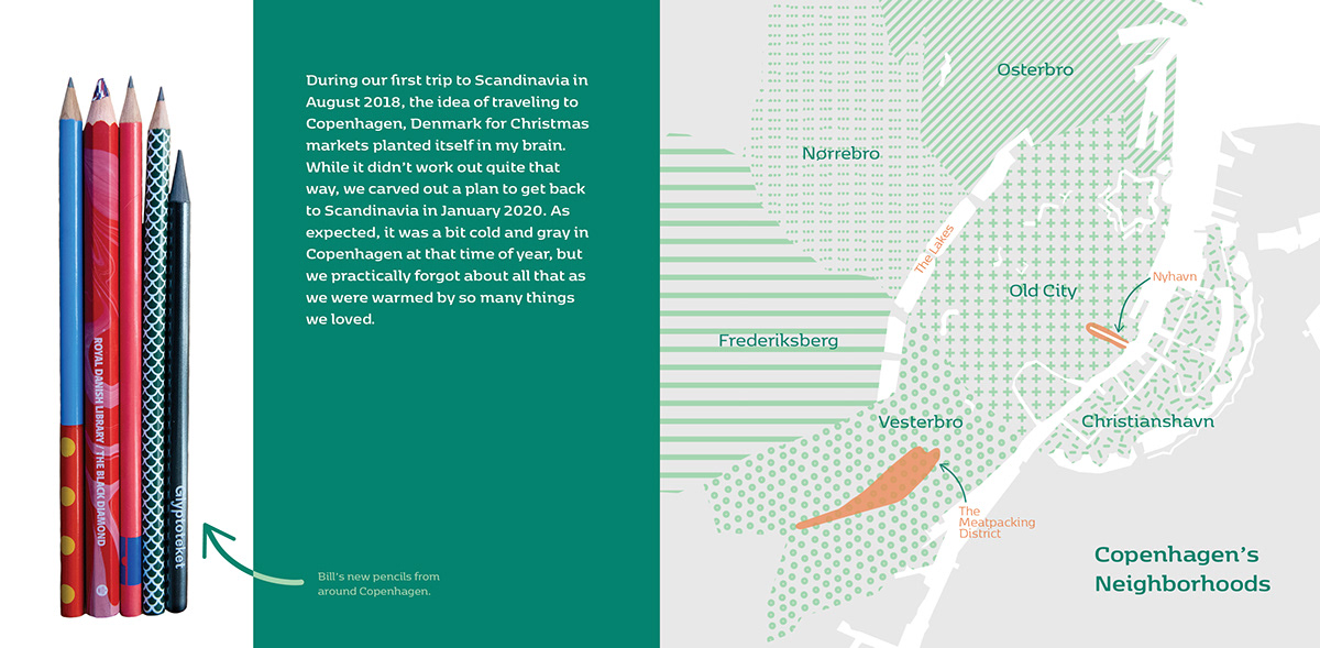
I picked a set of colors that were inspired by the colors we saw around Copenhagen: in design shops, on building facades and rooftop tiles, and in museums. I created patterns for the first map I created, and I continued those patterns throughout the pages of the book to create rhythm and continuity. For the headings, lead paragraph, and labels, I chose the typeface 'Kobenhavn,' which was designed by a Danish designer that lives and works in Copenhagen. The type has a geometric nature with slab serifs, which remind me of the bold, geometric furniture designs we saw in shops and museums. For the body text, I chose a readable serif font (Caslon Pro), because the book contains ample text.


