Neon
EN
Founded in 2016, Neon was one of the first Brazilian fintechs focused on opening and operating digital checking accounts and issuing debit and credit cards. Four years later, we were invited to redefine the brand's visual strategy and its expression in the most diverse points of contact.
Together with the design team and brand experience, we were able to make a thorough analysis of the competitors and understand the points of opportunity that could be exploited in a proprietary way by Neon. Our answer came directly from the strategic platform: presenting the power that people have at hand, financially empowering each of the bank's customers.
We have created a visual system to accurately reflect this very genuine premise of the Neon brand and we have extended this to all points of contact - from institutional communications to a large-scale digital ecosystem.
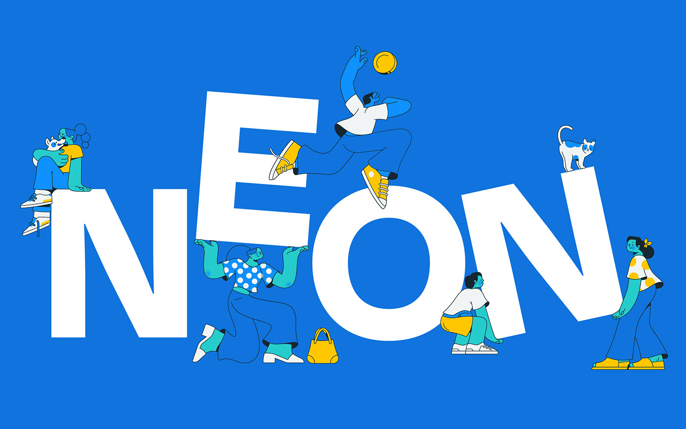
We organized the entire visual system in 3 pillars, the first of which was the colors, highlighting the territory and the fluidity already achieved by the Neon gradient. Then, we worked on the typographic pairing, combining strength and impact in institutional communications, with the functional focus on the application in digital products. Finally, one of the great protagonists of the system: the illustrations; we had the pleasure of working with the brilliant execution of Estúdio Passeio, which managed to bring the necessary uniqueness and disruption so that we could structure the entire visual strategy one step further.
In addition to the development of the brand's entire graphic package, we expanded the visual guidelines to the kinetic environment in motion, translating Neon's strategy and values into parameters and directions of time, pace and acceleration. We created an animation guide that presents conceptual and technical guidelines that should permeate any piece of communication that is in motion.
COLOPHON
Typography: Degular Display + Inter
Illustrations: Estúdio Passeio
Illustrations: Estúdio Passeio
3D: Rafael Eifler
Neon Team: Alexandre Alvares, Bruno Chung, Danilo Lima, Michel Farah
PT
Fundada em 2016, a Neon foi uma das primeiras fintechs brasileiras voltada para abertura e movimentação de contas correntes digitais e emissão de cartão de débito e crédito. Quatro anos depois da fundação, fomos convidados convidados para repensar a estratégia visual da marca e sua expressão nos diversos pontos de contato.
Ao lado da equipe de design e experiência de marca, criamos uma proposta que surgiu diretamente da plataforma estratégica: dar o poder nas mãos das pessoas. Desenvolvemos um sistema visual que reflete o empoderamento do cliente, e estendemos isso para todos os pontos de contato — de comunicações institucionais a um ecossistema digital em grande escala.
O sistema foi construído com base em 3 pilares: o primeiro deles é o das cores, que realçam o território já conquistado pelo gradiente da marca. Em segundo, o pareamento tipográfico, que traz força para as comunicações institucionais sem perder a funcionalidade nos produtos digitais. O terceiro pilar, das ilustrações (brilhantemente executado pelo Estúdio Passeio) traz a diferenciação necessária para levar a marca um passo além.
Além do desenvolvimento de todo o pacote gráfico da marca, expandimos o raciocínio visual para o cinético, traduzindo a estratégia e valores da Neon em parâmetros e direcionamentos de tempo, ritmo e aceleração. O resultado é um guia de animação que reúne as orientações conceituais e técnicas que devem permear qualquer peça de comunicação que esteja em movimento.
COLOFÃO
Tipografia: Degular Display + Inter
Tipografia: Degular Display + Inter
Ilustrações: Estúdio Passeio
3D: Rafael Eifler
Time Neon: Alexandre Alvares, Bruno Chung, Danilo Lima, Michel Farah