Rebranding of ROSGOSSTRAKH insurance company
In early October, Russia celebrates two holidays at once: The Insurer’s Day and The Birthday of “Rosgosstrakh” company. “Rosgosstrakh” has been a symbol of insurance in Russia for a long time. So, the holiday was established on the day of the first “Gosstrakh” had been founded in 1921.
Company will be celebrating 100 years old in 2021. On the eve of the centenary, “Rosgosstrakh” decided to update the brand and give it a new meaning. LINII studio was invited to collaborate on rebranding. Studio’s goal was to significantly modernize the brand in order to make it relevant to the modern visual environment, including digital media.
It was important to take into account the visual continuity, at the same time — new image should be organically linked to the company’s long history.


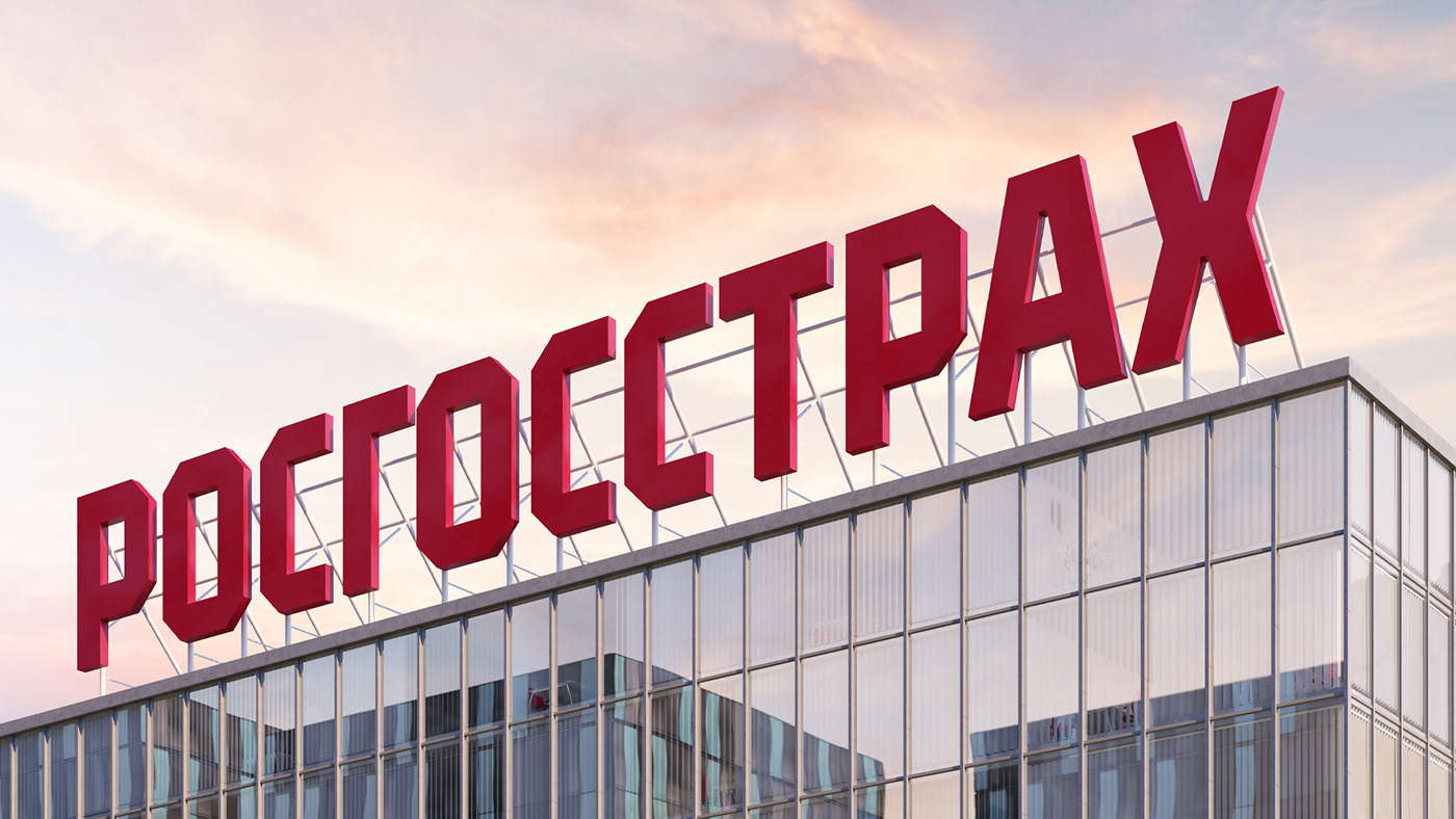
New logotype retains the geometric and stable character common to the previous solution and at the same time has acquired own uniqueness. Logotype’s geometry set the basis for the corporate identity.
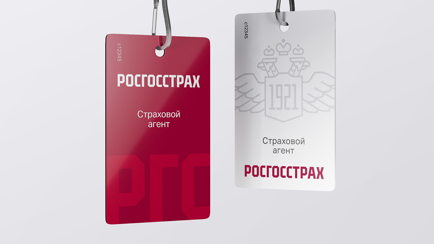
The eagle was no longer part of the new logotype, but it wasn’t completely discarded. Updated logotype has reduced details, more concise graphics reflect current design trends. As part of the restyling, main attention was focused on the typography of “Rosgosstrakh” logotype — the eagle has become a decorative element without losing its visual significance.


Brand’s color scheme has also maintained continuity, while becoming more diverse, modern and flexible in use. An important part of the corporate identity is the pattern created on the basis of the company’s historical heritage, made in a modern style.


Creative Director — Michael Gubergrits
Project Director — Dmitry Burenko
Project Manager — Anna Alyaskina
Art-directors — Valera Sadovsky, Nikolay Demin
Designer — Alena Gorbacheva
Typography — Alexander Koltsov
3D-visualization — Andrey Tupikin
Strategy — Polina Vasilieva


