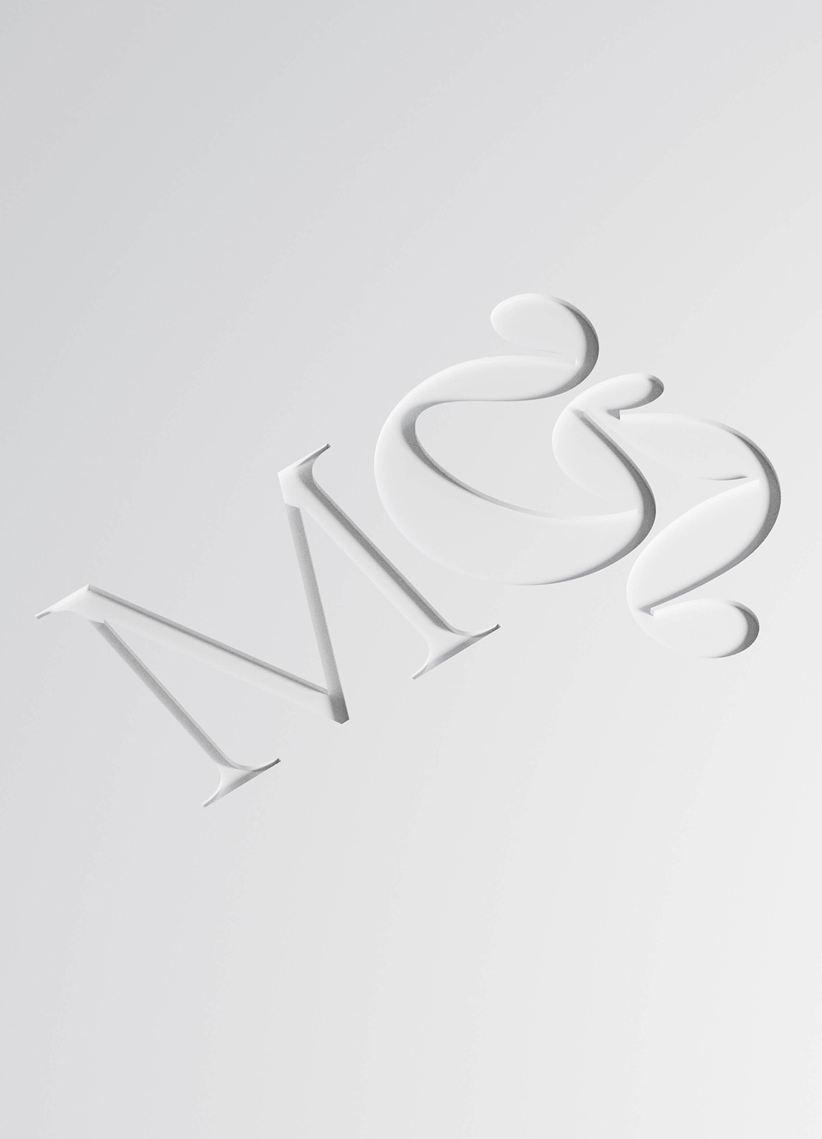
MGcream
2020
Client: MGcream
Art director: Aleš Najbrt
Designer: Jonatán Kuna
Cooperation: Michael Dolejš (webdesign)
Font: Reckless, Helvetica Now
Type: Packaging, Web, Brand
There's awful lot of nice things to say about MGcream. The ointment developed and produced by a family company in the Czech Republic is a unique way to supply magnesium locally, directly to the strained muscles, ensure their relaxation and regeneration. The light cream composition does not contain additional fragrances and colors and the packaging is completely recyclable. The amalgamation of pure magnesium and plant extracts blends scientific innovation with traditional natural materials. So, in the letters MG, we elegantly inscribed the same combination of cold scientific rigor and the ornamental practice of alchemy, curved charm of herbalism and old pharmacies. Or maybe it's just that the G looks like squeezed cream and a frog's leg.