Grandhotel Pupp
2020
Client: Grandhotel Pupp
Art director: Aleš Najbrt
Designer: Jakub Spurný
Cooperation: Michael Dolejš (webdesign)
Font: GT America
Type: Interior, Restaurant, Web, Brand
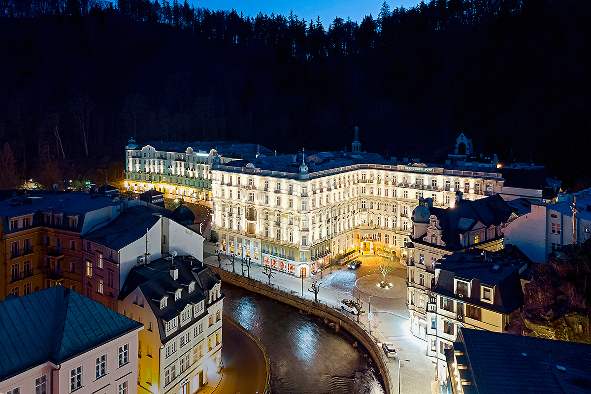
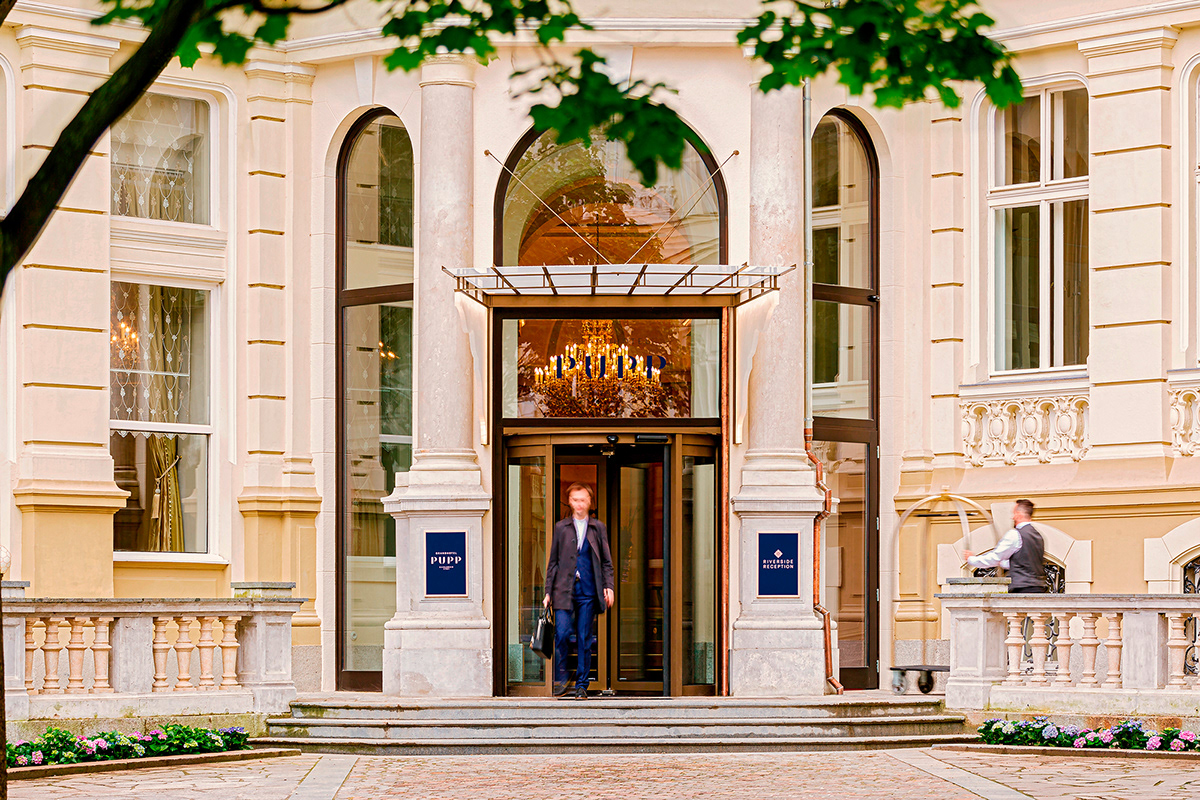
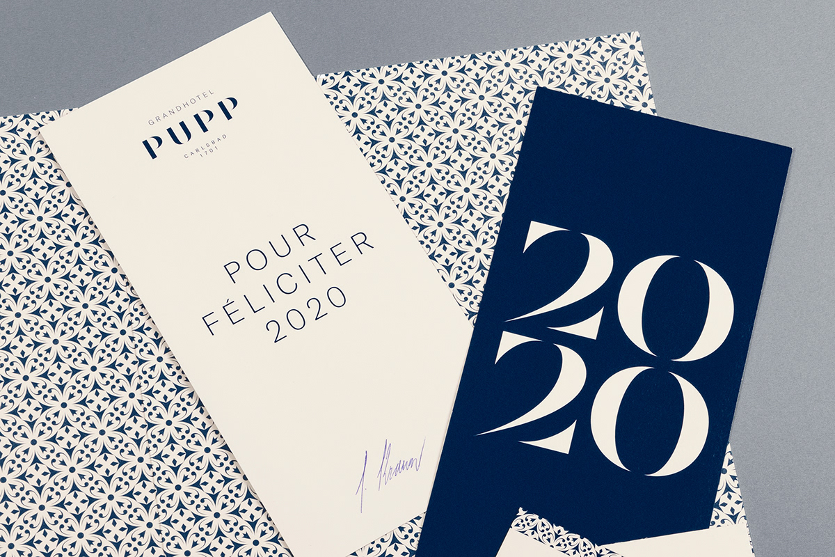
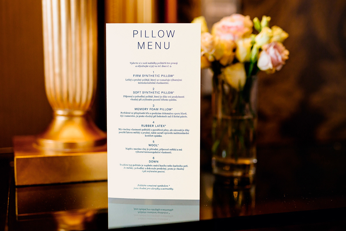
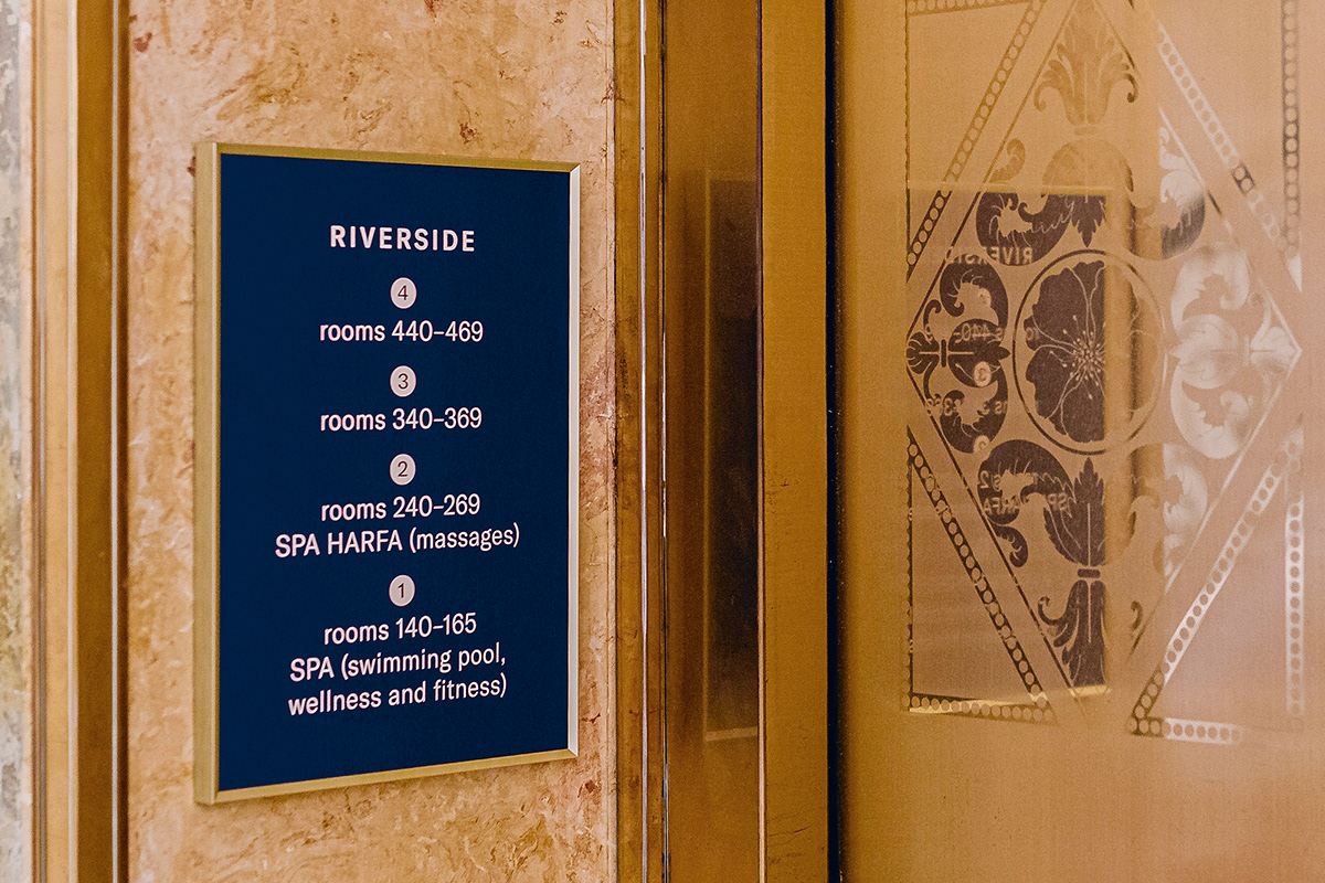
The new logo and the resulting visual style serve to cover the wide spectrum of activities of the second oldest hotel in Europe, with a tradition going back to 1701. The monumental, neo-Baroque style of its Karlovy Vary building led at first to the curlicues of the scripts still bearing the traces of quill, but calligraphy was soon traded for a clean, more modern typography – elegant but retaining "twists" only in hints of some features. Contemporary expression, classiness abstracted to basic shapes, pure stem and shine. They are supported by a thin sanserif GT America, used for additional information. Together, from printed matter to shoe bags and shower caps, they promote a sense of spotlessness and tranquility in the rooms, away from the ornamental vanity fair of common areas. However, the more straightforward references to the decor of the luxury of the past centuries into the visual style ultimately brings a stylized emblem derived from a grid in the interior of the hotel, offering specific uses in patterns and decorative strips. Its royal dark blue stands out from the gentle vanilla background corresponding to the hotel's façade.