

BANG. Une grande famille de produits rechargeables.
BANG. De nouvelles boîtes de remplissage et d’expédition.
The Unscented Company (TUC) a de nouveau fait confiance à notre studio de création. Maintenant que la grande famille de produits est bien en place, l’entreprise souhaitait revoir ses stations de remplissage de 4 L et de 10 L, ainsi que ses boîtes d’expéditions.
L’objectif était de rendre plus attrayante la surface principale des nombreuses boîtes de remplissage, ainsi que d’ajouter une touche sympathique aux boîtes d’expédition du quotidien. Suite au changement de format des boîtes de 4 L et de 10 L, maintenant sans colle, nous avons pu utiliser les lignes de contour représentant les produits sur les surfaces principales. Cette décision permet d’utiliser les pompes de remplissage à même la représentation du produit, à l’avant plutôt qu’à l’arrière, facilitant ainsi l’identification et l’utilisation des stations de remplissage, autant à la maison qu’en magasin. Quant aux boîtes d’expédition, la rédaction bilingue attitrée à chaque produit a été mise de l’avant, en français et en anglais dans leurs graisses typographiques respectives. Les 2 boîtes pour envois spéciaux ont été illustrées à la main, soit la vague et la montagne représentant les 2 gammes de produits (Maison + Corps). Ainsi, l’ensemble des boîtes en carton kraft de TUC s’harmonise et s’exprime au même niveau que l’ensemble de leurs produits.
-
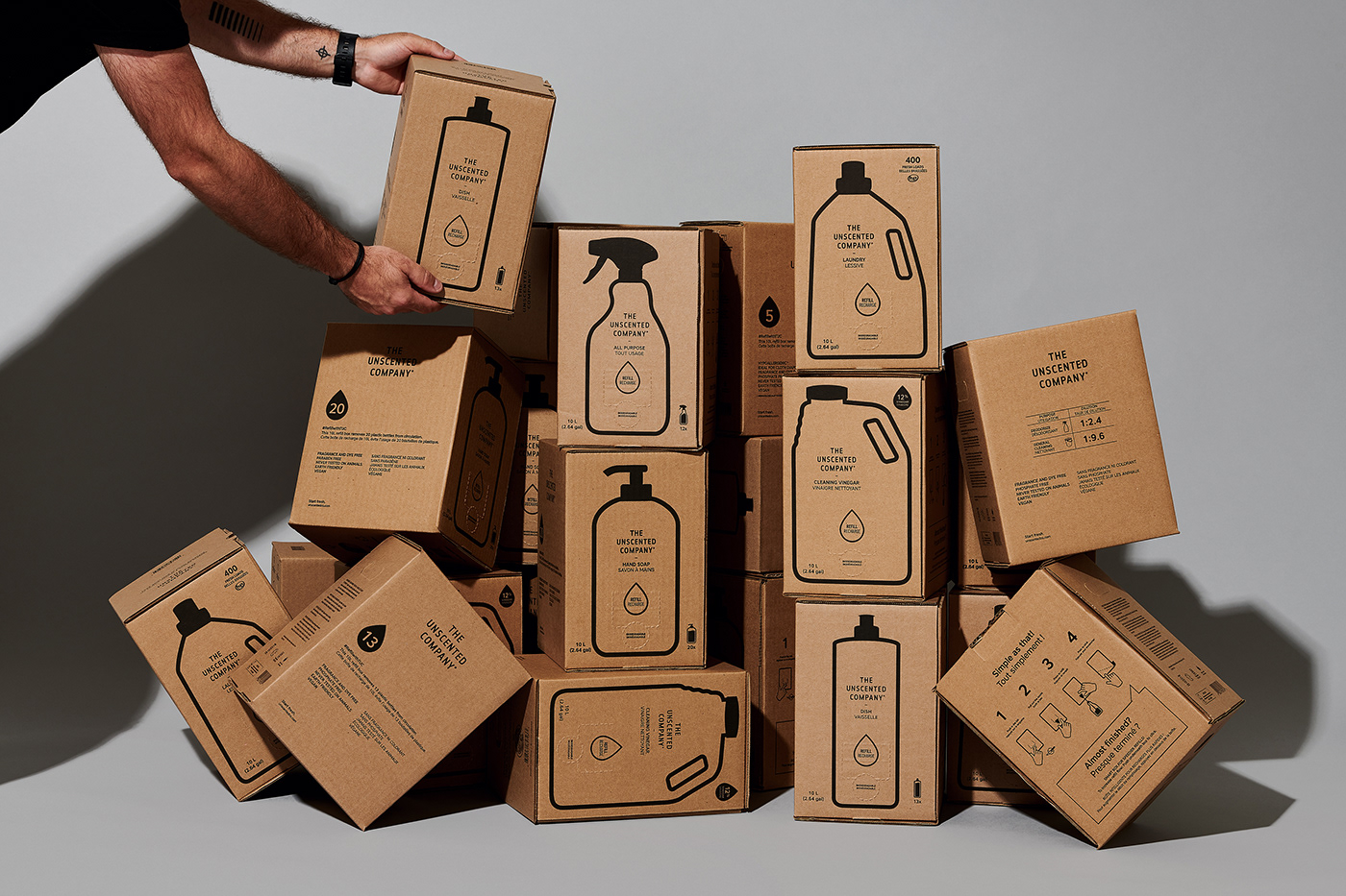
BANG. A variety of refillable products.
BANG. New refill and expedition boxes.
BANG. New refill and expedition boxes.
The Unscented Company (TUC) has once again trusted our creation studio. Now that the important product family is established, the company wanted to review their 4 L and 10 L refill stations as well as their expedition boxes.
The objective was to make the main surface of their many refill boxes more appealing, and to add a pleasant touch to their daily expedition boxes. Due to a format change of the 4 L and the 10 L boxes, now glue-free, we were able to use contour lines on the main surfaces to represent the products. This decision allows using the filling pumps directly from a representation of the product on the front of the box, and it eases the identification and use of the refill stations, at home and in stores. As for expedition boxes, a bilingual description of each product, in English and in French, was applied on the boxed in their respective typographic weights. The 2 boxes for special shipments were illustrated by hand, namely a wave and a mountain representing TUC’s 2 product categories (Home + Body). That way, every kraft cardboard box from TUC goes well with all of their products.


