


One of our latest rebrands - Charcuterie Board Workshop.
Originally started as a company giving lessons in woodworking and charcuterie board presentation in a Toronto studio, these guys have blown up in popularity, already expanding to a stunning Niagara location.
With their lessons completely booked up week after week, they needed a brand that could support this ever-growing reputation.
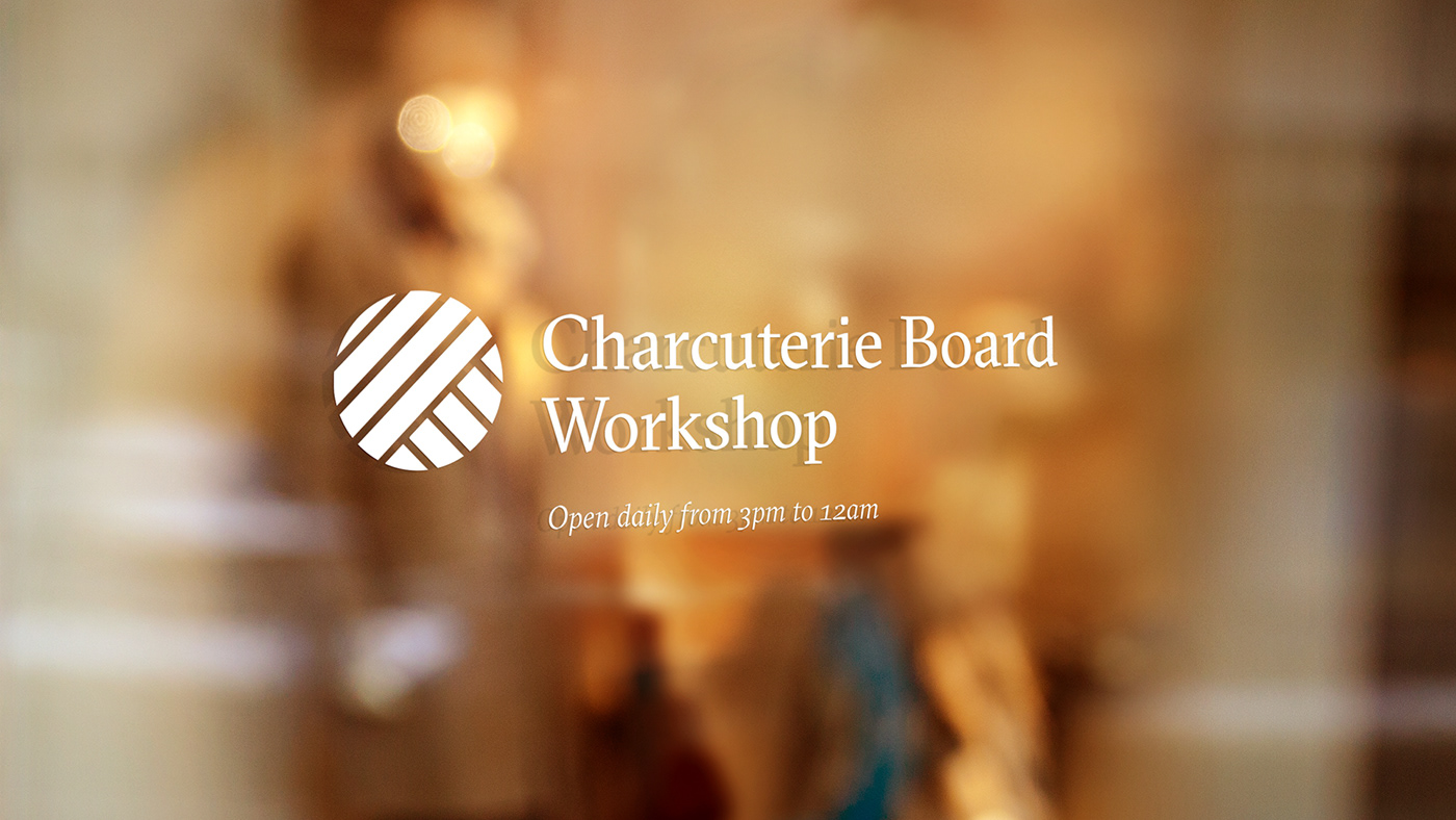
As a business with a genuine community, we opted for a circular logo to represent this. We then took inspiration from tree rings, almost treating the circle as a cross-section of a tree, and transforming these rings into linear shapes and patterns.
These hard, deliberate lines convey ideas of construction and process, as their customers transform a piece of wood into a crafted charcuterie board.
Originally started as a company giving lessons in woodworking and charcuterie board presentation in a Toronto studio, these guys have blown up in popularity, already expanding to a stunning Niagara location.
With their lessons completely booked up week after week, they needed a brand that could support this ever-growing reputation.
As a business with a genuine community, we opted for a circular logo to represent this. We then took inspiration from tree rings, almost treating the circle as a cross-section of a tree, and transforming these rings into linear shapes and patterns.
These hard, deliberate lines convey ideas of construction and process, as their customers transform a piece of wood into a crafted charcuterie board.
See more of our work at: fookcommunications.com


