


Amanda is a women’s health company based in Toronto. Their focus is on health coaching and shifting perspectives around body image, and empowering women by breaking the cycle of negative thoughts around size, shape, and food.
Founded in part to counter the often damaging perceptions set by the diet and wellness industry, Amanda is on a mission to free people from their inner critic, and encourage a mental transformation to find health and happiness.
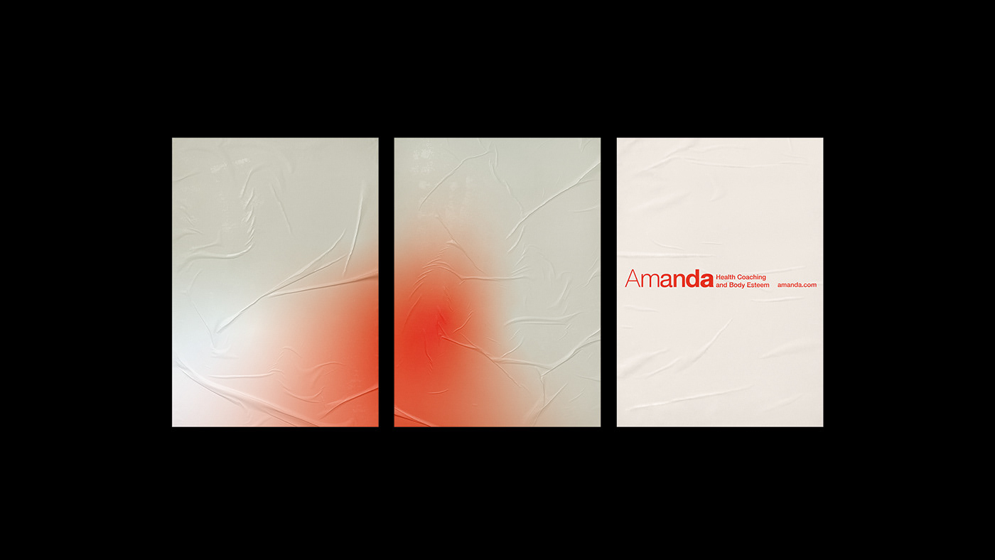
This visual identity, created by Fook Communications, was one of two brand concepts pitched to the client, and puts their mission at the heart of the brand. It expresses acceptance, transformation, growth, and a mood of rejuvenation in its use of type and colour.
The logo is a representation and celebration of all body types, using a gradual increase in letter weights to convey the embracing of these differences. Putting this idea at the centre of the visual identity clearly communicates that no one body type is better than any other, and that all are welcome. These letter weights also speak to themes of change and transition, referencing the transformation of mindset seen in the people they work with.
The typeface itself, utilising various weights from the Helvetica Now family, is very neutral, deliberately chosen to demonstrate Amanda’s core value of body neutrality, and their non-judgemental approach to health. This simple, varied use of the Helvetica Now family communicates an acceptance of all shapes and sizes purely through type, while always maintaining a clear sense of unity.
The use of colour and colour gradients furthers the identity’s connection to growth and change. The bright shade of red used with more neutral colours conveys a burst of life, energy, and positivity. Contrasting this with more neutral colours again captures the theme of transition, and a positive personal journey. The gradients also convey the sense that this change is steady and gradual.
A concentrated, deliberate use of red in key areas brings a soft but lively tone to the communication. It conveys the warmth needed for approachability, but also the boldness required of a business blazing a new trail in women’s health.
The result of these considerations is a visual identity that carries the values of the company throughout every part of its construction, and gives a brand that is accessible, approachable, and human.
See more of our work at: fookcommunications.com


See more of our work at: fookcommunications.com


