

(Est. 1995) Rich is a premium brand of 100% juices and nectars available in Russia that are produced by JSC Multon, which specializes in the beverage industry and has been part of Coca-Cola Russia since 2005.
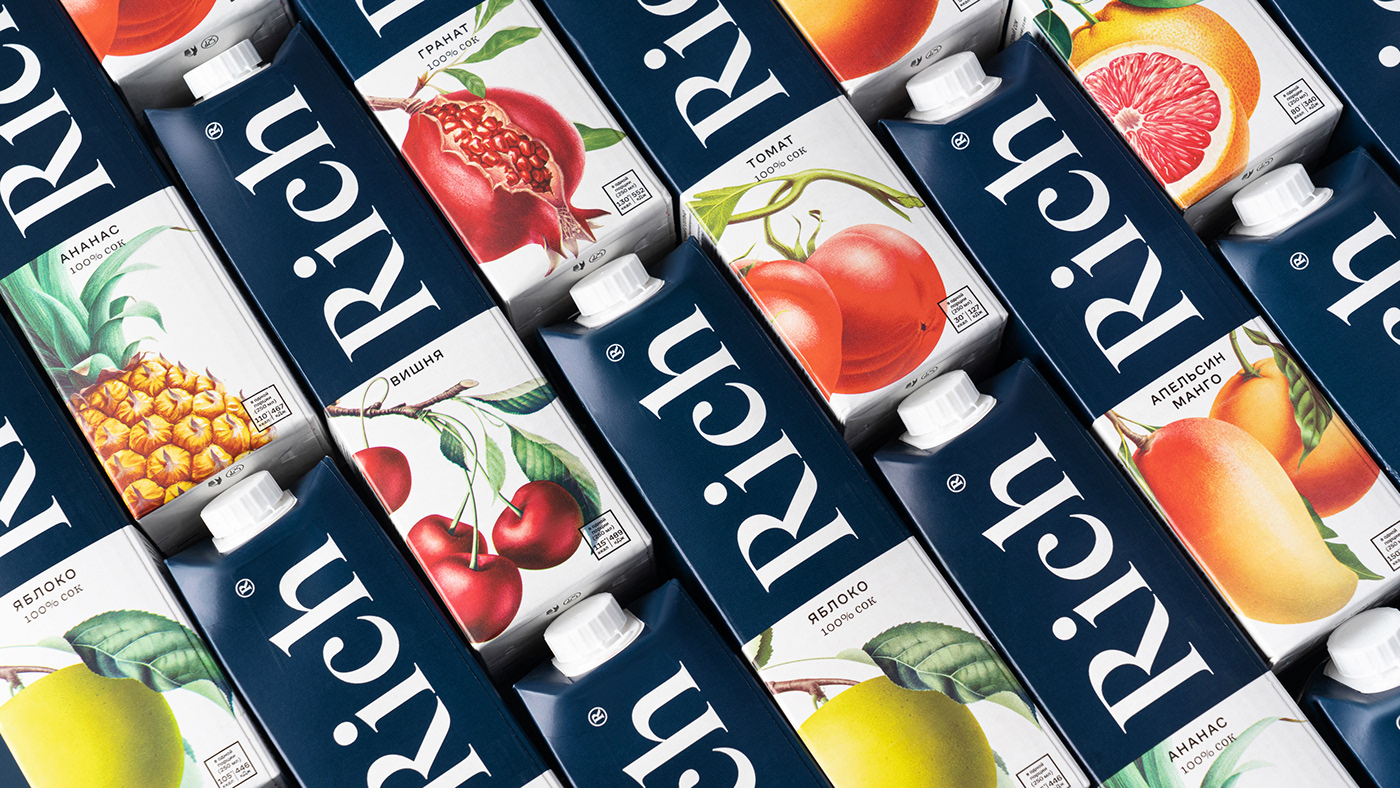
The brand is radically changing its design for the first time in its 20-year history to present its premium juice line in a new way. Inspired by the aesthetics of 19th century botanical paintings, premium brand Rich has redefined its appearance. The new design reflects the brand's philosophy and retains all the features of Rich's iconic style: minimalism, laconicism and attention to detail. Noble blue was chosen as the key color of the new look.
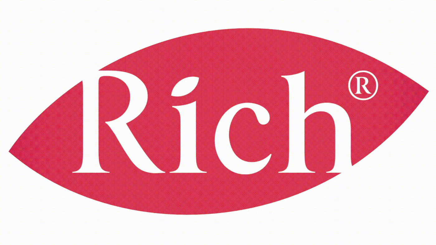


We revitalized the packaging design with a strong brand focus. The photograph was replaced by a botanical illustration that displays a more natural product with less sugar. The new logo got rid of the red and acquired more of contemporary lineament.
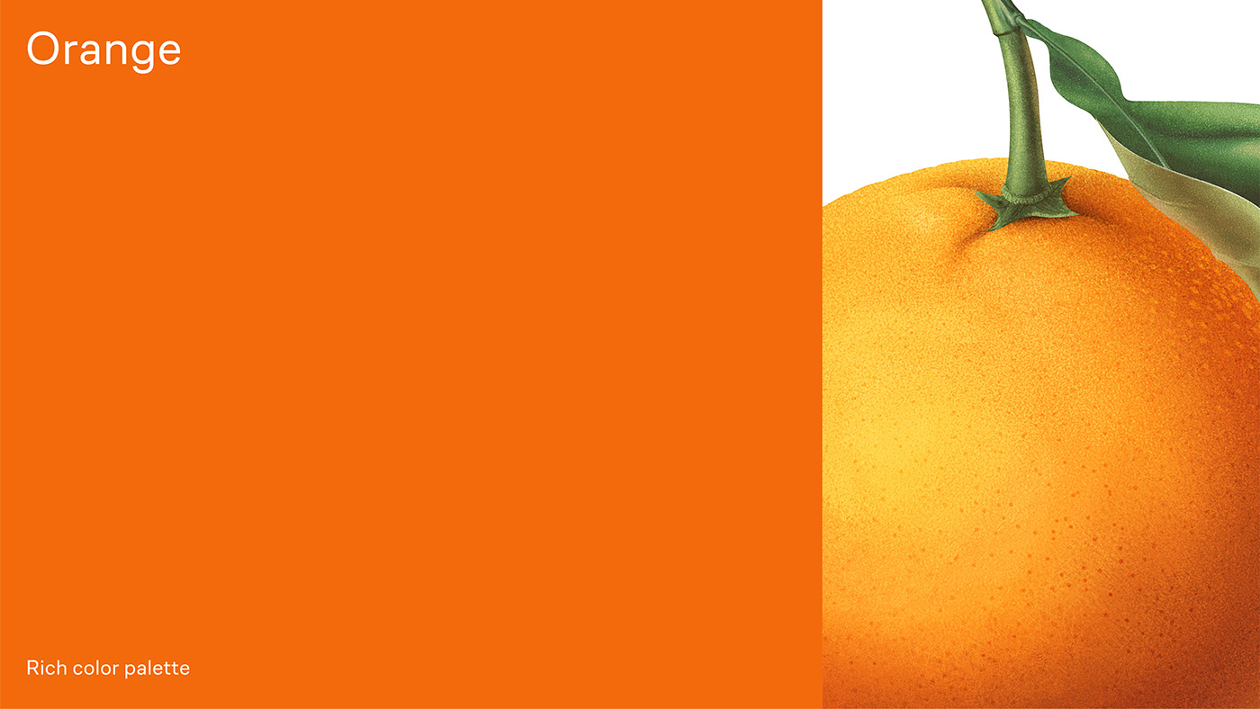
Transition from photograph to illustration is a revolutionary step for the brand. Dark blue colour brakes the mould of juice category and differentiates brand on the shelf. Upper part holds a massive logotype, bottom part — the illustration that marks product’s flavour. Therefore, the packaging forms a unified visual brand-module on a shelf and allows for easy navigation through the flavours. Detailed illustrations, referring to the 19th century botanical painting, invite the consumer to study and consider the nature of fruits.


Tuman studio
Creative & Art direction: Ira Kosheleva
Head producer: Konstantin Tolstikov
Type designer: Liza Rasskazova
Illustrator: Ivan Davydov
Creative & Art direction: Ira Kosheleva
Head producer: Konstantin Tolstikov
Type designer: Liza Rasskazova
Illustrator: Ivan Davydov
Photo: Olga Pogorelova
Rich team
Marketing manager: Tatyana Esipova
IMC manager: Anna Reymonte
Brand manager: Inna Ten
Creative Excellence manager: Maria Petrenko
Senior designer: Daria Kondratyeva
Rich team
Marketing manager: Tatyana Esipova
IMC manager: Anna Reymonte
Brand manager: Inna Ten
Creative Excellence manager: Maria Petrenko
Senior designer: Daria Kondratyeva
follow us on instagram →


