
Vazeh font family creation started with its very first version for web and app use in 2016, and was completed with designing the version for printing Quran. We dealt with some particular form and technical problems and limitations throughout the design process. Our solution was to create a unified font family in both web and print styles. A typeface that is nice to read, having Iranian spirit, containing very legible and recognizable letters, not scaring off the young audience by just looking at it but actually encouraging them to read; a typeface that is invisible, not showing off, and not interrupting the reading rhythm. Since text contents are growing daily in cyberspace, we wanted to design a typeface that not only covers that but also is warm and friendly.
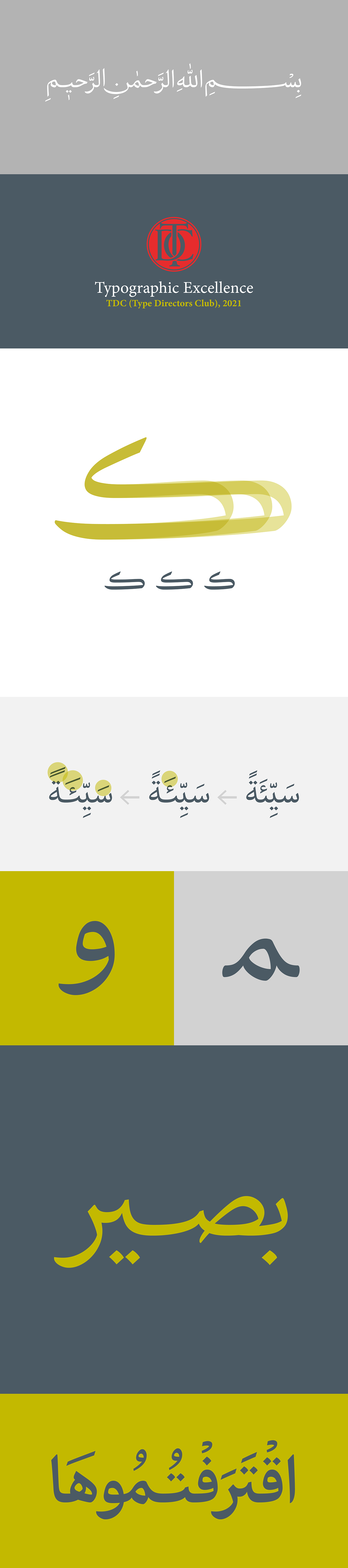
Vazeh Classic doesn’t have the reading limitations on digital screens; basically reading on paper is easier. Therefore, by studying Neyrizi Naskh script more than ever, we revived the calligraphic elegance. We designed more Ligatures for this typeface and also designed 2 to 3 different lengths for letters, joints, and diacriticsin order to create the best balance between positive and negative spaces.
A summary of other changes: increasing the pen angle and thickness contrast, diminishing the size of the teeth, eyes, and bowls, lengthening the ascenders and descenders, turning it into a more condensed typeface, having smoother joints, wider grooves, and more natural and mature forms.
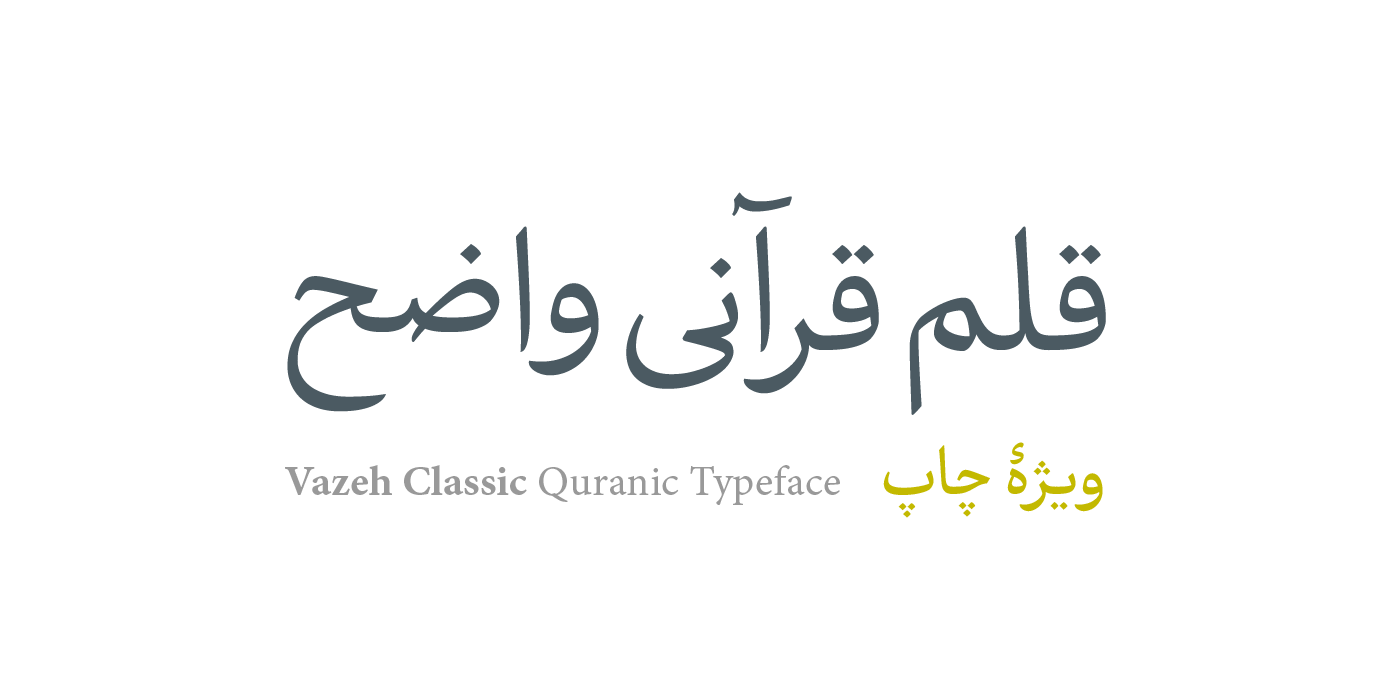
This typeface was designed in 2019. The font family includes three weights: regular, semi-bold, and bold. The typeface designers are Reza Bakhtiarifard and Omid Emamian. The technical part of the production was on MaryamSoft. Vazeh typeface was designed for Ofogh-e Rooydaad Company andcannot be purchased.
*Vazeh means clear
تایپفیس واضح تلاشی است که از سال ۹۵ با طراحی نسخهی اول برای وب و اپ کلید خورد و در سال ۹۸ با طراحی نسخهی ویژهی چاپ قرآن تکمیل شد. در طی فرآیند دیزاین، چه از نظر فرمی و چه فنی، با مشکلات و محدودیتهای خاصی دستبهگریبان بودیم. راهحل ما خلق خانوادهی فونتی یکپارچه در دو سبک برای وب و چاپ بود. فونتی که خواندنی باشد و حس و روحیهای ایرانی را منتقل کند، حروف بسیار خوانا وقابل تشخیص باشد، مخاطب جوان و امروزی با نگاه به آن نترسد، بلکه درصدد خواندنش برآید، نامرئی بوده، خودنمایی نکند و آهنگ خواندن را متوقف نکند؛ فونتی که با توجه به رشد روزافزون محتوا در فضای مجازی، نهتنها پاسخگو بوده بلکه بتواند دلنشین باشد و خواننده را با خود همراه کند
واضح کلاسیک محدودیتهای خواندن در صفحات دیجیتال را ندارد؛ اصولاً خواندن روی کاغذ آسانتر است. پس بیشاز پیش به نسخ نیریزی رجوع کردیم و ظرافتهای خوشنویسانه را احیا کردیم. حروف ترکیبی بیشتری برای تایپفیس طراحی کردیم، همچنین برای حروف، اتصالات و اعرابها ۲ تا ۳ مرحله کشیدگی طراحی کردیم تا بتوان به بهترین شکل، بین فضاهای مثبت و منفی تناسب ایجاد کرد
تغییرات دیگر بهطور خلاصه: افزایش زاویهی قلم و کنتراست ضخامت، کوچکتر شدن دندانهها، چشمها و کاسهها، بلندتر شدن صعود و نزول، جمعتر شدن نوشتهها، اتصالات نرمتر و فاقهای بازتر، فرمهای طبیعیتر و پختهتر
تایپفیس واضح کلاسیک در سال ۹۹ موفق به دریافت نشان تایپوگرافی ممتاز و اثر منتخب هیئت داوران باشگاه طراحان تایپ امریکا شد که میتوان گفت از معتبرترین گواهیهای بینالمللی طراحی تایپفیس است
این تایپفیس در سال ۱۳۹۸ طراحی شد. خانوادهی فونت واضح دارای ۳ وزن رگولار، سمیبولد و بولد است. رضا بختیاری فرد و امید امامیان طراحان این تایپفیس هستند. تولید فنی فونت بهعهدهی نرمافزاری مریم بود. واضح به سفارش شرکت افق رویداد طراحی و تولید شد و قابل خرید نیست