Old Masters
2020
Client: Národní galerie Praha
Art director: Zuzana Lednická
Designer: Jakub Spurný
Font: Untitled Serif
Type: Gallery, Catalogue, Poster, Exhibition
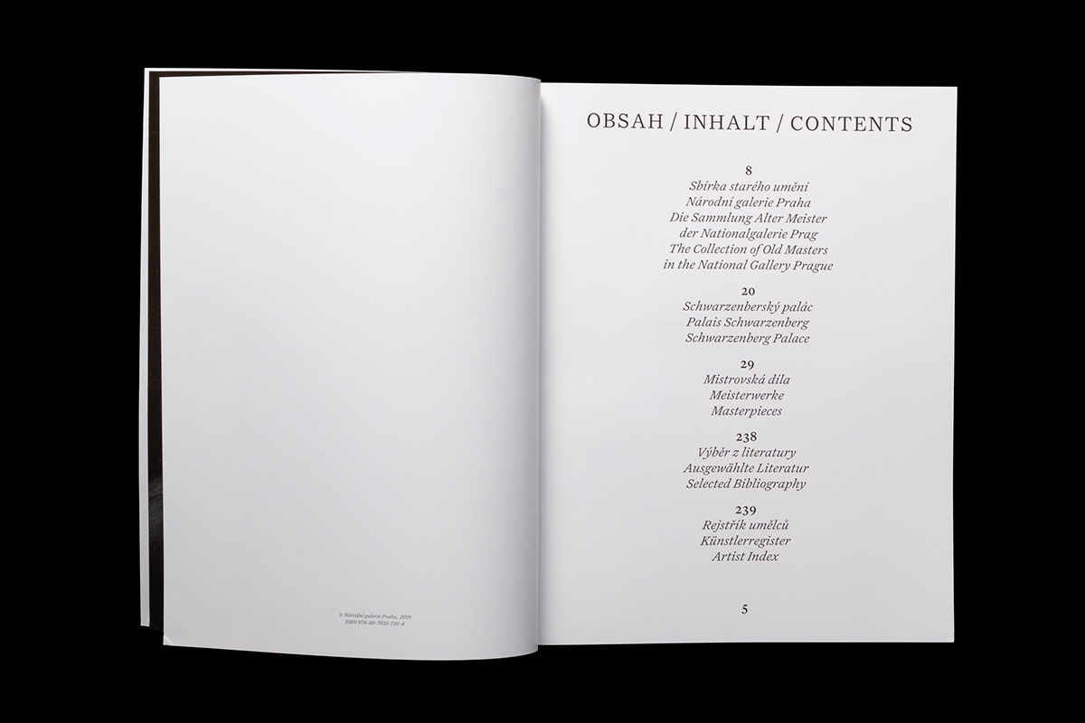
The ambition of the Old Masters, like of any re-arrangement of the collection, is to provide an up-to-date view of the work and, possibly, of its authors and the time of its creation. The exhibition of the key works from the Collection of Old Masters created in the Schwarzenberg Palace in Prague in collaboration with the architect Josef Pleskot does just that, and the two gender-balanced posters visualize the effort with a magnifying window. In the accompanying publication, the detail shines through to the next page with a precisely reproduced whole canvas (glossy lacquered – please do not touch!). Just as in the text-rich exhibition, the book features a second graphic leitmotif – trilingualism as a reflection of the exhibition as “a dialogue of the national and international impulses, influences and changes in the spirit of the dialectic of forms, styles and motifs”. Three columns and the fundamentally uneven nature of information from the 16th to the 18th century in three graphically different languages motivated a salient, dynamic “medieval” layout with dominant symmetry of the central composition, protruding titles, a number of highlighting fonts, jumping font sizes and number of characters on the edges of the pages. The impression of a baroque book is also met by an embossing on an uncoated cover. As the historically oldest so far, the Old Masters are also the first exhibition using Untitled Serif, a serif version of the Untitled typeface, which we prescribed to National Gallery in Prague in its new visual style manual in 2018.