

Skinsophia
Skin Care Philosophy
——————
Challenge
‘Skinsophia’ is a new skincare brand in China. They hope to design a unique packaging for their serum product that fits the brand, to build a good brand image.
Insight
The products of ‘Skinsophia’ are made from Chinese herbs and plants, with scientific formulas that work on the essence of the skin, the brand image is both Western and oriental.
Solution
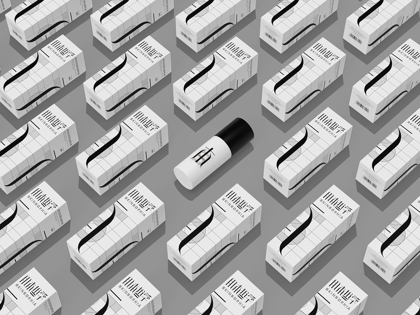
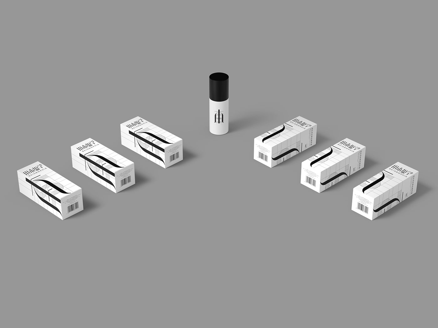
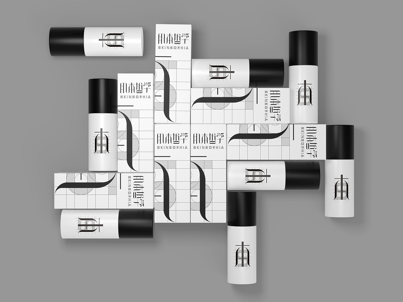
We used the Chinese character ‘本’ from the brand Chinese name “肌本哲学” as an extended graphic to design. The word ‘本’ means ‘basis’, it could represent both the herbal basis of the product formula and the brand philosophy of returning to the essence of the skin. The strokes of the character ‘本’ are shaped like grass and trees, reflecting the characteristics of the oriental herbal ingredients in products. There is a graphic of "S" behind, represents the initial of the brand's English name "Skinsophia", the design is inspired by the western artist Leonardo da Vinci's painting “The Vitruvian Man”, lines are arranged precisely just like the golden ratio of “The Vitruvian Man”, which embodies the scientific of the formula. We enlarged the main element and split it by a certain proportion, printed them into two adjacent sides of the packaging, that creates a 3D effect when folding the packaging along the crease lines. This design shows a unique sense of fashion and modern.
Result
The packaging received a lot of good reviews on social media after the serum product released, and a large percentage of consumers said they would try this product due to this packaging.


Client: Skinsophia
Creative Company:The Nine Shanghai
Founder and Chief Creative Officer: Jody Xiong
Art Director: Jody Xiong
Designers: Jody Xiong / Renqi Lan / Hu Mo
Account Manager: Siqi Zhu
Copywriter: Candy Chen/Yaoyao Lu


