
Logotype
For Biopack a logotype has been designed to make visible the name of the exhibition.
The tone of the exhibition is serious but close and human at the same time (because it requires implication) and clean (according to the idea of diasspearance of residues).
For Biopack a logotype has been designed to make visible the name of the exhibition.
The tone of the exhibition is serious but close and human at the same time (because it requires implication) and clean (according to the idea of diasspearance of residues).
A change of location has been made to the dot of the “i”, putting it in the lower part, as if it were into the soil, where the biodegradable materials are broken down.
The font chosen is Gill Sans, a sans serif humanist font; wich is not as cold as other sans serif fonts, since it has the proportions of the lowercase Reinassance humanistic fonts. It contributes to a meaning of modernity, reliablility and warmth at the same time.
As for the color, a bright, positive, clean blue is used. It is also important to emphasize the existing white spaces, which contribute to evoke cleanliness.

Business card
It belongs to the institutional identity.
The text is written in a piece of acetate, where the ink is of the same color as the cardboard, so in order to be able to read its content it is needed to open and remove the remaining parts of the cardboard. This highlights the idea of cleanliness and social commitment.

Envelope
It belongs to the institutional identity.
It opens by tearing it into three parts, as an idea of beginning with the breaking down process of the material, as the main caracteristic of the biodegradable materials.
It belongs to the institutional identity.
It opens by tearing it into three parts, as an idea of beginning with the breaking down process of the material, as the main caracteristic of the biodegradable materials.

T-shirt
It is part of the institutional identity.
This T-shirt is sensitive to UV rays, that is why when exposing it to the solar rays, the ink becomes invisible, as a metaphor of the natural ecosystem being the place where the biodegradation process takes place.
It is part of the institutional identity.
This T-shirt is sensitive to UV rays, that is why when exposing it to the solar rays, the ink becomes invisible, as a metaphor of the natural ecosystem being the place where the biodegradation process takes place.
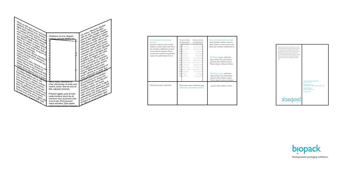
Brochure
It belongs to the institutional identity.
It is composed of three parts, one inside of the other. The outer part is printed in a 180g/m² paper and is about non biodegradable packaging. Inside of it, it is found the second part which is printed in a 80g/m² paper and talks about the advantages of biodegradable packaging. Finally, in the interior an acetate with the basic data about the exhibition is found.
It intends to show the disappearance idea as an advantage of the biodegradable materials, with a progressive decrease in the amount of text, thickness and size of the paper.

Temporary setting
It belongs to the commercial identity.
There will be a wall full of cards linked to each other, and each person will remove one, sign it with an special pen (whose ink is invisible and gradually will become visible) and place them on the opposite wall.
This will show the idea that to reduce the amount of waste it is needed an increase of
social commitment.

Visual cohesion of all the components
