Various Identities: '02 - '08
logo & identity work
logo & identity work

As part of the HFPA/Golden Globes collateral applications, the Hollywood Foreign Press Association's logo needed reworking. The revised logo improves upon the original by simplifying the shapes & cleaning up the hand-drawn lines of their popular logo. The new version adds vector economy & shape simplicity allowing it to be readable at a variety of sizes.

When I operated as "Opusîa Studios" I created a chat engine because my clients wanted to be able to contact me at any time but I didn't quite like talking on the phone. Plus this allowed for conversations to be saved so no mistakes were made. "Flare" was based on chat emoticons :¬) and takes its meaning from the concept of "sending up a flare for help" which is essentially what the clients were doing. I felt that the smiley face put a happy spin on crisis issues.

"Resentment is like taking poison and waiting for someone else to die."
Personal Biological Warfare. "V'ndetta" is a line of fragrances & cosmetics based around the concept of revenge. Taking from the concept of Venetian Blood Feuds, the logo is an ambigram because there are two sides to every story and revenge is never-ending cycle.

Event Promotion identity - they wanted something simple & modern, but fun & upscale without being stuck up. I felt the martini glass was rather obvious.

The LA Chamber of Commerce needed their logotype updated and their symbol refreshed - without resulting in a drastic change to the brand. The symbol, a holdover from hand-drawn paste-up needed to be redrawn with precision while the logotype needed to be simplified & a font chosen for the chamber to utilize company-wide. Since the name was so long, the ideas were split up using contrasting faces of the same family. This was applied across the chamber's brand collateral.

The World Youth Peace Organization was holding their 2003 summit in Kenya and needed an identity that would speak to all corporate objectives across the linguistic divide while at the same time being joyful, positive & full of hope. Globally, "green" symbolizes growth & life, while "Orange" symbolizes spirituality, energy & balance. The typography of WORLD PEACE was accentuated since that is the primary goal.

NBC was creating a new gameshow called "Amnesia" with Dennis Miller as the host and they had me create a number of logos for them. Ultimately, they ended up using one created in house (http://www.nbc.com/Amnesia/) but I still like this one - created from question marks. The directive was that they wanted it to have a "groovy" feeling as that was the direction the set was going. I've never seen the show, so I have no idea where they ended up. I just had fun doing it.
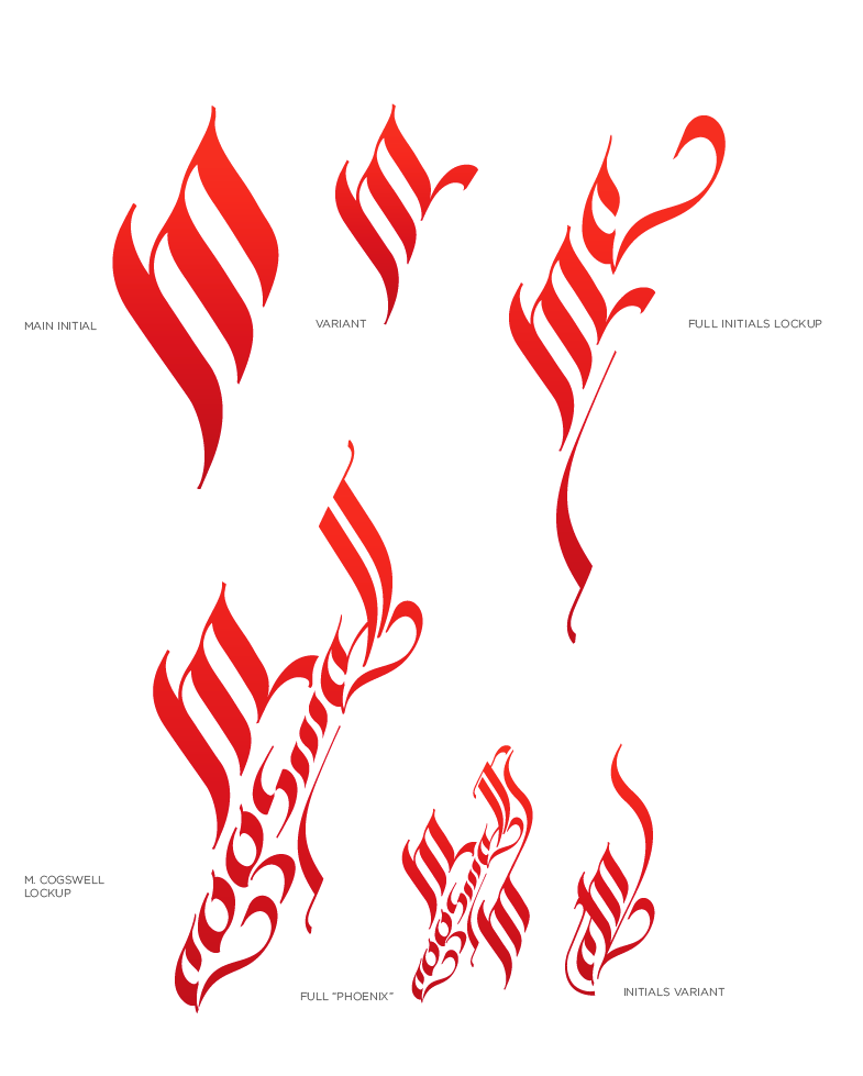
And of course, my own identity... Having gone through so many "deaths & rebirths" I thought it fitting that my symbol be a stylized Phoenix. The lettering is based off of Moorish calligraphy because, well, I like it.

