
Yeti Ice Cream explores the notion of creating awareness around food serving sizes and their relevance in living a healthy life. Ice cream pints—like in many food packages—tuck all their important information in the back. By making serving sizes easier to see and experience, people are deterred from binge eating—a habit that can lead to obesity.
From the start, the project was about more than redesigning the pint; the ice cream pint is not only successful from a packaging standpoint, but it is also iconic and recognizable. Rather, the focus was on redesigning the interaction with the pint.

After looking into more subtle ways of getting the message across, it became clear that a serving size loses its value when it is hidden. To be effective, the user must somehow interact with the serving size.


The final prototype embodies that idea in a rather simple way. By creating separate levels inside the pint, people are slowed down and deterred from eating the whole pint in one sitting. It’s is a simple solution, with an honest and transparent mission: one spoonful at a time.


Alongside the ergonomic explorations, the Yeti brand was developed. A mascot was created, along with a mark and supporting typography. The back of the package was explored first, with powerful graphics to draw attention to the ingredients.


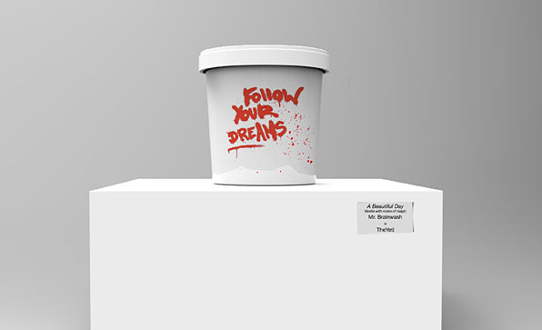
As a way to get the brand out, Andres explored street art—with its bold, irreverent attitude.


And finally, one-of-a-kind editions of the pint are conceived as an exhibition, featuring well-known artists.


Following is a diagram of the design process during the 5-week project.


