


GATHERING FINENESS AND FUNCTIONALITY
-
-
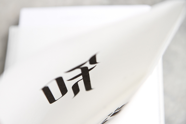
As part of Sixstation workshop's rebrand project, the design company compiled its portfolio into two brochures under the themes of “Emotional” and “Rational” respectively. The Chinese characters of “emotion” and “rationality” overlap on the wrapper when the books are taken out, serving as a playful element that connotes the idea of harmony.
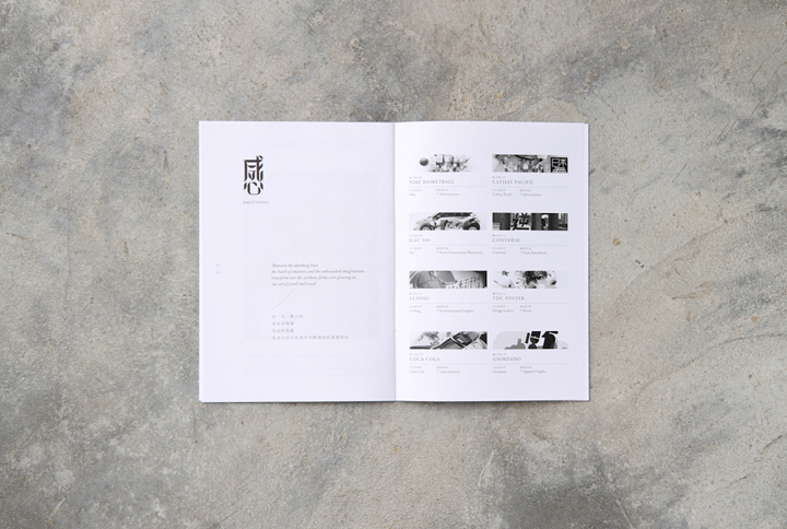
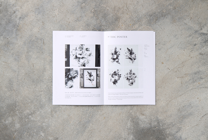
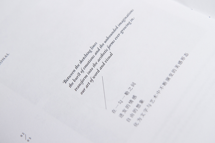
The Emotional part features creative projects executed solely out of interest to satisfy the team’s thirst for free art. Meanwhile the Rational part collects the best of our commercial design works, each received positive feedback and great appreciation from the clients.
The books present two distinctly different design directions, aptly complemented by a textural contrast between the side-seam pocket’s roughness and the paper’s coated smoothness.
The diverse variety of works, ranging from web designs, typefaces to identities, is systematically compiled, in a modern-classic style that echoes with the team’s aesthetic concept. Sixstation’s signature typeface is used throughout the books.
This project review showcases a collection of millstones, as a record of the team’s passion for quality design.
-
-

