SISU
Finding the inner strength of a brand
Finding the inner strength of a brand
SISU came to us with a business problem: the new owners wanted to position the vitamin company for a very ambitious resale in under 2 years. Before that could happen, the brand would have to look global and sharp. At the time, there was no consistent logo, no brand graphics, no strategy for advertising or marketing or packaging.
To build a strong brand, we needed a solid foundation. We found it in the company's history. SISU is Finnish for 'inner strength' - an attribute the Finnish founder wanted his vitamins to build.
Based on the brand's Finnish pedigree, we gave it a northern, scandinavian logo - complete with 'harmony mark' umlauts that represented two halves of the whole.
This cool northern feel would be complemented by the cobalt bottles we chose - completely unheard of in the brown bottle vitamin category.
The label on the bottles would break another taboo. Vitamins are not allowed to 'state' their health benefit - in words. So we decided to use icons to telegraph these benefits - much like a European brand would in a foreign market.
We launched the new bottle designs, and almost immediately discovered that people felt drawn to the playful umlauts. In fact, it was SISU staff who coined the phrase 'harmony marks'. Based on this emotional response, we created a multimedia campaign - print, web, online tv, collateral - that played with the harmony marks.
Not only did SISU win virtually every Canadian design award and win a coveted spot in Communication Arts' Design Annual, but the company sold in two years. On timeline, and at the ambitious asking price. The ultimate tribute, however, is that the brand is still intact today - a testament to the pulling power of our communications.
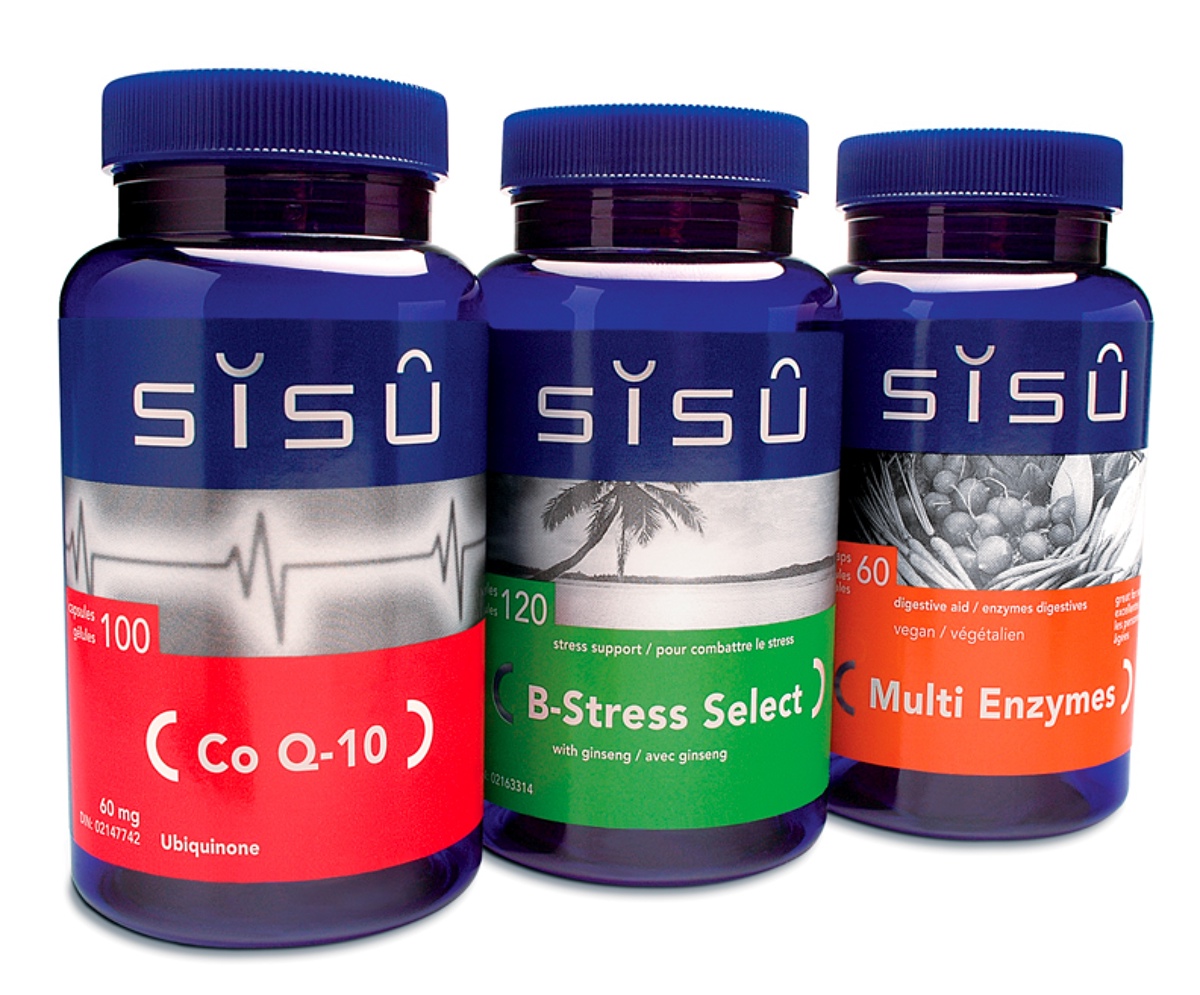
SISU's redesigned bottles - note the 'harmony marks' above the I and U, and the visuals that telegraph the desired effect.

In the spirit of minimalism, we used the harmony marks in print ads to telegraph brand attributes. Here, they become coral...
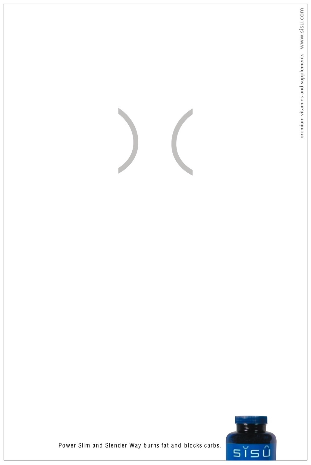
...And here, the harmony marks become a slender waistline.
We also used the harmony marks in15 second TV spots. This one is a minimal take on yoga...
...And this one turns the harmony marks into a skipping rope.

