Pure Integrative Pharmacy
An innovative new concept - the Hub Of Health.
An innovative new concept - the Hub Of Health.
The world of healthcare is changing dramatically. A grey tsunami of aging boomers is demanding more holistic, enlightened solutions; Europeans have taken integrative pharmacy (a combination of natural remedies and conventional pharma) to the mainstream; and people are moving away from 'magic pill' solutions to a more 'preventative medicine' perspective.
Pure is a pharmacy that embraces this thinking.
Pure came to us wanting to create a strategy and brand that could be templated and rolled out across multiple stores.
We started with research and brainstorming that resulted in a brand bible. This bible was the foundation of everything from our graphic design and communications to our brand values, story and essence. Most significantly, the exercise led to our positioning of Pure as your Hub Of Health.
Then we moved on to execution, which included some of the pieces seen here - a new logo (with a modified pharmacy cross superimposed over a 'alternative' tilted cross), advertising, even store design.
Just as important, though, we analyzed how to fulfill on the intangible 'hub of health' positioning. This led us to map out things like a knowledge-sharing network for pharmacists, naturopaths and homeopaths inside Pure; and a 'Global Expert' network of outside experts who could regularly speak at Pure to educate both staff and customers.
Pure is launching this concept throughout 2012. Stay tuned for more!
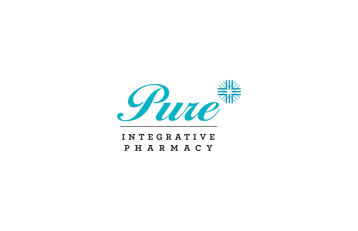
The new Pure logo, with a European-style 'Apotheke' cross superimposed over a tilted 'alternative' cross.

The new business card - part of our stationery package.

An exerpt from the Pure brand bible.

This ad was created as a massive store window cling. It will be hung in stores that are being converted to the Pure concept.

The flyer page on the left represents the look and feel of Pure's communications prior to our project. The flyer on the right represents the new graphic identity. The old logo top left vs. the new logo top right nicely illustrate the graphic evolution of the brand.

Key to the new Pure store design is a bright and prominent 'Pharmacy' sign that reassures first time shoppers that this is, indeed, a conventional pharmacy. However, the sign is at the back of each store, and shoppers are drawn along aisles of both conventional and natural remedies as they make their way to the pharmacy counter. This breaks down the psychological barrier between conventional and natural remedy thinking.

Each new store will feature a 'story wall' that makes the Pure mission clear to shoppers.

A key differentiator in the Pure brand is accessible expertise. Pure customers will be more than carriers of a doctor's prescription: they will be engaged to give a 'big picture' of their health. This consultation nook was designed to make this process effortless and inviting.
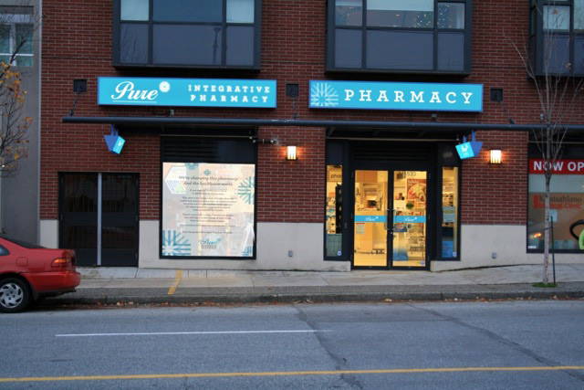
The first Pure store slated for conversion. Note the massive window cling preparing customers for the shift.

Behind every great project is a great client. Our client Bob - pharmacist by training, entrepreneur by trade, visionary by nature.

