plus20
User Experience & Development
User Experience & Development
Client:
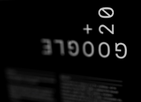
Semi-permanent / Google+
Design & GUI:
Maud
Development & UX:
Voodoo / Trevor Brennan
Semi-permanent / Google+
Design & GUI:
Maud
Development & UX:
Voodoo / Trevor Brennan
Working closely with the event’s brand-custodians, Maud, we developed the technical means to implement a concept they had been itching to try. Their intention was to introduce an animated overly over the entire website in order to invoke a sense of raw digital framework.
While conceptually interesting the overlaid animation proved technically challenging due to the ‘solid’ nature of HTML elements. Anything overlaid would prevent user interaction with the content below, rendering the submission section of the site useless. Voodoo’s solution was to infact place the animation behind the page elements giving the appearance of an overly but the practicality of normal HTML. Images and ‘solid’ design elements were then given a transparency in order to preserve the overall effect.


Voodoo also chose to procedurally animate the fixed position animation. A very specific font and layout was requested which prevented the use of webkit fonts or other dynamic type based solutions. To accommodate we opted for a sprite sheet (which Maud could edit in-house) which is dynamically and randomly accessed to produce a non-predictable animation. Variables were then added that paused the animation during it’s less visually intense frames; allowing for more moments of undisturbed reading.


We also opted to implement completely cascading colour values. Meaning that the entire colour scheme for a page could be programmatically indicated once at the start of the document. This meant that new pages could be easily added or page colour could be change effortlessly whenever needed, providing the flexibility required for the ad-hoc nature of first-time events.
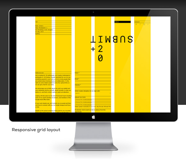
The website was also built to be responsive, a requirement not indicated by the client themselves but deemed mandatory by us. The target audience being innovative design and web specialists it seemed necessary to implement a solution that would work on newer handheld devices. We built the structure of the website using flexible and dynamic grids, once again to accommodate the sites fluctuating content.

MacBook: http://bit.ly/YcbeB6
iphone/pad: http://www.teehanlax.com/tools
iphone: http://drbl.in/eKFD
iphone/pad: http://www.teehanlax.com/tools
iphone: http://drbl.in/eKFD

