olveejay, comedian, beatboxer, good guy

forms of N and K (title and last letters) are almost mirror image

i played with it for to find optinal composition of the font


geometry is simple and symmetrical

and it can work with old school ribbon

microphone is his main device

here good placement for it

now it needs some spikes around to be a rock and not to roll

shadows

and rockin' hand on top

basic color version


halloween version


more funk colors


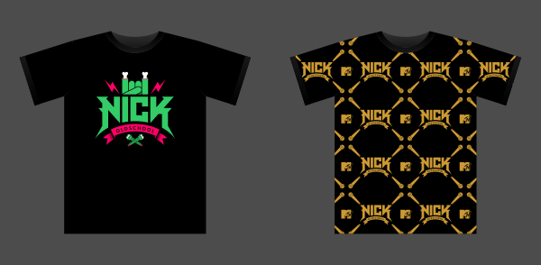


Later name was changed to N I K Oldschool after previous concepts was almost done.Previous version without C can't work good with such geometry and also can remind logo of Nine Inch Nails band.So, I just made new and different concept.

i started from this base

and made simple ambigram


this is full-colored version


so, how it works: the logo needed some interactivity, something like different skins and i decided to play with some oldschool or actual elements - things he works with (actual objects) and some key things of our history here (oldschool). For example, this is old microphone.

kolbasa is popular food for long time.
we also have a verb -kolbasitsya- what means to have a joy / to hang out, clubbing

kefir + fresh long loaf was popularcombination for breakfast / fast lunch in USSR.
we also have popular song about it

first adidas came to USSR in 80s, blue sneakers was like big and deficient dream

first action movies

first cell phones

lemon is million
that slang was popular from late 80s. it was time of fast money and first millionaires

i love first thrillers and jason's mask


version for day of army