Nanyang Junior College Open House 2013 | Theme: NYJC BE MORE
Event held at Nanyang JC School Premises, Singapore, 11th & 12th January 2013
The theme for Nanyang Junior College’s Open House 2013 is ‘NYJC BE MORE’, and the objective of the branding campaign is to market the school to the prospective students.
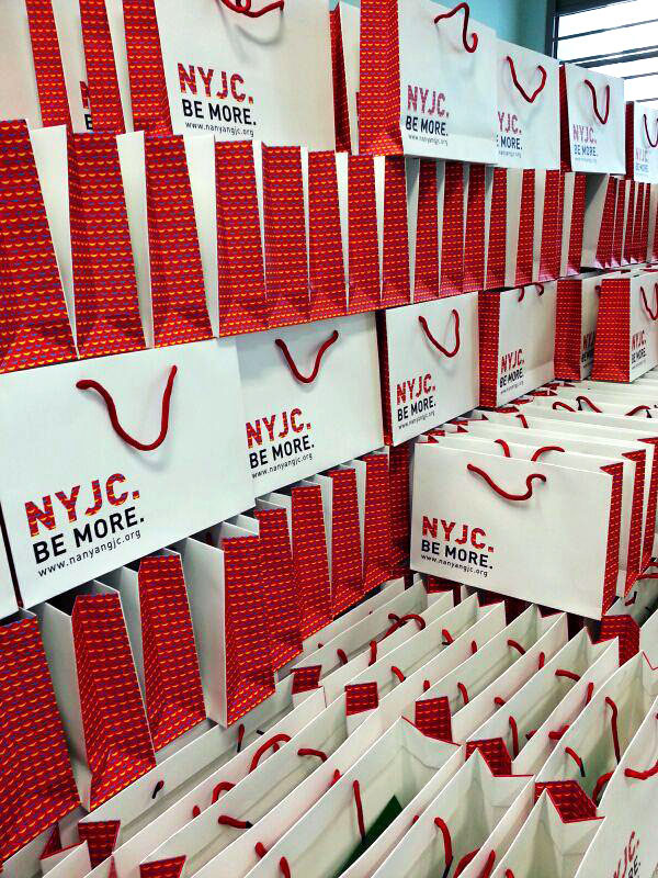
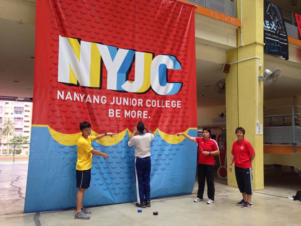
NYJC existing logo consists of the three most prominent primary colors, red, blue and yellow. These three colors are bright and pure in their nature and we believe that it best fits the idea of this year's theme. With just these three fundamental colors, can we get more out of it? Yes we can. We can "be more".
The slogan "SAY YES TO NYJC" is incorporated in this campaign as well. It sounds simple and effective, and that is precisely the essence of the whole campaign. We want to make it 100% clear, to encourage the prospective students to say "yes".
Along with NYJC's existing branding elements, we created patterns and visuals that convey the new activities that the school have. "SAY YES TO NYJC" is designed as big blocks of letters where miniature man are hiking on it towards the top. This subtly conveys the message of the potential ability in achieving to greater heights if prospective students were to make a right decision by saying YES to NYJC. The climbers suggests the newly built High-elements facilities in the school's compound.
CREATIVE ART DIRECTION / XIAN MIN CHIA
CREATIVE ART ASSISTANT / CHRISTOPHER CHIA
Generic banner design for school's main entrance

Postcards Series (Front & Back)


Paper bag design