Logos and logomarks
A collection of logo designs and comp studies.
A collection of logo designs and comp studies.


Serve. Lead. Go.
This is a logo for a faith-based program that focuses on High School Seniors. The program offers training, guidance, and service opportunities for Christian students who are about to take their next step in their spiritual journey.

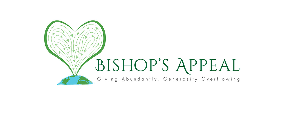
Bishop's Appeal Campaign 2013
Developed for the Northern Illinois Conference of UMC, this logo is for a special offering campaign. This campaign strives to encourage and inspire a group of churches and groups to give abundantly for a specific event. This year the focus is on larger project called Harvest 2020. The overall theme is about collective sharing and giving to benefit the needs of the world.
Final Logo (Stacked)
Final Logo (horizontal treatment)
This was a logo modification for a Prison mission church. They just wanted me to take an existing design and tighten it up as well as add some copy.


High 5 Logo: This logo was designed for a conference whose theme focused on the following five principles. HIGH PROFILE, HIGH IMPACT, HIGH GIVING, HIGH ENGAGEMENT, and HIGH TECH.

THRIVE!
Living the Life
This logo was for a campaign that bridged more than one initiative. It needed the ability to stand alone and yet also segue into the IMAGINE NO MALARIA companion campaign. With Thrive! the concept encases a larger mindset to encourage one to take care of one's HEALTH, SPIRIT, and then COMMUNITY, including the GLOBAL COMMUNITY. There are several avenues offered for people to nourish their Physical health, their Spiritual health and then in turn they are encouraged to nourish the health of others (All of God's children or the spiritual Body of Christ). Again the global focus is mainly on children and their families.... or lack there of. So I've tried to craft the graphics, color schemes, and some of the typography to reflect this overall feeling of .... "Don't just wander aimlessly through life, God wants you to Thrive!" Help yourself first and then you will find that you can thrive at helping others on a local level and even a global one.

Campaign logo for an event in Boise, ID.

KLO PUBLISHING SERVICE Logo: This logo is for a publishing professional who focus is Project Editor and editing in general. Great client and I love using the old typewriter keys.

FInal logo for a new brand of Bibles and devotionals.

ANITA HIGMAN LOGO STUDY: These comps are for an historical fiction author.

LOGO COMP

FINAL LOGO: This was for a community outreach event.

COMP STUDY

TRUCK TOUGH LOGO: This logo was created for an automotive parts division of Vista-Pro.

Final Logo for another community focused campaign.

STUDENT ORGANIZATION LOGO: This logo is for a campus program called Choose Life, Safety, Peace, God. The program served students with many of the challenges in their lives. There will be several candle light devotionals to celebrate their unity and spiritual comfort.

LOGO STUDY

POSTER GRAPHIC ROUGH

POSTER GRAPHIC COMP: OPTION 2

EVENT LOGO-COMP STUDY: The creative brief said the wanted it to be upbeat and playful.

LOGO STUDY

COMP STUDY

COMP STUDY

LOGO EXPLORATION FOR AN AUTO WHOLE SELLER.

LOGO STUDY

THE DIRTY ORPHANS LOGO: This was for a local alternative Rock band. They eventually went on to changing their name.

TRACTOR TOUGH LOGO: This is a case study of logos for a tractor parts division. Their main inventory consists of tractor radiators and their parts.

SOS LOGO: This was the final logo chosen by the client. Their campaign offers service to the schools of South Texas.

JON DOE LOGO: This was for an Atlanta-based DJ.

KOOP ART LOGO: This is the logo for Chris Wynkoop. An artist based out of Virginia.

LOGO FOR A COMMUNITY CHURCH.
Bishop's Appeal 2013 Comp studies:
These study comps are posted from the later rounds back to the early comps. You will see how we worked through the process of capturing a logomark that communicated the concept of "collective giving" for a larger purpose. That purpose being to take the gathered resources and to then plant and grow more .....so all will benefit from the "Harvest." I started with more abstract elements and then probably drifted too literal ..... and finally found something somewhere in the middle.
These study comps are posted from the later rounds back to the early comps. You will see how we worked through the process of capturing a logomark that communicated the concept of "collective giving" for a larger purpose. That purpose being to take the gathered resources and to then plant and grow more .....so all will benefit from the "Harvest." I started with more abstract elements and then probably drifted too literal ..... and finally found something somewhere in the middle.

Comp study: 5

Comp study: 4

Comp study: 3

Comp study: 2

Early thumbnail comp: Well recieved but a bit too abstract for the overall theme.
HARPETH LOGO STUDY
This exploration of logo comps is for a local band. They have a unique "alternative rock-like" sound with a hint of Radiohead, Elbow, and a touch of Sigur Rós. The name Harpeth is random .... it's the name of a local river as well an area that they all grew up around. They didn't want the logo to reflect anything particular .... so I was free to explore. So my initial comps were based around musical notes and sound waves. The following comps show the creative journey we took to land on their final choice.
This exploration of logo comps is for a local band. They have a unique "alternative rock-like" sound with a hint of Radiohead, Elbow, and a touch of Sigur Rós. The name Harpeth is random .... it's the name of a local river as well an area that they all grew up around. They didn't want the logo to reflect anything particular .... so I was free to explore. So my initial comps were based around musical notes and sound waves. The following comps show the creative journey we took to land on their final choice.

This early comp was a play on some musical notes and the suggestion of motion.

EARLY COMP

BARE FEET COMP #1: One of the other concepts I offered was based on an interesting fact that I discovered after seeing them play a couple of times. Almost all of the guys played live or otherwise ...barefoot or in socks. So I worked up a few roughs that reflected this idea. They liked them, but ultimately decided that they wanted a simple clean san serif treatment.

HARPETH LOGO STUDY: This was part of the next steps in exploring some san serif treatments. This is a personal favorite, but didn't make the final cut.

LOGO COMP: This is another personal favorite. To me the word harpeth suggests something with an "angelic" tone. So this little idea came to me to add this little toy-like halo .... sort of like an after thought that was stuck on at the last minute. Their music was original and clean .... so it kinda fit.


