

AN INTERESTING INTERSECTION
-
-
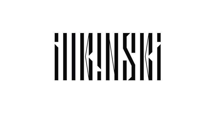
Done for Sixstation. Designed for illkinski’s latest EP “Fireflies”, the logotype’s core concept centers around the music note’s rhythmatic structure. And to highlight the London—and Melboure-based electronic music duo’s eclectic presence, thin strokes are used to create interaction between letters, and thus resemble the shape of the word “illkinski”.
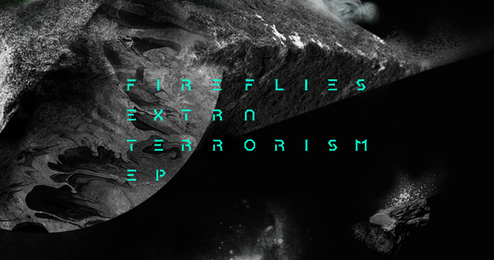
“Fireflies” might be one of the most important albums that build on this band’s identity. The cover presents an abstract depiction of their perspective of music movements.
-
-


