While Milton Glaser’s I love New York logo created an enormous buzz in the 1970ies graphic design, nowadays it became regular to meet more and more unique and prime visual identities among cities, towny, municipalities and regions. New or refreshed identities serve governments and other administrative organizations well. A very few attempt however is made to refresh a country’s ‘logo’, the coat of arms, and thereby the symbols of the national identity.
My experiment for this was willfully timed for 20 August, Saint Stephen’s Day, when Hungarians celebrate the Foundation of the State. This way, it’s a present for Hungary by me.
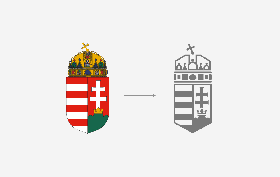
Today’s Hungarian coat of arms was complied for the middle 19th Century from medieval elements. Many variations of it appear under the 1848-49 revolution, but it only becomes official after the Austro-Hungarian Compromise of 1867, dubbed the ‘small coat of arms’. After many changes in the 20th Century, the historical, crowned symbol returned by the decision of the Parliament on 3 July 1990.
‘The coat of arms of Hungary is a vertically divided shield with a pointed base. The left field contains eight horizontal bars of red and silver. The right field has a red background and depicts a base of three green hills with a golden crown atop the higher central hill from which rises a silver patriarchal cross. The Holy Crown rests on top of the shield.’ (The Fundamental Law of Hungary, 25 April 2011)
I managed to simplify the coat of arms, leaving all the necessary heraldic elements on place, and therefore promote a more contemporary, simple and comfortable use.
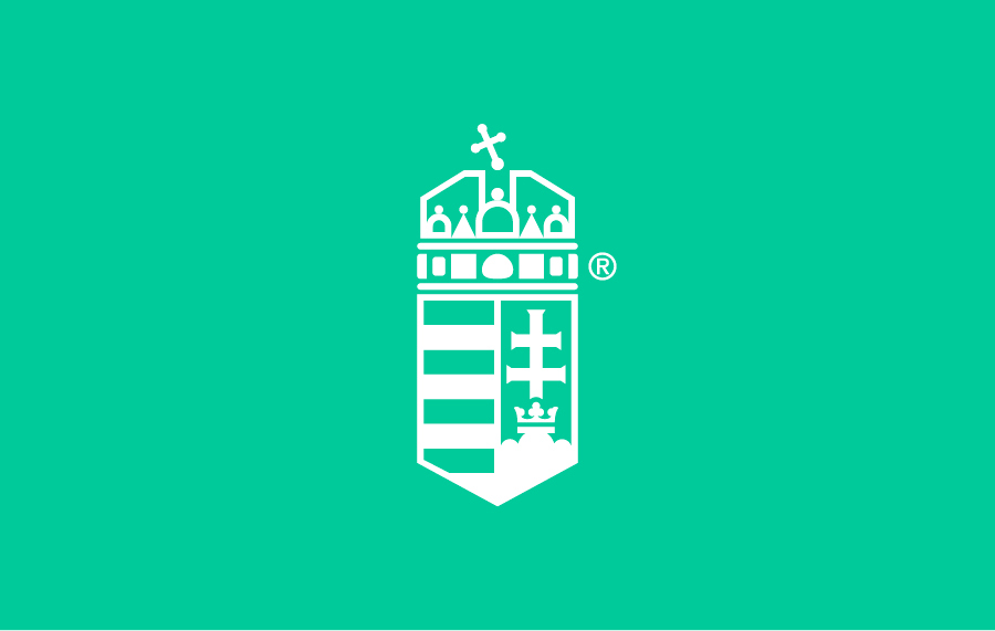
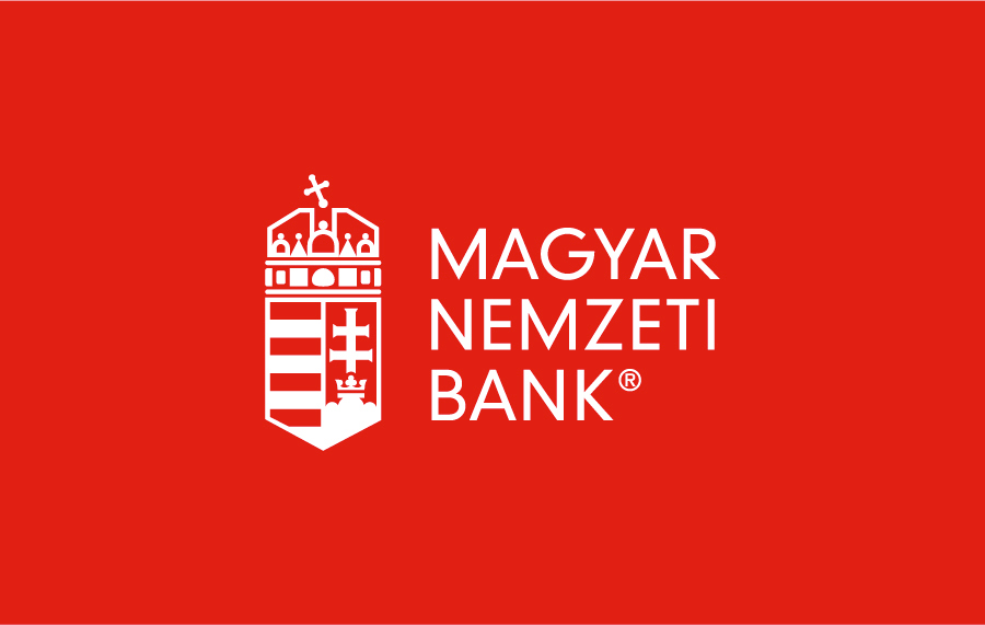
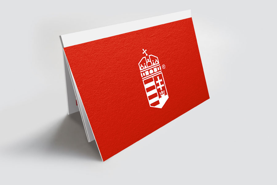
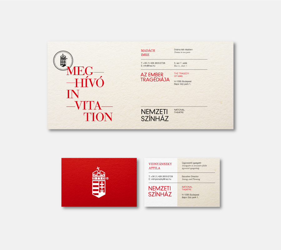
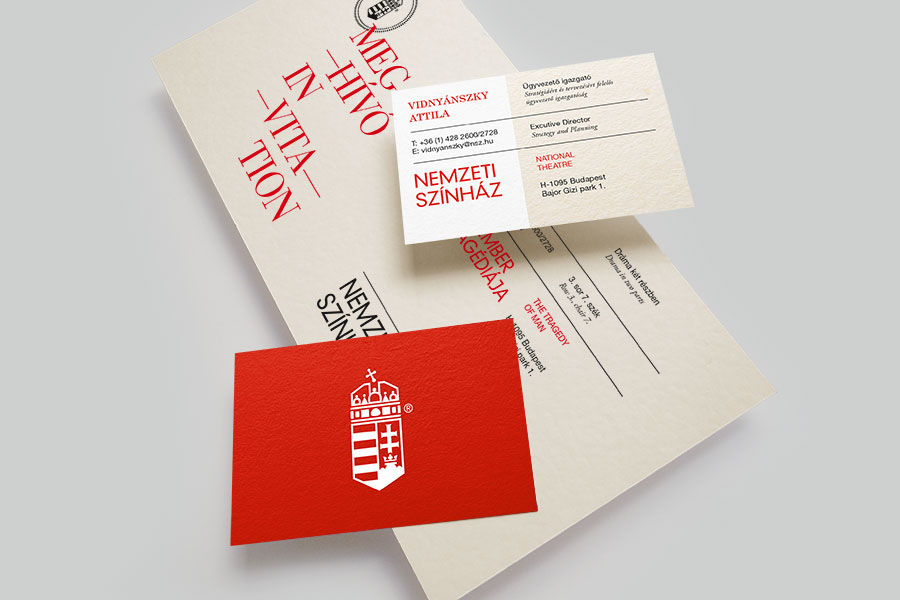
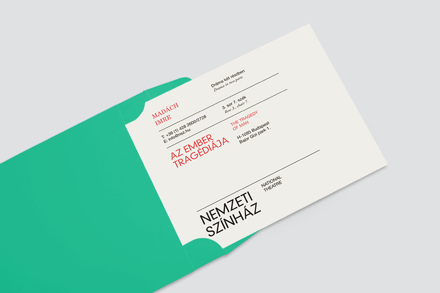
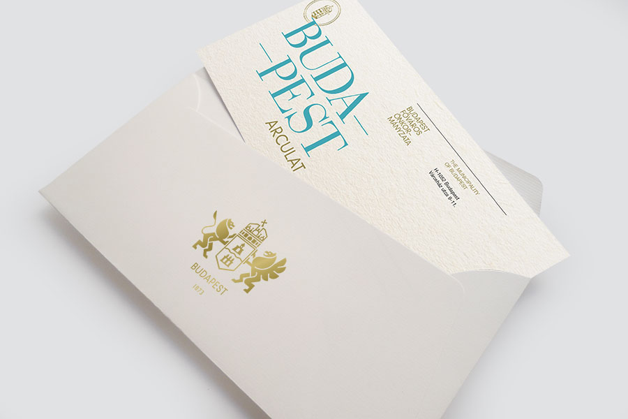
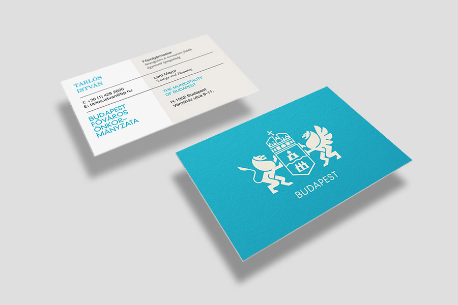
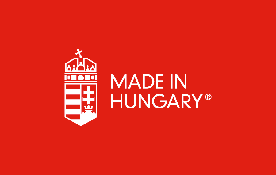
With the reshaped coat of arms I also managed to form a common visual language for the state administration and the national organizations. The examples seen here are a subjective selection, the identity can be used by many more of course. This is only the beginning phase, a first step in the process, hopefully even in an international level.
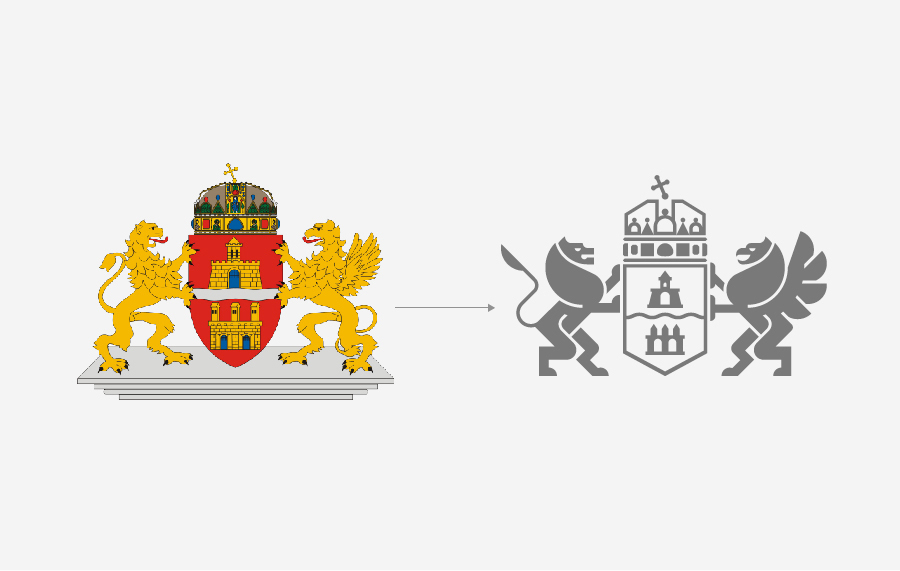
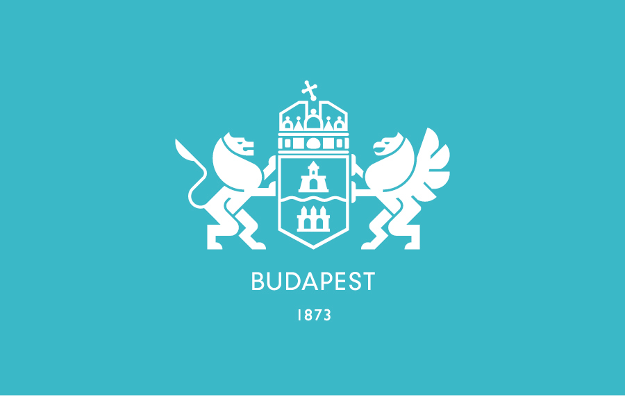
I also used the main principles of the project on another example, the coat of arms of the capital Budapest.
---
“When Simon Anholt began promoting the idea of ‘nation branding’ in the 1990ies, it took not so long for him to recognize that the concept if valid and effectual not only for tourists and foreign businessmen, but for every single citizen who meet with national symbols and visual identity daily. A main channel of this communication is the visual identity of the governmental bodies, even if this fact if usually disregarded. The good example of Germany, a strong and standardized branding of the German State Ministries, was followed by many European states from Spain to the Czech Republic. Miklós Kiss manages to customize this special formula of success for Hungary, by transforming the traditional coat of arms. The result is tempting: the imago of an effective, design-conscious state. A first step, Miklós says. I’d like to see the next ones.”
(Dániel Kovács art historian, journalist)
“As a community we could make two great mistakes: forcedly trying to “re-invent” ourselves with losing sense of common traditions, or don’t think about innovating at all. As Hungarians, most of the time we do one or the other, giving no chance for stylish renascence. After seeing great examples from New Zealand rugby or the Dutch royal dynasty, it’s finally time to think about our own symbols with dynamism and humility at the same time. Miklós Kiss is surely a right man to start the conversation.”
(Gergely Böszörményi-Nagy, Design Terminal, Strategy Director)


Join me on facebook ------› www.facebook.com/kissmiklosdotcom
...if you get a chance.
—
Thank you very much!
...if you get a chance.
—
Thank you very much!


