HealthEd CORPORATE IDENTITY
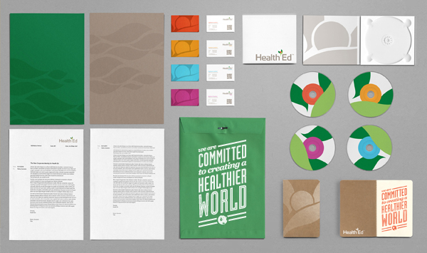
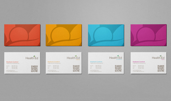
HealthEd is an international advertisement agency that specializes in applying patient education into marketing materials for pharmaceutical and health industries. Toward the end of 2010 the company began to move away from advertising to focus more on creating its own innovative products and applications aimed to educate and empower patients. With this fresh, new business approach, HealthEd decided they needed a refresh in identity and branding as well.
There were many considerations when approaching this re-brand. HealthEd was to remain in business with many of their advertisement clients so I wanted the new branding to have some reminders of the old branding, which had a substantial amount of equity. At the same time the company was moving into a digital environment and would be exposed to the consumer first-hand. Because of this I wanted the new branding to feel friendly and approachable.
CLIENT: Health Ed
ILLUSTRATION: Michael Molloy
ART DIRECTION & DESIGN: Michael Molloy
2011


Old logo; Designed by the current CEO nearly 20 years prior to this assignment.

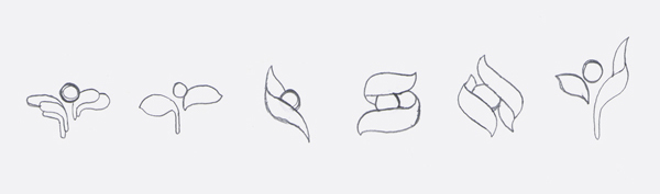

(Top) Logo inspiration. The old sprout conjured up imagery of a dancer and obviously, a plant, so I decided to research those forms; (Middle) Sampling of early sketches; (Bottom) Most prominent influences. When morphing the old sprout I wanted to retain its friendly, dancer quality, while adding a little more fluidity and grace. I also wanted to add a sense of warmth and compassion by making the sprout hold or embrace the "ball". This called for a larger dot, which was very useful when designing the division logos.