
Function, Restraint & Subversion in Typography
This is my 3rd book and my first attempt at long-form writing.
Publisher: Princeton Architectural Press, 2011

Matte black cover with a black foil-stamp.

A rigid sense of structure, typography, and color is used throughout the book.
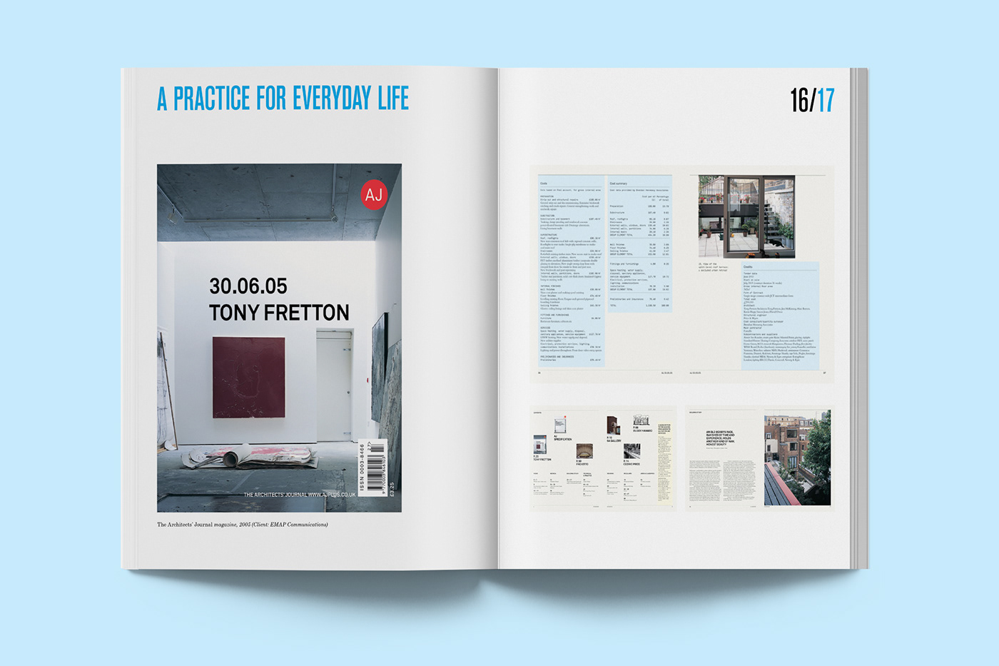
Berthold Akzidenz Grotesk Bold set all-caps for running headers and pagination, and Century Schoolbook Roman and Italic for text.
There are no graphic elements in the book that aren’t a direct expression of content. Each page contains only images of each designer’s work and typography.


Interviews with champions of the new typography are entirely image-less and printed reversed out of black and build a sense of drama into the book’s structure.


Posters occasionally cover up the page-numbering on the right-hand pages to aid pacing and visual rhythm.


