Settled in the centre of Rome, Frizzo is a new restaurant which offers a particular culinary experience mixing the best dishes from all around the world.
The name Frizzo come from the word “frizzare”, something real close to the verb “to sparkle”. It immediately gives a sense of joy, since we didn’t want it to appear too snobbish. The font used for the logo is Geogrotesque Stencil, designed by Eduardo Manso. Clearly inspired to industrial design, it offers a range of 7 weights to work well in small and larger size without affecting the reading.
We choose to create this kind of identity to bring out the multiethnicity and adaptability of the restaurant which is capable to periodically reinvent its menu. The graphic style is a mix between Art Deco and Industrial Design, with a contemporary touch and different textures and shapes to give a sense of refined dynamism.
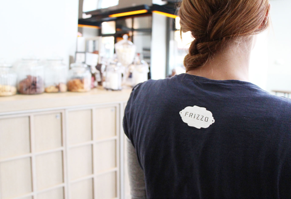
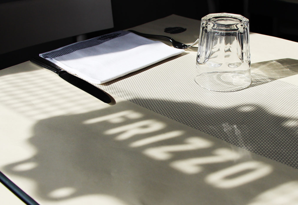
The logo appears on every pieces of communication such as clothes, menu, tablecloths and tablewares. On some of them we developed a verbal communication that, just like the name of the restaurant, is very ironic and informal.
_
Credits: Humus Design http://www.humusdesign.com/
_
Credits: Humus Design http://www.humusdesign.com/