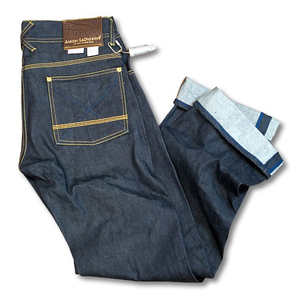
Creative direction by Boy Bastiaens in a wide range of designs for Atelier LaDurance the small French independent label, founded by Gerard Backx, that combines a high level denim collection with a modest and down to earth presence.

The promotional Japanese Denim packaging is used as a site specific medium and developed for the retail environment. Its design is associative by means of an elegant simplicity that shows product and packaging, becoming one object.

The repairkit is an emergency capsule that has been put together to an autonomous design with only ‘off-the-shelf’ metal components. Containing a thimble, 2 original 2-color brass buttons and a piece of lining and a piece denim cloth.
Manually assembled, one by one and attached to all Atelier LaDurance denim products with a keyring, the repairkit became known as the brand's mayor identifier, as quick as lightning.

Limited Edition series of 25 pieces only for the famous Parisian concept store Colette. Signed, numbered with certificate and packed in a silver colored box with a king-size black and white image of the repairkit.

The leather belt packaging is a sheet of 300 grams white m.c. board, folded around the belt and attached with two brass splitpens. Easy to open and easy to close. With just one single print run for the logo and size chart (marked with ballpoint pen).

Wrapping paper with a repeating pattern of 20 big images of different Atelier LaDurance branding items. The printing of the 22 grams sulphite paper was a delicate job, in keeping the repeating pattern crisp while avoiding the ultra thin paper from absorbing too much ink and getting too stiff.

The salesman’s case is a wooden merchandising display. Featuring four transparent glass jars filled with cotton balls, indigo powder, plain and dyed cotton blends; the raw materials for denim fabrication. Being the first out of a series Atelier LaDurance shop decorations that illustrate the brand’s product expertise in a narrative way.


The Kiddies display is another wooden Atelier LaDurance merchandising display. A little twist can literally achieve a maximum visual impact and works like a magnet for curiosity. The unusual position of the little wooden flat mannequin was also used as image for press purposes.

The choice of material for the polo packaging is a very inexpensive loose woven cotton cloth. Known as cheesecloth which was originally used as a wrapping for pressed cheese. The white plastisol silkscreen print with the Fleur de Lys design and Vichy check pattern gives the envelope style bag its distinctive look, 2007

The washboard is another example out of the series crafted wooden Atelier LaDurance shop decorations, that illustrate the brand’s product expertise and its preference for unwashed Japanese Denim fabrics in a narrative way.

Crystal clear Atelier LaDurance single page advertisement for Dazed and Confused magazine. Stripped to the bone while recording the rich texturing of fabrics and construction particulars.

Garment branding. Dark brown grained leather patch with size & quality rizers. Perforated offwhite leather patch with size & quality rizers. Japanese Denim quality tags. Rivet. Laurel leaf brass buttons. Feur-de-lys icon. Pocket tab and woven inside labels. Blue and Red Vichy check pocket lining indicating a female or a male fit.
AWARDS
Dieline Award 2010, 1st place winner Promotional Japanese Packaging
Dutch Design Award 2009, best packaging Promotional Japanese Packaging
Sportswear International Fashion Award 2005 ‘best mens denim collection’ Commended for excellence in design, brand strength, vision and saleability.
Dieline Award 2010, 1st place winner Promotional Japanese Packaging
Dutch Design Award 2009, best packaging Promotional Japanese Packaging
Sportswear International Fashion Award 2005 ‘best mens denim collection’ Commended for excellence in design, brand strength, vision and saleability.


