A selection of two- and three dimensional graphic elements, designed by Boy Bastiaens for K, the label of Karl Lagerfeld between 2006 and 2009. Developed with close attention to detail and innovative usage of material.
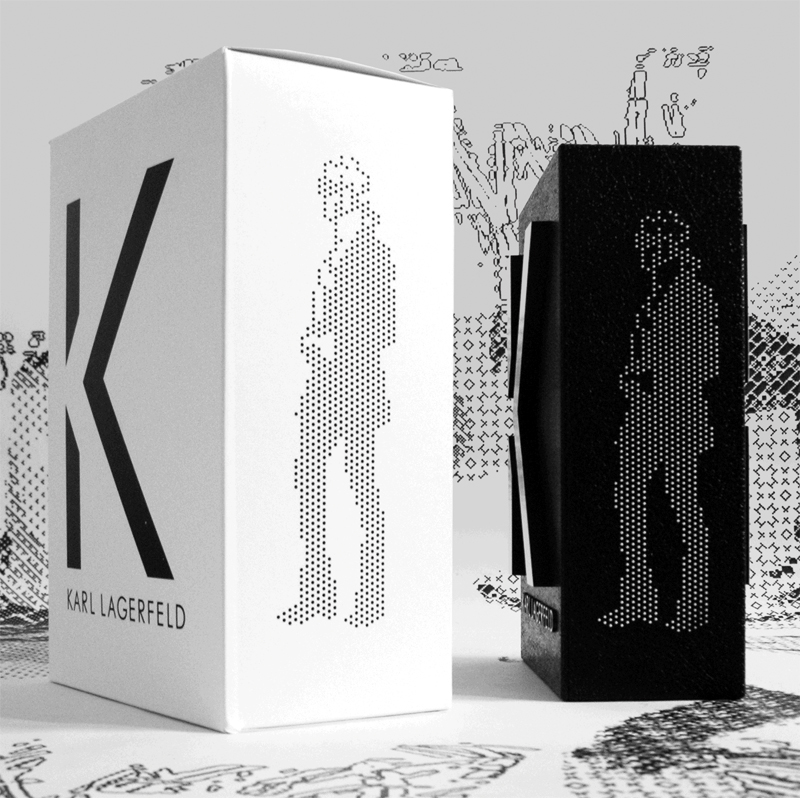

Featuring the pixeled portrait pictogramof the fashion designer and its application as a sublogo on the injection moulded polyurethane in-store sign & packaging.


The 'K' shape accessories table that makes an imaginative use of black stained massive oak, aluminium and crystal glass.

While asymmetry, form simplicity and elementary construction details give the object its distinguishing characteristics. Produced in a edition of 107 pieces. Developed to use also, without glass top, as a spatial logo signage.

T-shirt prints and proposals that use the 'K' logo as key element and run the gamut from minimalist to witty.

Designed for the garment that ever since the 70's has flourished as a personal expression medium.

Allowing people to flaunt their taste for for rock bands, pop culture items or favorite designer brands.

The design of the Victorian style silk scarf print was also applicated as t-shirt print and used as ornament for a metal belt buckle.

The 'limited edition packaging' featured a black bookbinders linen slipcase with a magnetic asymmetric envelop lid that uses the K logo as an inventive closing mechanism. And a squares based Karl Lagerfeld portrait silkscreened on two different height levels. ( prototype / not executed).


