Arché Travel — The Essence of Mediterraneo
Italian Creative Travel Agency, that specializes in Mediterranean countries
Italian Creative Travel Agency, that specializes in Mediterranean countries
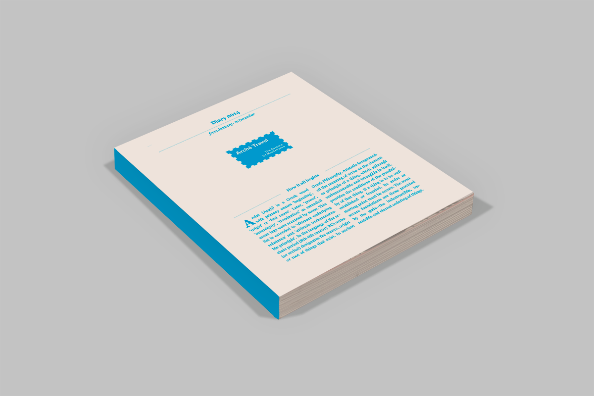
Arché (Ancient Greek: ἀρχή) is a Greek word with primary senses 'beginning', 'origin' or 'first cause'.
—
The main feature of the Agency is the alternative choices that offer to its travelers, such as activities that deal with the knowledge and the understanding of the specific visited aerea. These activities include sports, depending on the country, culture and tradition such as guiding tours of museums and archeological places but also culinary quest. The schedule of the individual traveler is also developed on his likes and dislikes, the age and the preferences, and there is the basic idea that not all the travelers can be copied with the same way, like it happens with massive groups. The thing that makes Arché Travel different from its competitors is that the services are not simply touristic but it gives much of importance to the local habits and traditions, so the traveler could meet and absorb these new essences like he's part of the local community.
Logotype Concept
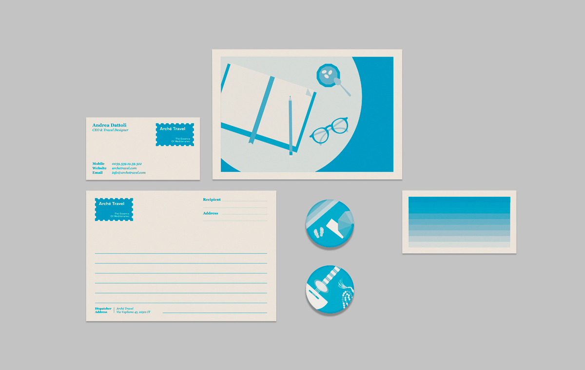
Having a name like Arché Travel and as a secondary identifier The Essence of Meditteraneo, we tried to clearly link these two values, specifically the value of the beginning (of the journey) and the sense (essense) that the traveller conveys from one place to another. A common way to transfer the essence / experience of a trip from the traveler himself is when he communicates his experience being at the exact same time that he is living it. This is done either through image or through text, or the combination of both. The most traditional way, known and recognizable to everyone, regardless of age, is sending a card-postale, a letter or a package. So officially, sending them oversealed, requires a stamp which always reflects the characteristics and the name of the country from which they originate. The stamp is classic, timeless, known to everyone, involves emotion and of course the notion of travel.
Identity Concept
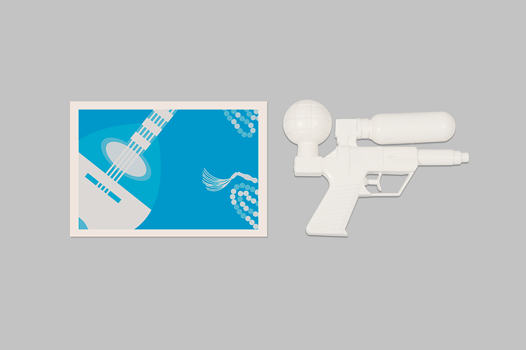
A stamp always illustrates the region, country of origin, but also certain values. Some extra graphics have been created in order to strengthen the concept of the logo. These graphics aim to summarize the basic values and the Essence of Mediterraneo focused on Greece, which is the primary place for the Agency. They are designed in such a way as to have visualization perspectives of different places / different values. We chose to design the additional graphics like snapshots within the framework of the stamp, which happens anyway with stamps. The perspective is like viewing snapshots, with a strong element of abstraction and geometry in combination with the special cropping. In summary, we have tried to gather the most clichéd values / habits but to portray them with a special perspective, making these clichés unique. The basic colour is the shades of blue, not the deep one but the more eccentric cyan, which is modern, matching the profile of the Agency and representing the most predominant colour of Mediterranean at the same time.