Ambrosia Milk Packaging
Nectar of the cows
Nectar of the cows
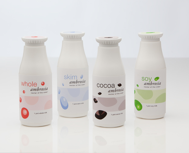
Four varieties of milk were branded and packaged in a retro-inspired fashion, producing a more youthful, modern look for pint-size milk containers.
A subtle color palette from a retro-inspired shapes and design were used in this branding and package scheme. The target audience is younger to middle-aged customers at upscale grocery stores and delis such as whole foods... read on for more details.
PROMO COPY:
Ambrosia – Nectar of the cows.™
In Ancient Greece and Rome, Ambrosia was the word given to only the most delectable food and drink, consumed by the Gods for immortality. Straight from the mythic pastures where only the most divine cows graze, Ambrosia brand products bring you the most heavenly experience; a luxurious nectar for your health and vitality.
Demographic / Key Market / Distribution / Design strategy / Process
My design process borrowed retro inspired shapes and colors combining them to create a new, more modern sleek look with Helvetica Neue in combination with my favorite, the more classic style of Garamond italic. I first made icons and repeated them organically throughout the labels in repetitions of three, and borrowed a more muted shape for the bands. Competitors have more overly designed patterns, which use excessive gradients (Dean’s) and detailed pictures (Kemps). I gave this brand a more youthful look with organic patterns to help signify vitality. I thought Ambrosia would be perfect because it represents a sort of magic liquid that keeps ancient Geek and Roman Gods immortal and powerful. So in essence I combined ideas of the past and put a new spin on it with cleaner colors; which pictorially extends to the imagery on my label. The mixture of old and new fonts and retro inspired patterns, which are cleaner.
I would market these in specialty stores such as whole foods or in high-class delis such as Au Bon Pan or Pret a Manger. Because of the small size, they would be in these shops for single-serving consumption, perhaps near the checkouts as well as in the milk aisle. The demographic is a younger, trendy crowd which is more upscale and swanky; perhaps for young adults or business professionals on their lunch breaks.
I would market these in specialty stores such as whole foods or in high-class delis such as Au Bon Pan or Pret a Manger. Because of the small size, they would be in these shops for single-serving consumption, perhaps near the checkouts as well as in the milk aisle. The demographic is a younger, trendy crowd which is more upscale and swanky; perhaps for young adults or business professionals on their lunch breaks.

These are the identifying icons that serve as the main imagery of the milk bottles and as the color-coded caps. Each showcases a different flavor/variety of milk; soy, cocoa, whole, and skim.
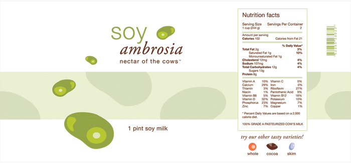
This is the soy ambrosia package; for those who are lactose intolerant. Delectable soy ambrosia, nectar of the cows showcases a soybean with repeated shapes and sizes. The pattern of the bar in the background represents the simplified patterns you would see on a cow.
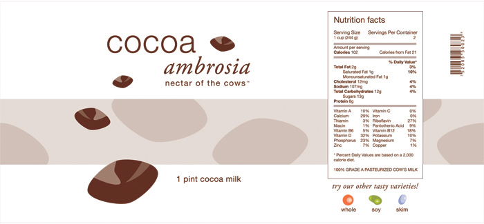
This is the cocoa ambrosia package; for those who love chocolate. Delectable cocoa ambrosia, nectar of the cows showcases a cocoa square with repeated shapes and sizes. The pattern of the bar in the background represents the simplified patterns you would see on a cow.

This is the whole ambrosia package; for those who like their milk as it comes. Delectable whole ambrosia, nectar of the cows showcases a circle (signifying whole or complete) with repeated shapes and sizes. The pattern of the bar in the background represents the simplified patterns you would see on a cow.

This is the skim ambrosia package; for those who like their milk a little lighter. Delectable skim ambrosia, nectar of the cows showcases a skinny oval with repeated shapes and sizes. The pattern of the bar in the background represents the simplified patterns you would see on a cow.