

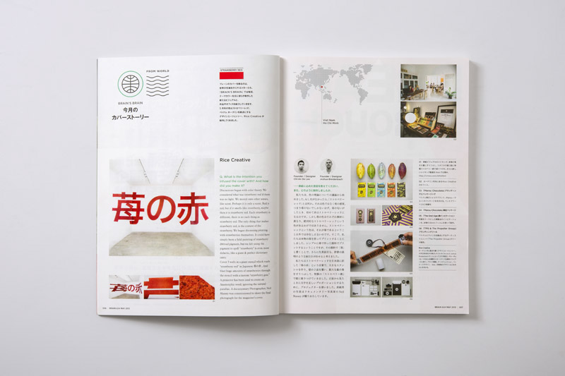


BRAIN magazine is a leading design magazine in Japan. Every issue of BRAIN, artists & designers are given the simple, yet difficult brief to express a single colour for the cover image. BRAIN asked us to create the cover image for the MAY 2013 issue. Our brief / colour was "Strawberry Red".
BACKGROUND
Discussions began with colour theory. What is colour, light, reflection, refraction, etc. We talked matter, molecules. We considered what was strawberry red if there was no light. We considered the sense of smell. Perhaps it is only a scent. Red is red, but if it smells like strawberry, maybe only then it is strawberry red. Maybe the image could be any colour, but smell like strawberries. Scratch & sniff would make it strawberry red. We needed limitations. We decided to show red, & strawberry as our limitation, We kept coming back to the fact that there is no specific strawberry red. Each strawberry is different & has a spectrum of reds on & beneath it's skin. There is no such thing as strawberry red. No pantone, no CMYK, no RGB. The only thing that makes strawberry red, is the context of the strawberry. We began discussing printing with strawberries. The goal became to demonstrate the many of the reds of strawberry red by printing in large scale, with strawberries themselves. It could have simply been a field painting of strawberry derived pigment, but we felt using the pigment to spell the word was even more didactic, like a giant & perfect dictionary entry. The entry could not be reproduced in a dictionary, in traditional print. It had to be created in actual & experienced first hand under a standard type of lighting, close to the lights used for colour calibrating. This would be strawberry red.
Discussions began with colour theory. What is colour, light, reflection, refraction, etc. We talked matter, molecules. We considered what was strawberry red if there was no light. We considered the sense of smell. Perhaps it is only a scent. Red is red, but if it smells like strawberry, maybe only then it is strawberry red. Maybe the image could be any colour, but smell like strawberries. Scratch & sniff would make it strawberry red. We needed limitations. We decided to show red, & strawberry as our limitation, We kept coming back to the fact that there is no specific strawberry red. Each strawberry is different & has a spectrum of reds on & beneath it's skin. There is no such thing as strawberry red. No pantone, no CMYK, no RGB. The only thing that makes strawberry red, is the context of the strawberry. We began discussing printing with strawberries. The goal became to demonstrate the many of the reds of strawberry red by printing in large scale, with strawberries themselves. It could have simply been a field painting of strawberry derived pigment, but we felt using the pigment to spell the word was even more didactic, like a giant & perfect dictionary entry. The entry could not be reproduced in a dictionary, in traditional print. It had to be created in actual & experienced first hand under a standard type of lighting, close to the lights used for colour calibrating. This would be strawberry red.
EXECUTION
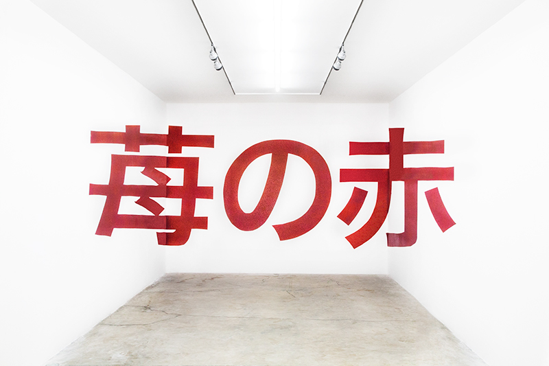
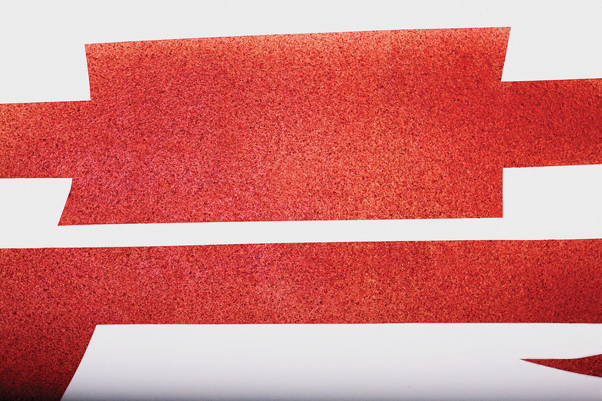
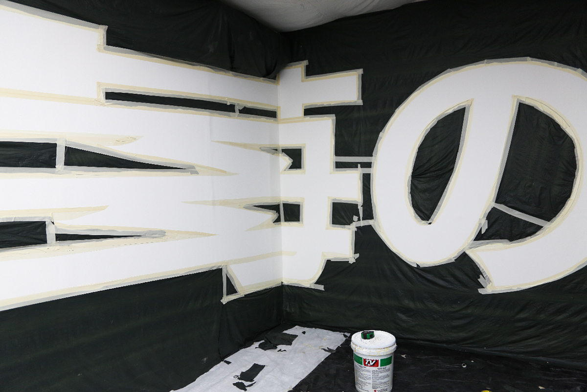
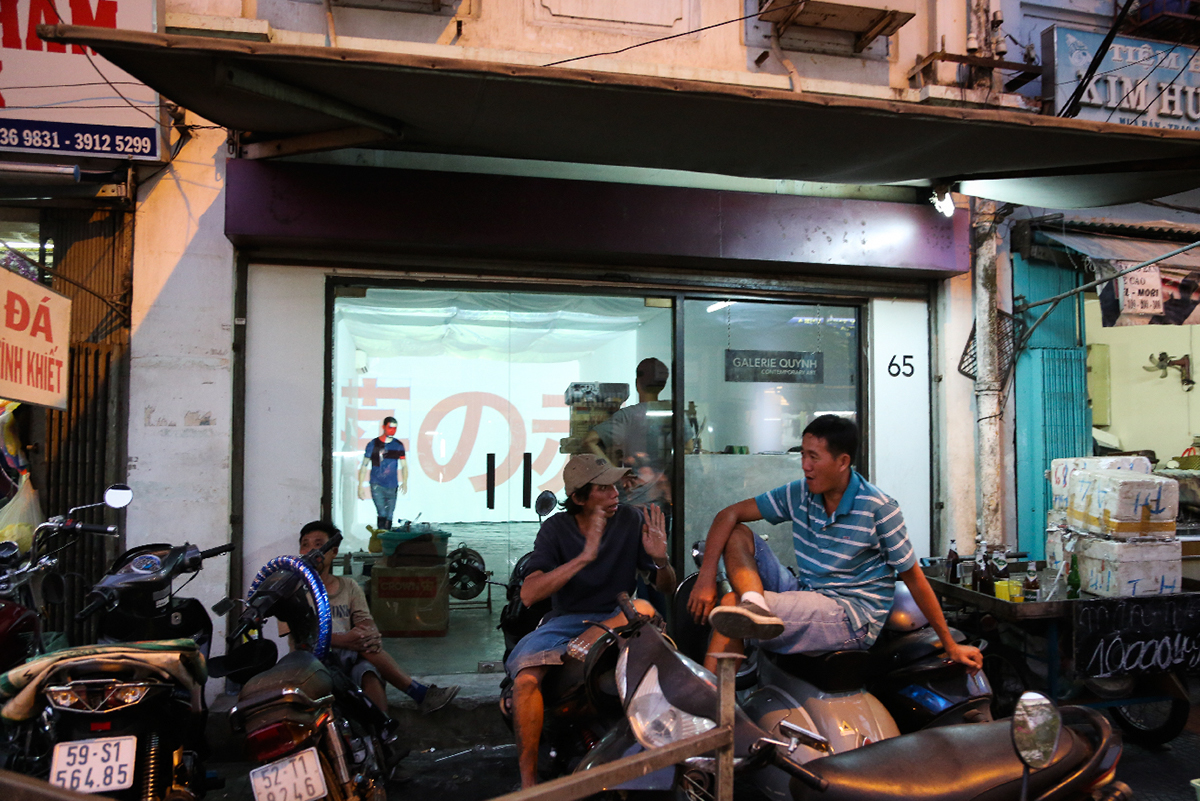
We coverd 3 walls with a giant stencil which read "strawberry red" in Japanese ( 苺の赤,) And blasted huge amounts of strawberry purée through the stencil with a custom air-compressor powered "strawberry gun.” We removed the stencil to reveal the word against stark flat white. This was done at Galerie Quynh, so that the lights could be used to accurately view the result. A projector had been used to project the Anamorphic word, ignoring the natural parallax. Standing back from the composition at one specific vantage point, one could read the word 苺の赤 as large as possible with little distortion. Up close, the word abstracted, and became "strawberry fields" where one experienced a full range of strawberry reds. The strawberry gun, was not frivolous, it served the purpose of distributing large amounts of strawberry pigment over a large surface area in an even fashion over a short amount of time. More surface area of strawberry pigment allowed for more experience of the hues.
This is strawberry red.
Please note, we used 40 kilos of strawberries which were deemed inedible.
Cover shot by Neil Massey
Top 4 images shot by Wing Chan
Film:
Film by Nadege Nguyen
Music by Cale Parks


