Lunartics Communications
Branding & Identity Design
Branding & Identity Design
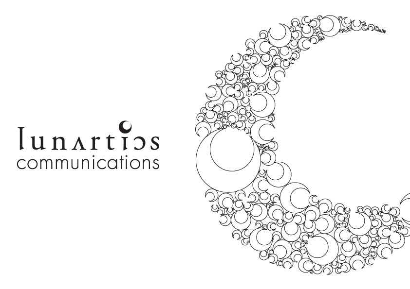
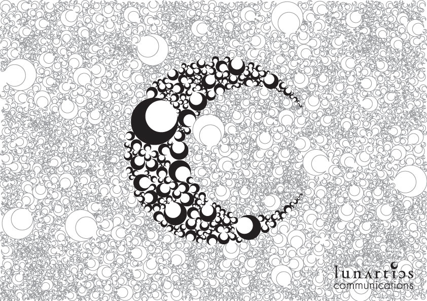
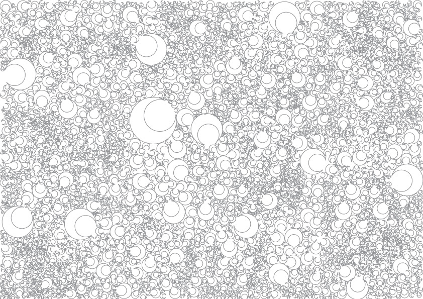
A small Malaysian publication house with an exceptionally interesting team. Their company name is a play of the words ‘Lunar’ and ‘Lunatics’, hence Lunartics. The idea is to create a surreal image yet keeping a creative and professional outlook. We have used the word Lunar to create a unique pattern for their company image.
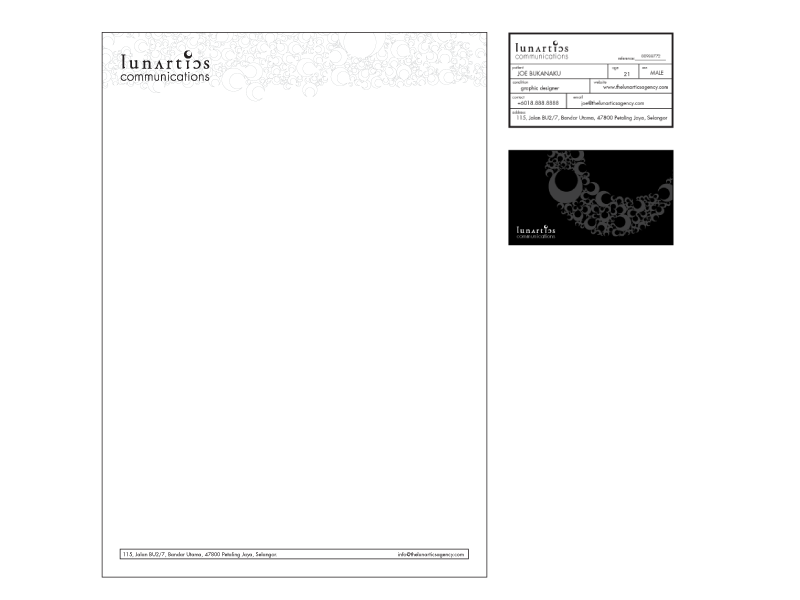
The logo itself is a combination of several inverted and normal characters to keep the surreal image consistent. Stationaries are build based on the pattern created and made to look like hospital/asylum forms.
--
Client: Lunartics Communications
Agency: Leanne Network
Creative: Leanne Network
Art Direction: Andrew Tay