
A Little Houseless Match
Letterpress Poster
For the second assignment in my Letterpress class, I was to design a poster that was at least two colors, utilizing wood type and a carving I was to make out of a linoleum block. I was really excited to finally get into the wood type, but I was also super excited to do linoleum block cutting. I had only ever done it once way back in high school and I had never done it since. Needless to say that going back to something after more then twenty years made me itch to get my hands on the materials.
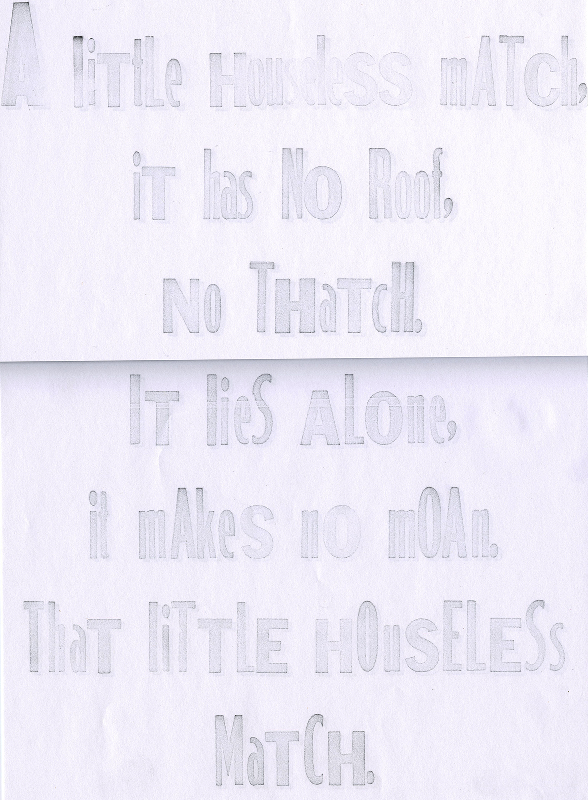
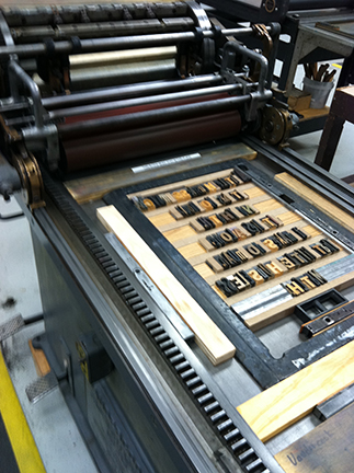
But my first dilemma was I had to design this poster. I had to pick a theme and have an idea. At this time I was deep into binge reading the works of the Mitford sisters. In fact, my reading was so profuse that I was able to create a themed month on my blog dedicated to their writing, ie, Mitford March. When I was re-reading Nancy Mitford's 'The Pursuit of Love,' which is the first in her most famous trilogy, I was struck again about this funny little rhyme she had about a houseless match. The artist in me was going, yes, that would make a fun book nerd poster. So I had my text, a lot of text... in fact I used up quite a lot of the wood type on hand, but luckily I had enough for the full quote.
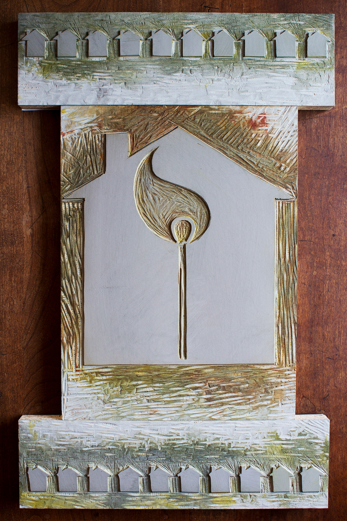
After I had my text and the type pulled, I moved on to the illustrative part of the assignment. I spent much time brainstorming houses and matches and matchboxes. In the end I went with a simpler design for more impact. I had a house that clearly read as house, which with the match on fire was the focal point. The flame was key because without the flame, the match reads more as a stick. Then I took the house and made a border of them top and bottom. I have to say, the carving was fun, aside from when I carved out a chunk in my arm and had to get a tetanus shot. Being a perfectionist, letterpress was teaching me that being a handcraft, you have to allow for the errors and the inadvertent chimney removals in carving. It's something that in it's nature isn't perfect. But it's the differences, it's the mishaps, that make make each poster unique and beautiful.
But my first dilemma was I had to design this poster. I had to pick a theme and have an idea. At this time I was deep into binge reading the works of the Mitford sisters. In fact, my reading was so profuse that I was able to create a themed month on my blog dedicated to their writing, ie, Mitford March. When I was re-reading Nancy Mitford's 'The Pursuit of Love,' which is the first in her most famous trilogy, I was struck again about this funny little rhyme she had about a houseless match. The artist in me was going, yes, that would make a fun book nerd poster. So I had my text, a lot of text... in fact I used up quite a lot of the wood type on hand, but luckily I had enough for the full quote.
After I had my text and the type pulled, I moved on to the illustrative part of the assignment. I spent much time brainstorming houses and matches and matchboxes. In the end I went with a simpler design for more impact. I had a house that clearly read as house, which with the match on fire was the focal point. The flame was key because without the flame, the match reads more as a stick. Then I took the house and made a border of them top and bottom. I have to say, the carving was fun, aside from when I carved out a chunk in my arm and had to get a tetanus shot. Being a perfectionist, letterpress was teaching me that being a handcraft, you have to allow for the errors and the inadvertent chimney removals in carving. It's something that in it's nature isn't perfect. But it's the differences, it's the mishaps, that make make each poster unique and beautiful.

The finished poster.
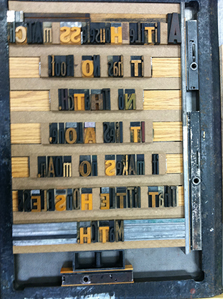
The locked chase. This involved lots of custom spacing but was still so much lighter then metal type.
My proof of the text on the show card to see that the spacing looked good. Yes, I did spend time leading and kerning, because that is an aspect of letterpress that I can control.
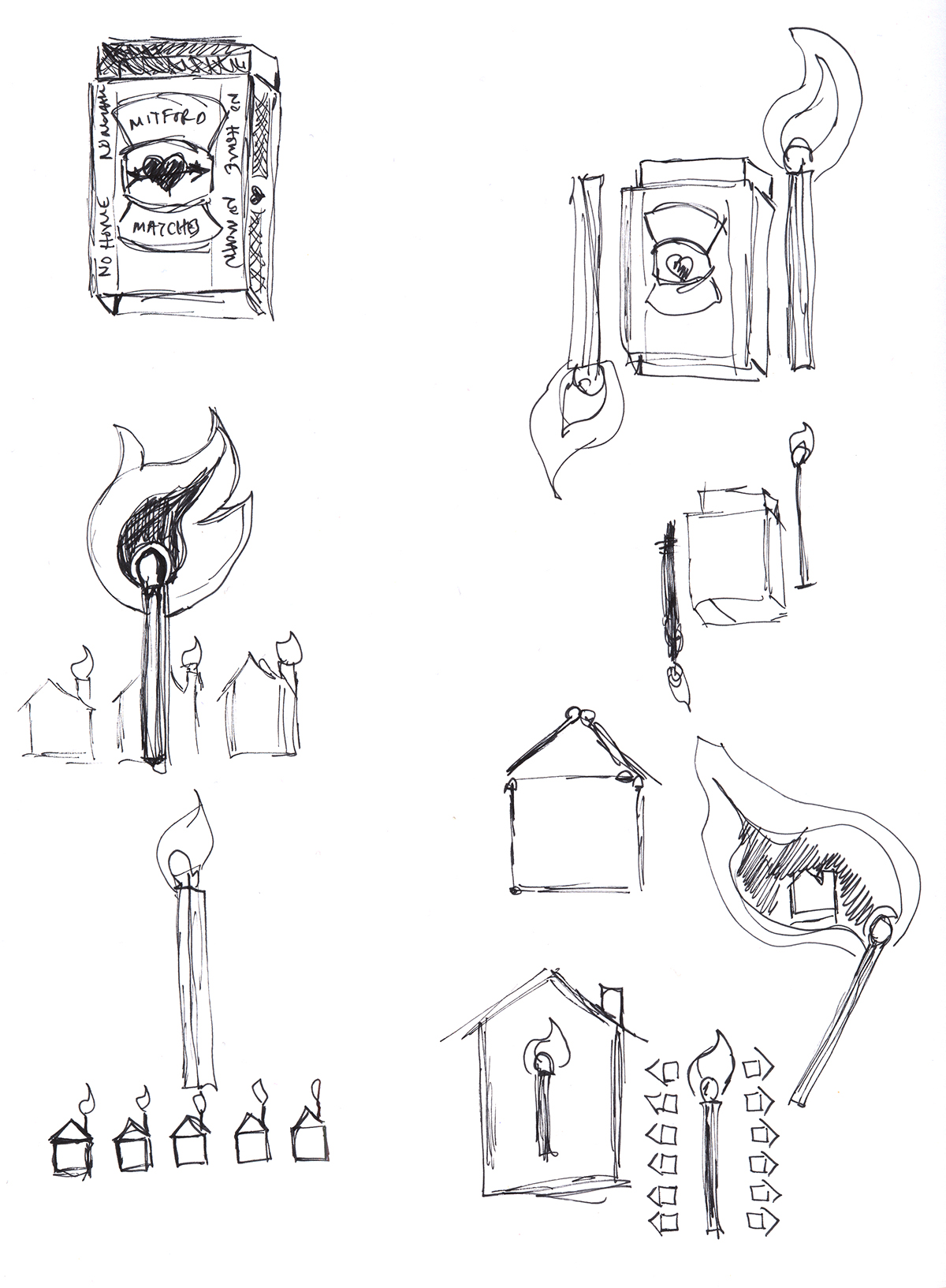
Initial sketches, included a specialty matchbox called 'Mitford Matches.'

More sketch work on the flame coming off the match.
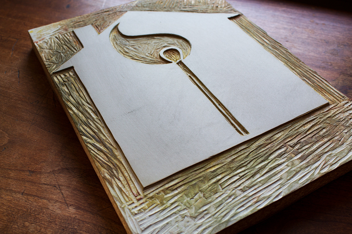
My main carving, the one that took a chunk out of my arm.

The top and bottom houses. I carved them so that the spacing was part of the block.

Top and bottom together.
How the complete carving fit together.
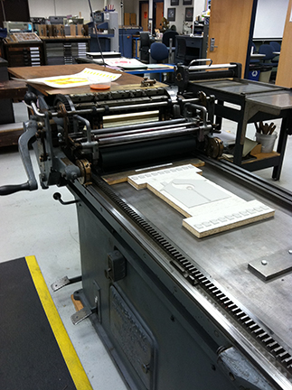
My carvings on the Vandercook getting ready to be locked in place.
Locked down and inked up.

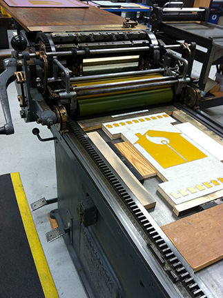
The first color down. I had a hell of a time getting the color. The Pantone colors I mixed looked all wrong, so I went back to my good old days of paint mixing in the theatre and played it by eye. I love how it just glows. It looks like it was done with a split fountain, but it wasn't.

Getting ready for the second color.
Press time!

For fun I tried one of Neenah's Laid paper stock and I was able to get this wonderful texture.

