Ethnographic Research, Poster Design
Professor: Andrea Quam

This series of posters began as an exercise in ethnographic research for which we were asked to learn about a group of people different from ourselves. This meant that instead of only reading books or online articles to learn about these people, we were required to find them and visit, interview, observe and photograph them in person to learn about their habits and beliefs. By doing this, we hoped to gain better insight into their perspective on the world, a perspective that we would not be able to see by reading about them alone. We were required to spend a minimum of 8 hours performing our ethnographic research.
For my project, I chose to learn about library conservators - people who repair and preserve old and damaged books, documents, maps, artifacts, photographs, etc. for libraries. To do this, I spent a lot of time visiting with people who work at the conservation lab at my university's library. After we completed and compiled our research, we were asked to consider what we thought some of the problems that our chosen group encountered in their lives. Two of the biggest issues I noticed were 1. most people do not know what conservators do or why conservation is important, and 2. funding for conservation efforts has fallen in the last several years, meaning many books and artifacts cannot be cared for properly.
After identifying what we perceived to be problems, we were tasked with creating a design solution to alleviate those problems. To that end, I created a series of posters sponsored by a fictional organization, Preserve our Past, to be hung in the library to promote conservation efforts. The statistics on each poster were found in the Heritage Preservation’s Heritage Health Index, which can be found here.
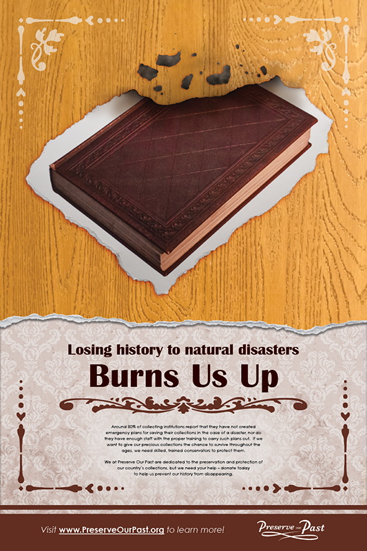
"Losing history to natural disasters Burns Us Up: Around 80% of collecting institutions report that they have not created emergency plans for saving their collections in the case of a disaster, nor do they have enough staff with the proper training to carry such plans out. If we want to give our precious collections the chance to survive throughout the ages, we need skilled, trained conservators to protect them."

"Losing history to environmental damage Dampens our Spirits: Approximately 26% of collecting institutions report that they do not have any systems for protecting their collections from the damaging effects of temperature, humidity, and light. Without proper storage environments, millions of items such as books, rare photographs, historic maps and more are in danger of being lost."

"Losing history to neglect and disrepair Tears Us Apart: According to a recent survey, there are approximately 1.7 billion rare and unique books, periodicals, and scrapbooks being held in U.S. collections. However, around 16% of these items are in danger of being lost without proper care and treatment."


To achieve the look I wanted for my posters, I took a photograph of an old book, printed it out, distressed the photograph, and then photographed the photo for incorporation into the final product. I also had to edit the picture of the book before I printed it to be distressed, as the original book had American iconography on the cover. I wanted a plain-looking book, so I used Photoshop to edit out those parts of the image (The image of the book before editing can be seen on the left, while the image after editing can be seen on the right).

I also took the photographs that were used for the textured background myself, and I did my best to match those textures to the theme of each poster. For example, the background is waterstained for the "dampened" poster, and I used a wood-grain texture for the "burned" poster. The tear that seperates the top and bottom sections of each poster is custom on each one as well, and I also attempted to match the color scheme I used on each poster to the theme of their respective messages.
I also designed the logo for the fictional conservation organization, which can be seen below: