Rebranding a Hypermarket
O'key is a Russian hypermarket chain with over 150 locations across the country. Founded in 2002, it had accumulated a lot of baggage over the years of operations. Brand Manual started with a clear value proposition, setting it apart from competition. Cleaning up the identity, creating a defined set of signage and point-of-sale communication tools were a part of this.
The only thing that remained more or less unchanged was the logo. The process involved on-site discovery, interviews with customers and staff, competition mapping, shop layout review, navigation architecture, prototyping and building a full-scale test shop.

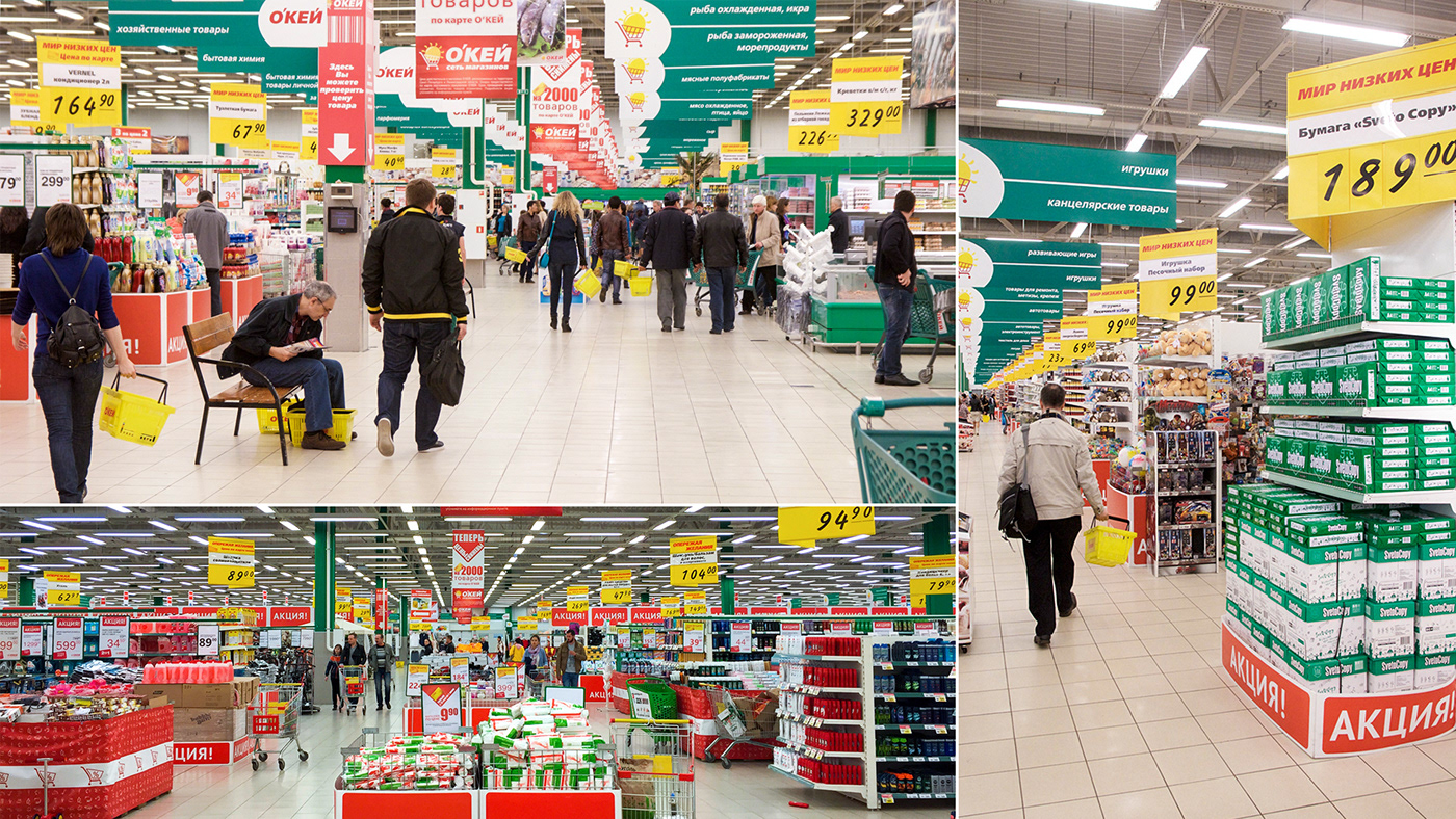
O’key hypermarkets before rebranding

Quick mockup prototypes to test design directions

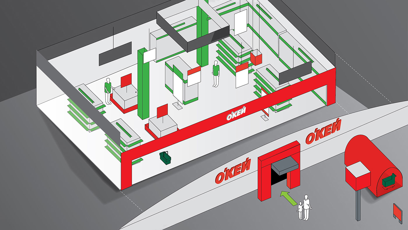
A simple “dollhouse” model to narrow down the distinctive visual set of the brand

The initial set of basic identity elements

Signage mapping of a hypermarket, main visual beacons

First level of navigation – approaching the location, parking signage

Grid system of in-shop navigation

Helping visitors navigate through aisles

Key department design

Overall shop navigation and feel – less is more

Client’s iteration based on the concept / Image courtesy of O’key Hypermarkets

Parking navigation – concept and on-site application

Price and discounts information – visible yet not overwhelming

Visual Identity Book – Tone of Voice and main elements

Visual Identity Book – stationery and photography style guide

Visual Identity Book – graphic elements and signage application rules

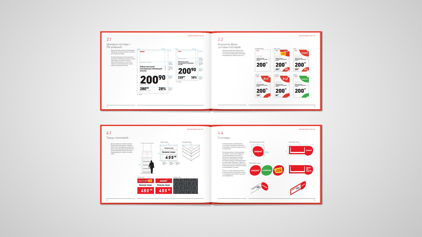
Visual Identity Book – pricing guidelines

Visual Identity Book – other identity applications, from uniforms to vehicles
The result was a 150-page manual, serving as a guide for refurbishing old shops and building new ones. Based on our concept, ALEN Architects developed standardised hypermarket facade designs.


