

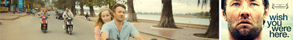


Four friends lose themselves in the fun of a carefree South East Asian holiday. Only three return home. Who amongst them knows what happened on that fateful night when they were dancing under a full moon in Cambodia? Wish You Were Here is a psychological drama starring Joel Edgerton, Teresa Palmer, Felicity Price and Antony Starr.
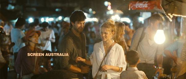
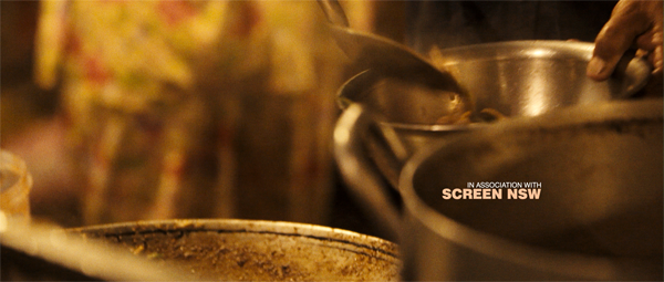
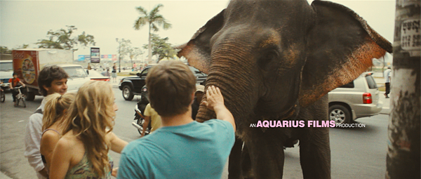
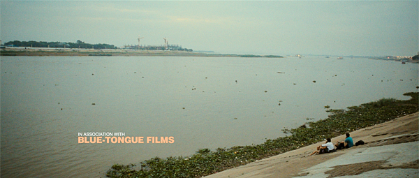
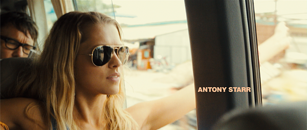
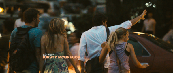
Bluetongue films Director Kieren Darcy-Smith wanted a typographic treatment for opening titles, shown over a 10 minute sequence introducing us to the film’s characters. Working with a set colour palette, we laid out typography, matched colours to scenes, and presented various animation styles and positioning over a very visually busy montage of Thailand.
The result is simple and elegant, sympathetic to the colour tone of the sequence, remaining very easy to read, and yet appearing unobtrusively in this immersive introduction to the film.

Credits:
Director: Kieran Darcy-Smith • Producer: Angie Fielder • Title Design: Substance • Post Production Supervisor: Rebecca Cubitt


