Overview of our rebranding pitch presentation (350 sheets)
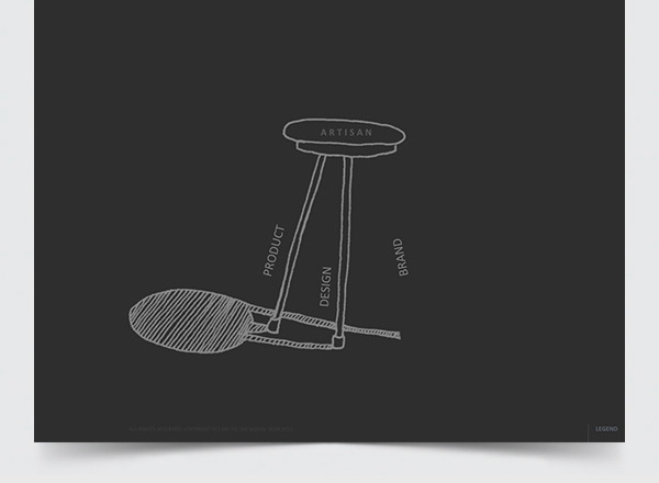
In December 2012 we were offered to pitch for Artisan's rebranding.
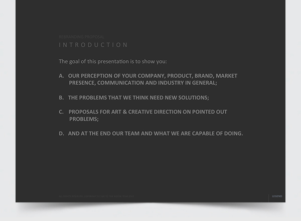
Below is an overview of our presenation (shorter version).
"Artisan is a furniture company from Tesanj, Bosnia & Hercegovina and specializes in the manual production of high quality furniture made from solid wood. They acquired their first experiences by producing furniture for Dutch and British designers, and in 2007 they started their own first collection in collaboration with the regional designers. For their products they received numerous international design awards and they have distributors in more then 20 countries around the world."
- www.artisan.ba -

Starting Notes
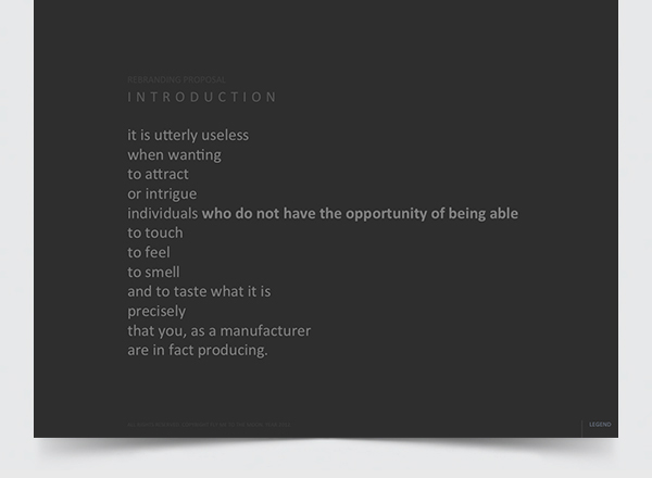

We followed with analysis on Artisan's current brand state through website, print and photography.
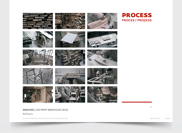
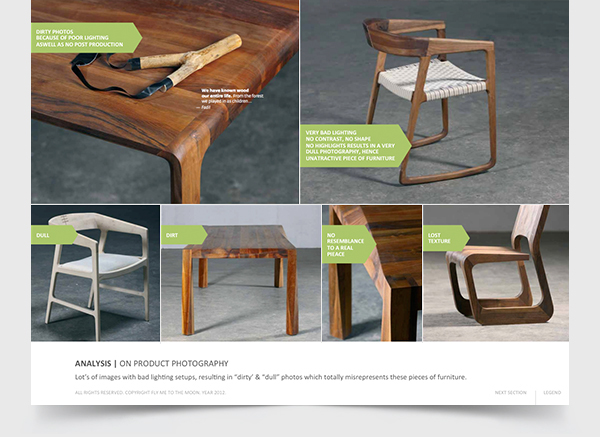
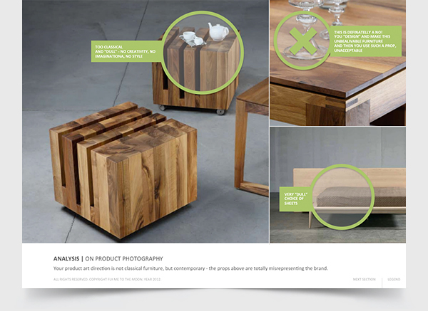
For somebody who is into design, visual esthetics, contemporary furniture, we found this sort of propping unadequate/unharmonious. The same goes for production process photos as well as the notion that they could have picked much more interesting production stages for a story telling then this.


Research
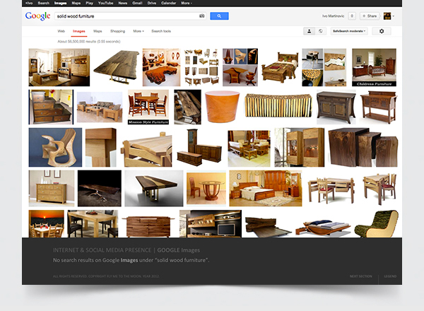
We conduct a detailed research on solid wood & contemporary design furniture industry,
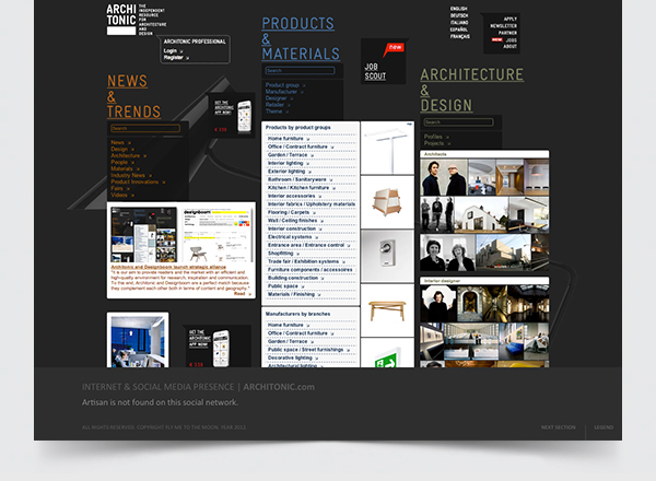
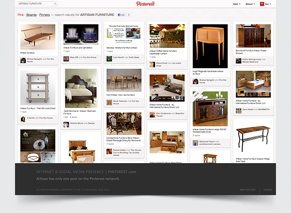
as well as on Artisan's online presence (from google search, to specialised social network Architonic to others
like Facebook, Pinterest, Tumblr etc.).
We analise not only their visual treatmants but also their brand communication.
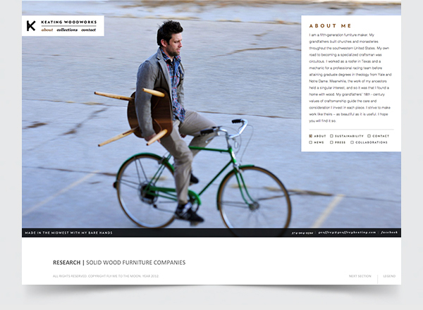
We looked from individual solid wood furniture craftsmen and their presentations...
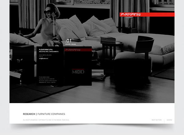
... to the world's most famous furniture companies (Flexform, B&B, Moroso, Driade, Poltronafrau, Herman Miller, Knoll, La Palma, Arper, Edra, Vitra, Giorgetti, Horm and many others...)
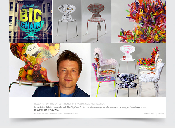
We stumbled upon some great examples of mix marketing activities between brands
(i.e. Fritz Hansen & Jamie Oliver).
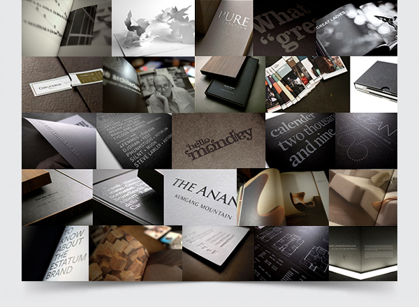
Print material (brochures)
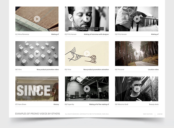
During our research we also payed attention to promo videos and so we presented the most interesting ones through various categories: corporate, making of, teasers, animated, designer interviews and others.
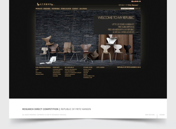
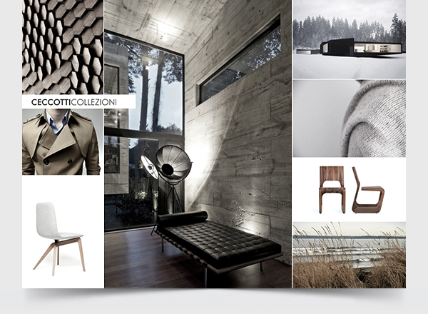
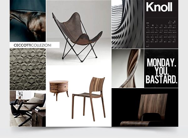
We also present the client with deep analysis of their closest competitors:
Ceccotti, Riva & Zeitraum Mobel.
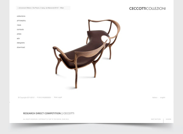
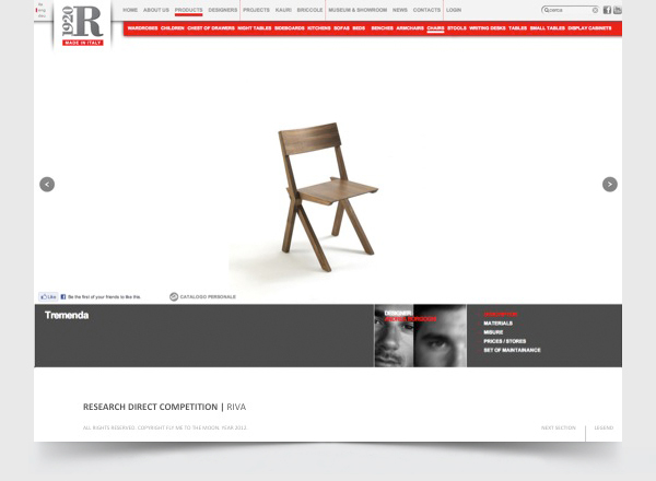
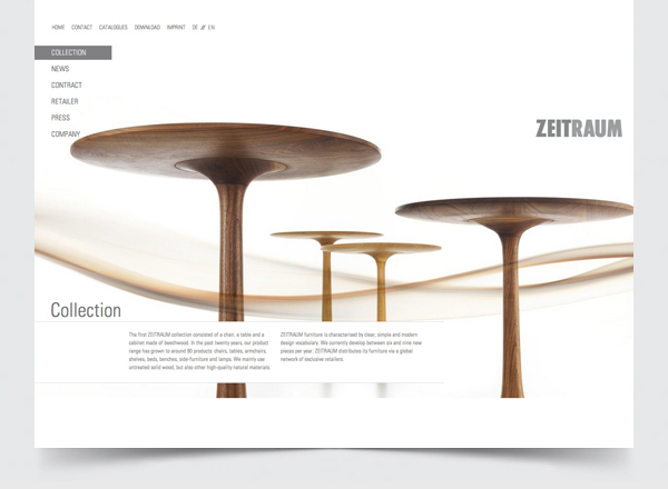
Next to these 3 competitors, we showed an example of furnitire industry most comprehensive brand, Republic of Fritz Hansen ("Apple" of furniture industry).

Research Conclusion
After such a detailed research on direct & indirect competitors, we managed to identify the "gap" and opportunity for the brand identity development. And so, we were able to propose the following directions on rebranding through: photography, website, print, video & product development.


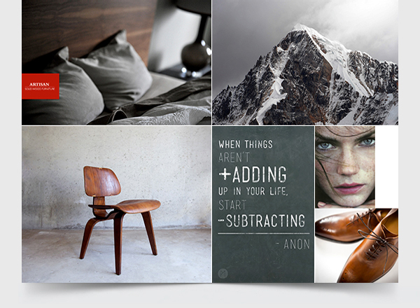
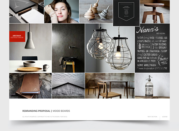
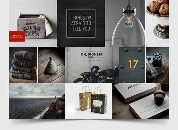
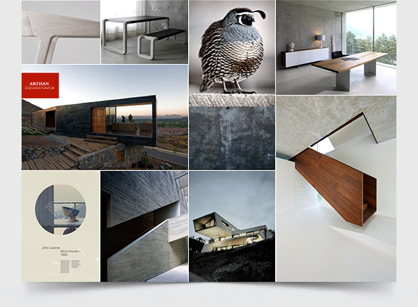
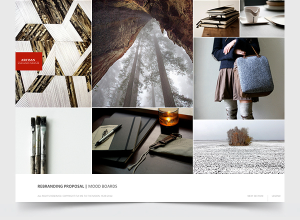
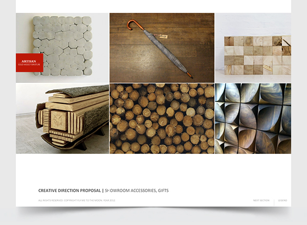
Brand Mood Boards
NOTE: ARTISAN'S PRICES ARE MUCH BELOW COMPETITORS WHICH MAKES THEIR UNIQUE DESIGN VERY AFFORDABLE AND WITH IN THE RANGE OF THE MIDDLE CLASS.
This fact, along with everything concluded from the research had a big impact on proposed art
direction which you are about to see.
So the first thing we did was to identify the color code for the brand.

The following mood boards show a mix of images related to their product, design style, location, lifestyle, props, interior design & architecture, materials, textures, colors...

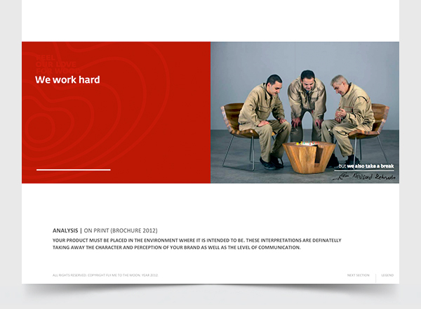
"Wrong aesthetics - wrong perception - wrong communication"
We also talked of the "thin line" in visual communications and how easy & dangerous it can be if you cross it. We placed a great emphasis on this by showing a client how a small change like color desaturation can shift ones product into a whole different category - Ceccotti category - 4 times more expensive furniture.


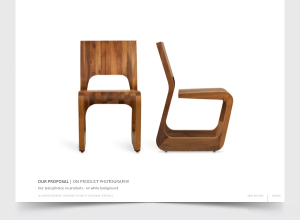
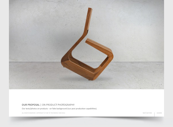
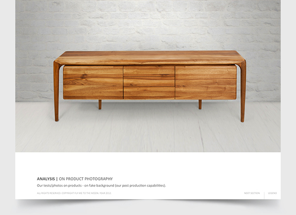
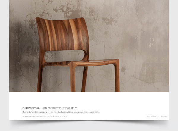
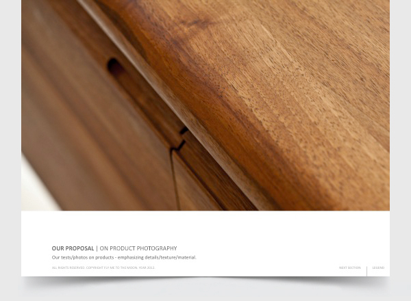
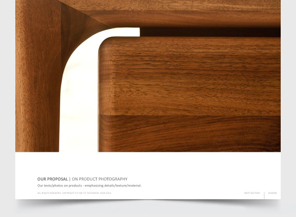
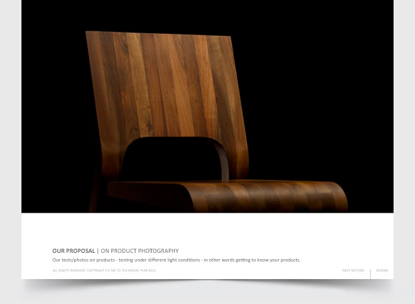
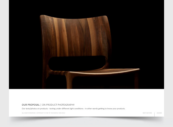
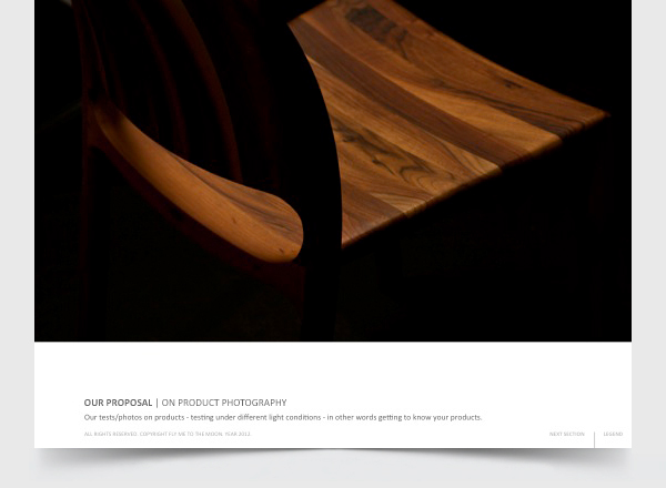
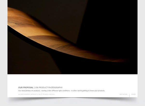
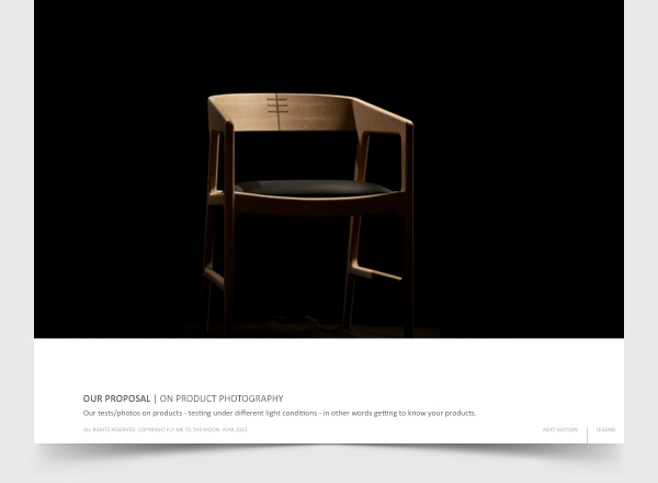
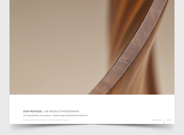
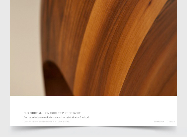
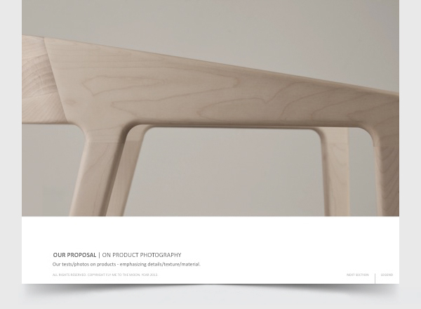
Art direction proposal on photography
In the furniture industry the most important thing is to show how your product interacts with it's enviroment (in the interior), to show if it's aplicable, if it fits, to show it's versatality, it's beauty and functionality. This is why at the very begining we proposed that rebranding as a process begins with photography. Their furniture must be shown on as much different sets as possible, and under different lighting conditions.
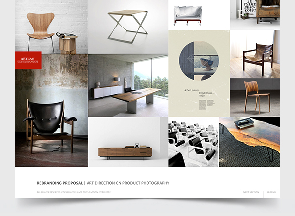
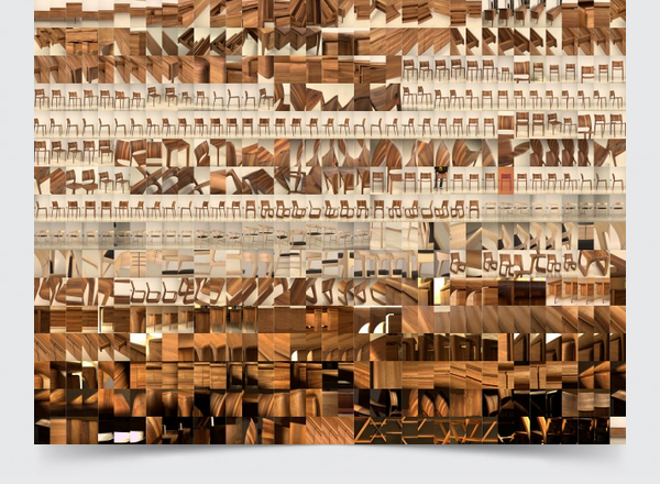
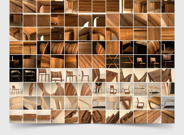
The following photos are all done especially for this pitch, and they represent our cabilities when dealing with subject such as furniture. With limited resources (furniture and locations/sets) we basicly experimented with Artisan's pieces that were available to us.
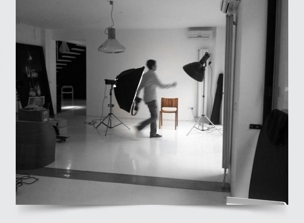


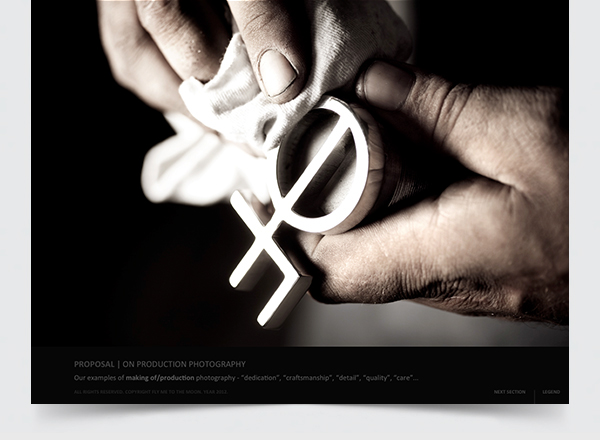
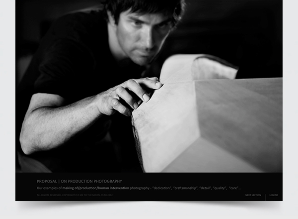
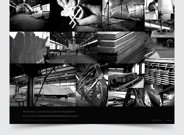
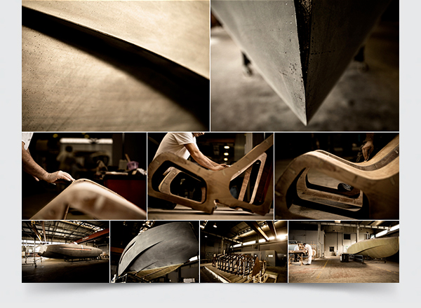
Proposals for "production process" photography
The following are all our photos (excluding the 1st two photos done by Sam Barker) made for our client
"Art of Kinetik", that makes bespoke yachts.

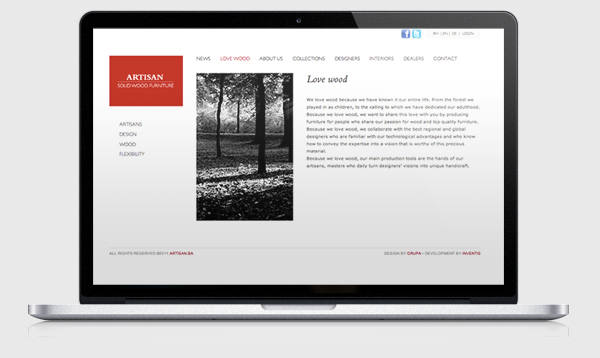
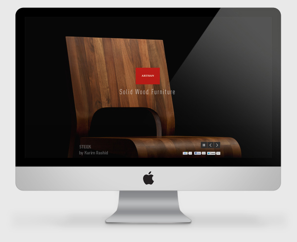
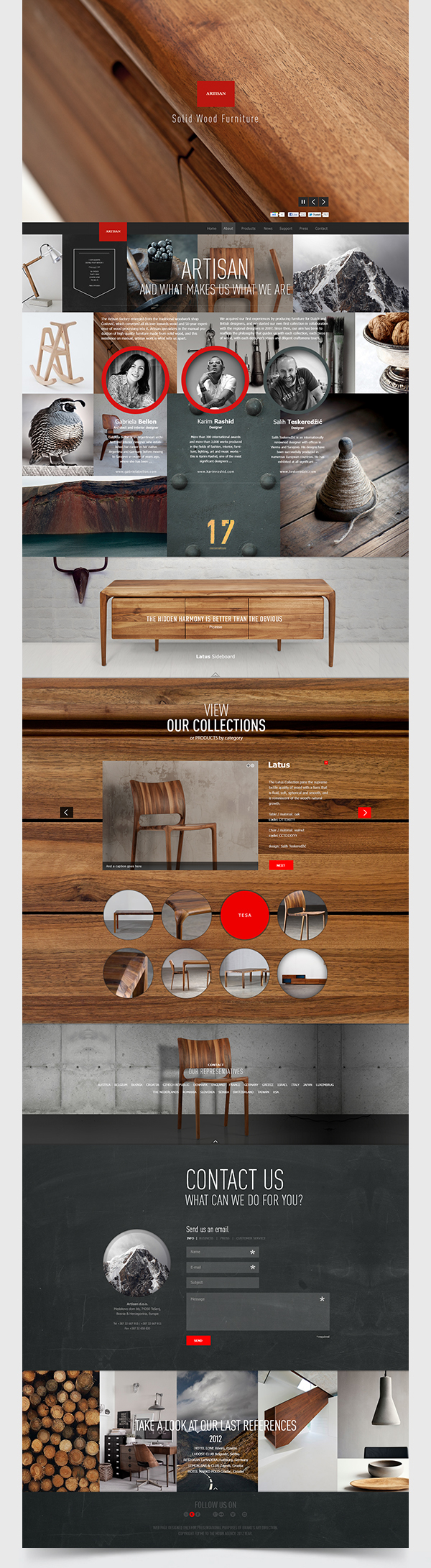
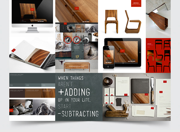
Website design proposal
Our first draft proposal was to go with parallax home page.
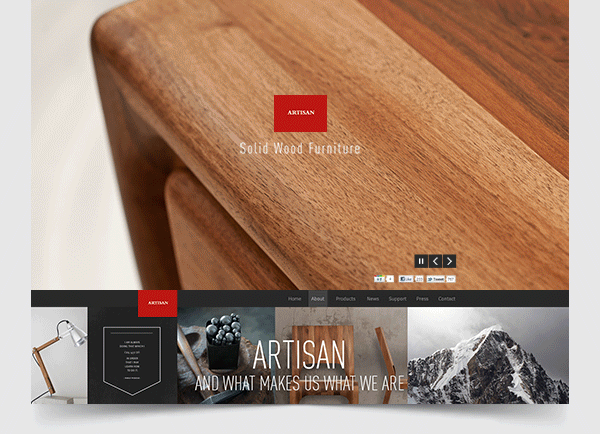

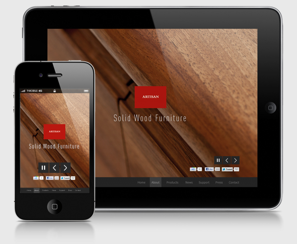
Smartphone & pad website versions
Heaving parallax effect for .com website, meant proposing mobile versions for smartphone and pad's.

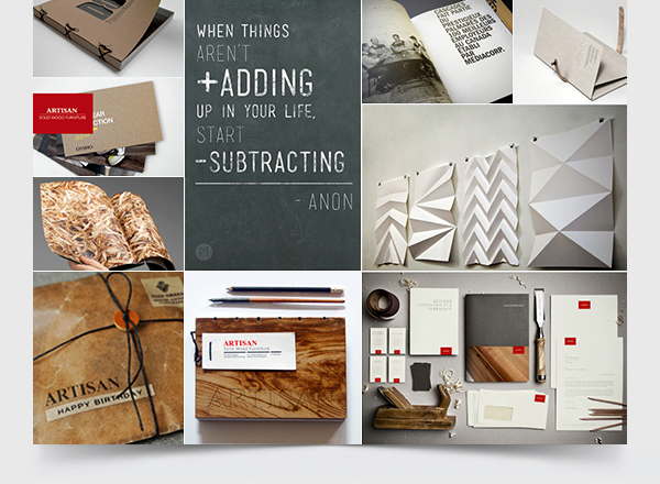
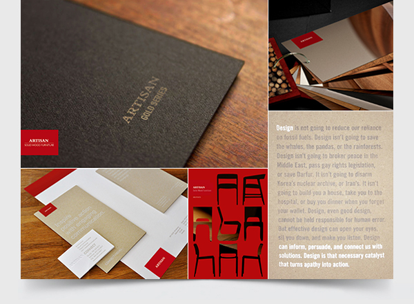
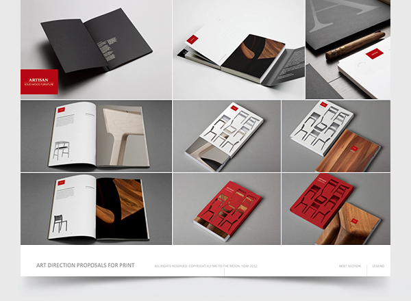
Print Material
We made a lot of mokup sketches for various print materlal based on the reference designs that we found
during our research.
NOTE: We didnt take any rights for designs, as they are not ours, we only used these to propose
1st draft art directions for Artisan future material.

Proposed creative & art direction for videos
Using some of the test footage we made during photoshoot, and videos we presented in research section, we edited few "video sketches" as an art direction proposal in their promo videos.
We proposed to make few corporate movies: about the company, making of, maintanance
and collection's and large number of teaser movies (+15) on various subjects
(chairs, stories by crafstmen, Tesanj - factory location, aclaimed & young designers interviews etc).
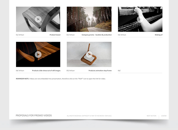
NOTE: Don't forget to turn on HD 720 res when watching the clips.

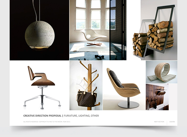
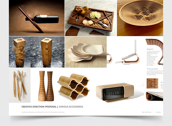
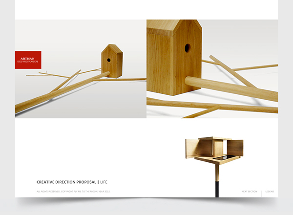
Product development consulting
Heaving M.A. in product design and 3 year of experience in branding furniture industry (2001-2004), we also proposed consulting services in this area for their product development.
The references below are areas in which we belive Artisan can experiment in the years to come. From the revival of the classics furnitre to support of accessories, to experimenting with abstracts for showrooms, to various other "everyday life" objects. Being highly creative in their products so far, all the things we proposed for them fall right into their current philosophy.

THE END
Besides these visual directions of our rebranding strategy, we also proposed in our presentation all the key elements, strategic moves and communication that Artisan needs to take after the launch of its new look.
Unfortunately, we can't show these, as we need to keep them confidential.
Client is still processing the pitch and we are still keeping our fingers crossed and hoping to get this project as we are truly looking forward working on this brand.
Thank you for viewing my project.

Credits:
Art direction & project management by Ivo Martinovic
Research & branding strategy by Nikola Romic & Ivo Martinovic
Presentation copy by Julio Wood
Photography & post production by Ivan Masic
Video editing by Aleksandar Perisic & Ivo Martinovic
Web design by Goran Stankovic & Ivo Marinovic
Video editing by Aleksandar Perisic & Ivo Martinovic
Web design by Goran Stankovic & Ivo Marinovic
Graphic design by Tijan Ninkovic, Goran Stankovic & Aleksandar Perisic
Web test development by Obrad Susa
Web test development by Obrad Susa
- December 2012 -


