


Förena
—
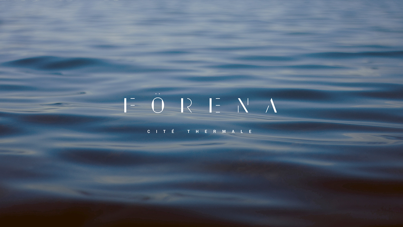
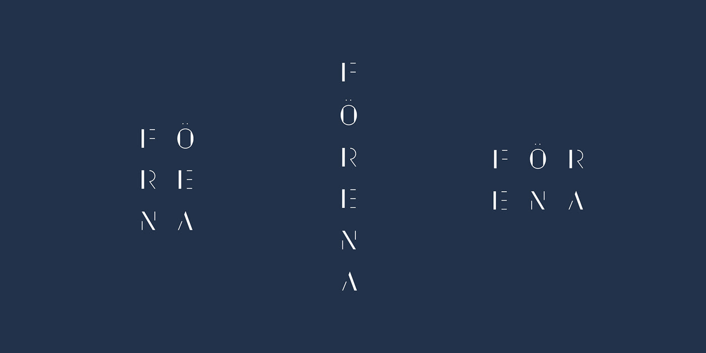
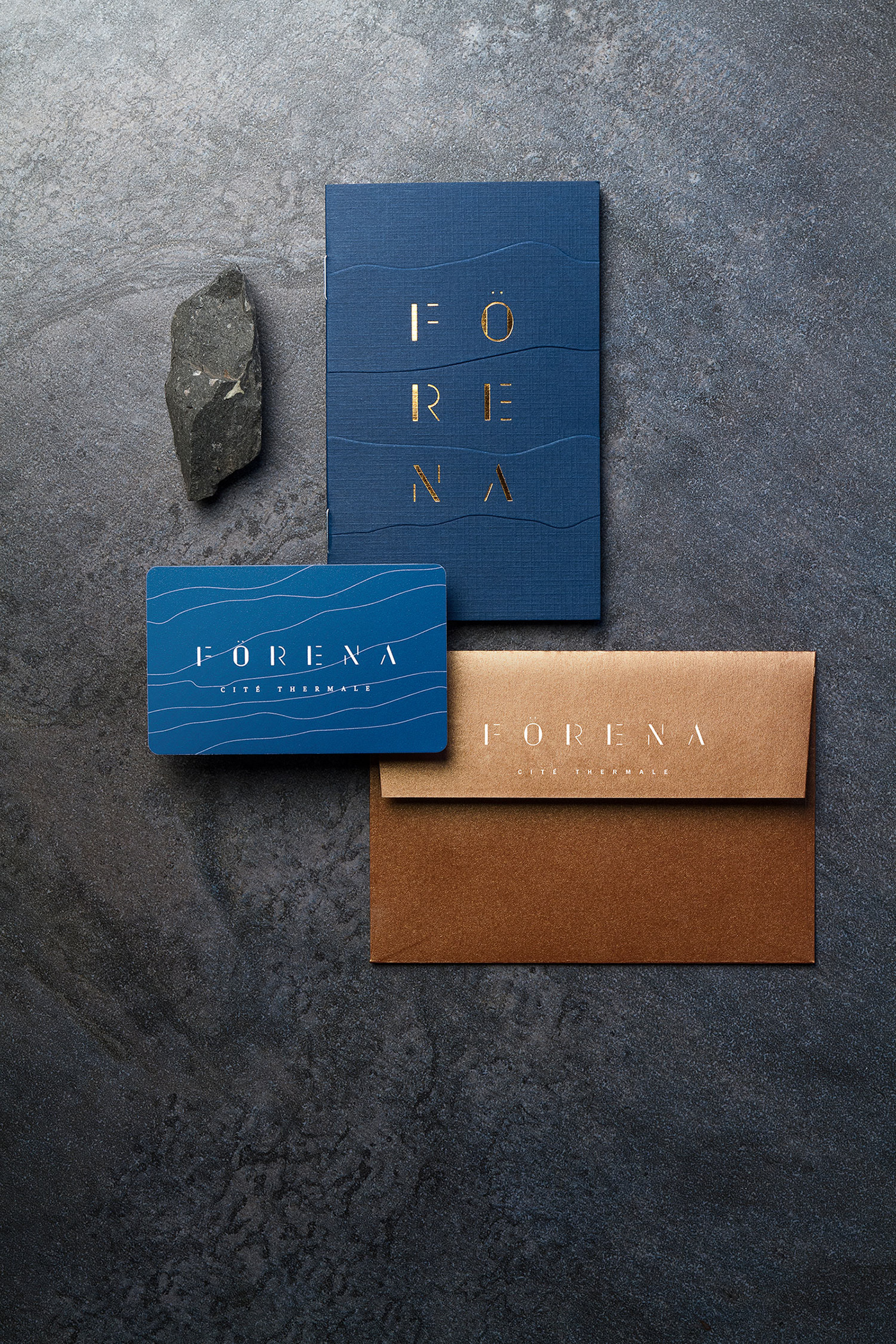
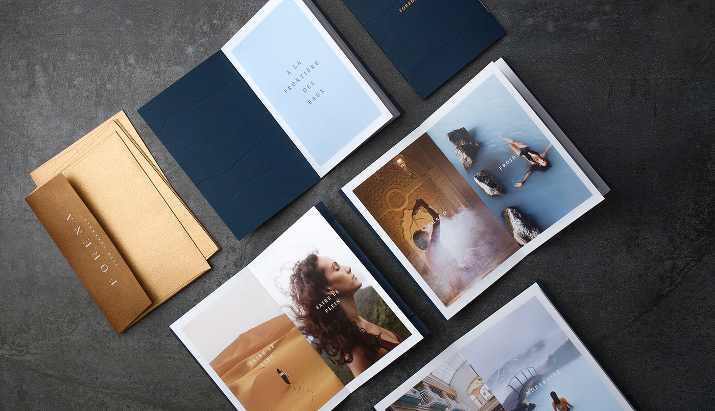
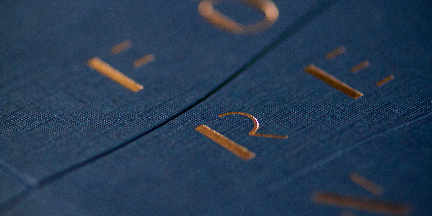
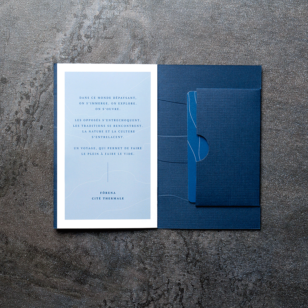
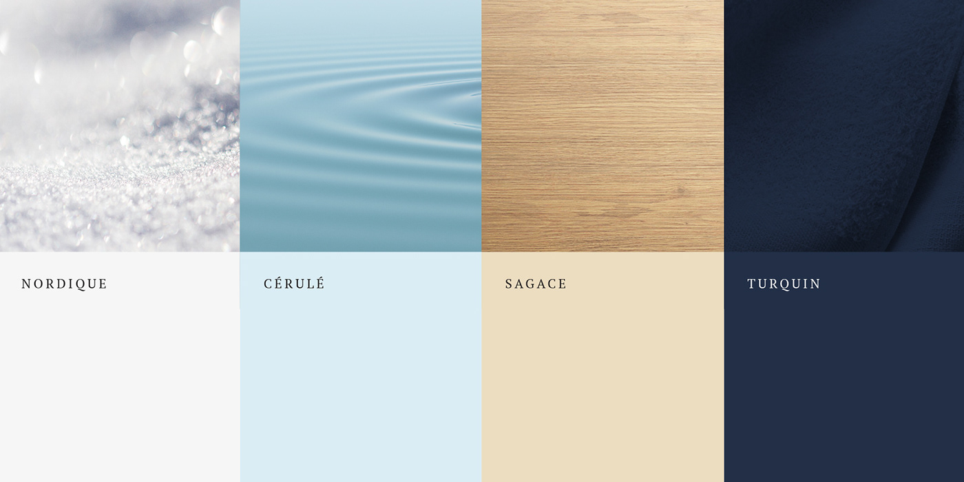
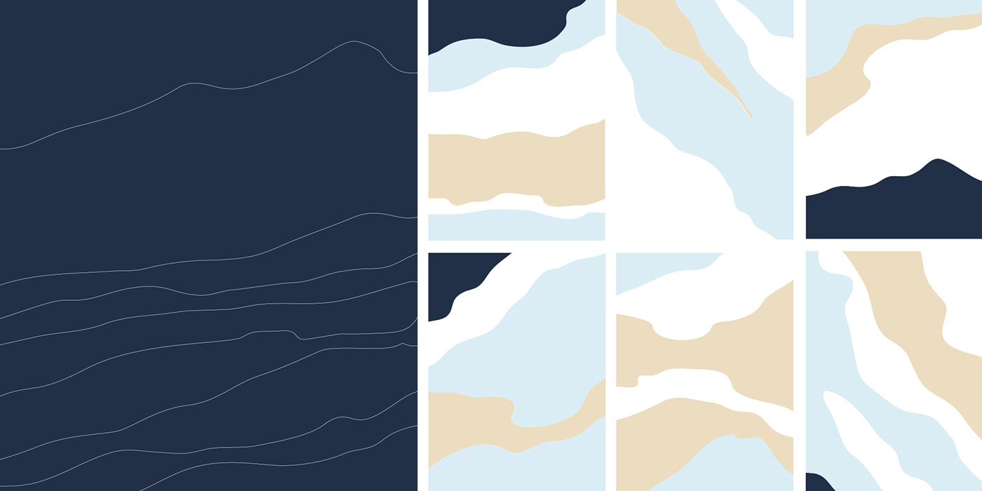
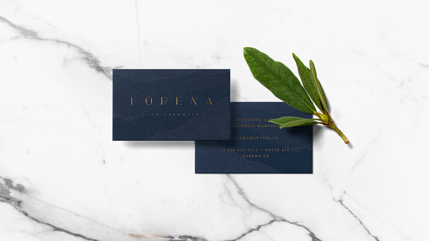
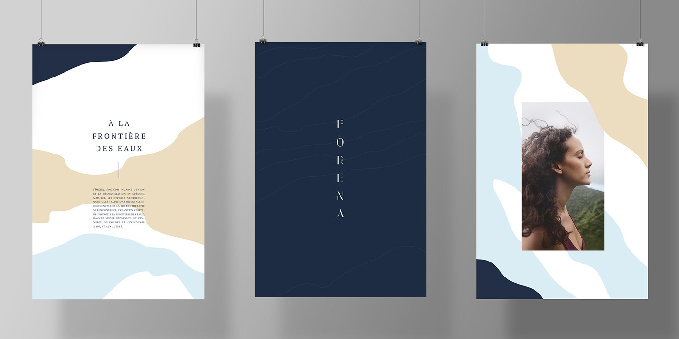
Identity for a brand new type of spa in North America. The visual identity of Förena was designed to support the vision of a great spa city: we have tried to extract all the necessary presence, expressing it in a soft and ethereal tone. The design of the logotype was inspired by the idea of contrasts, inherent in the occupation of the place (hot / cold, emptying / refueling). Thus, each letter explores this contrast through the thickness of its lines, through the full and empty which form the whole. Then, graphic motifs that recall both the rippling water, the steam and the topography of Mont-Saint-Bruno are exploited through a visual system that wants to be elegant and imbued with a certain mystery.
—
Identity for a brand new type of spa in North America. The visual identity of Förena was designed to support the vision of a great spa city: we have tried to extract all the necessary presence, expressing it in a soft and ethereal tone. The design of the logotype was inspired by the idea of contrasts, inherent in the occupation of the place (hot / cold, emptying / refueling). Thus, each letter explores this contrast through the thickness of its lines, through the full and empty which form the whole. Then, graphic motifs that recall both the rippling water, the steam and the topography of Mont-Saint-Bruno are exploited through a visual system that wants to be elegant and imbued with a certain mystery.


Copywriter : Josiane Cossette


