
GoEast! Eastern Design Conference – brand and visual identity
Eastern Design Conference showcases local projects with global impact from design and business viewpoints simultaneously. Definition of ‘East’ is best represented through the optics of geographical and market-related outskirts. Geographically it’s Central and Eastern Europe. With design being a world-wide phenomenon, the market-related outskirts are defined by our local eastern ways of doing business in a post-communist business environment. Eastern was founded to explore and define this relationship and will be taking place on 26–27th October 2018 in Košice.
More detailed description of the concept and initial ideas of the Eastern conference you can read in our Medium post here.

Eastern Design Conference logo. The background circle – actually it's mask – is a symbolic representation of the Sun. Sun=Sunrise=East. Go East! At the bottom versions prepared for different usage in small and extra small enviroment.
Identity
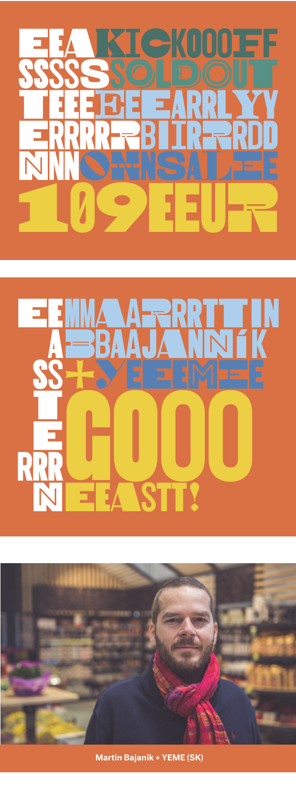
The identity of the conference is made in the spirit of organic and continous design. We believe in continous interlinked design processes where the steps are organically linked and created along casual relationships that are not timed but the actual need when real-life situations provide specific, related solutions to the previous steps of design process. The brand and visual identity was built with 3 main elements: characteristic, east-west typeface, highly specidfic eastern colors and finetuned unique eastern repetition.


Typeface – Woodkit
First component of the identity is award winning typeface called Woodkit (designed and produced by Ondrej Jób), contains 3 families (Solid, Print and Reprint) with 6 six distinct styles covering various alphabet designs, components and miscellaneous ornaments.
“From both aesthetic and functional reasons, the most important feature of Woodkit is that every single glyph fills a square, not just horizontally, but also vertically. This is a reference and an homage to the physicality of the real life wooden blocks. It didn’t only induce some new and unexpected constructional solutions, it also gave the final font broad versatility, mutual interchangeability, many visual treats unavailable in proportional typefaces and most importantly – playfulness.“
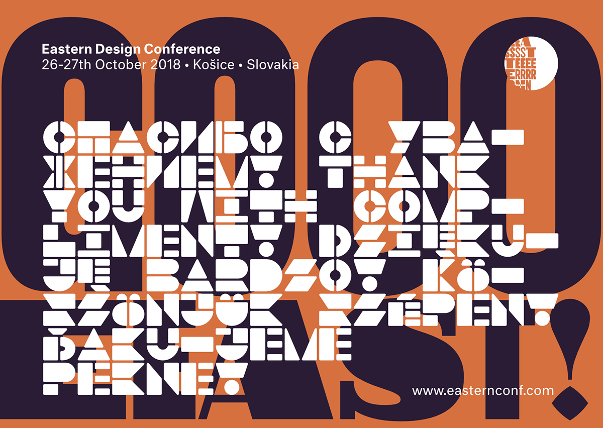
Thank you with comliment card with Woodkit Solid Pro in Blocks style.
Website
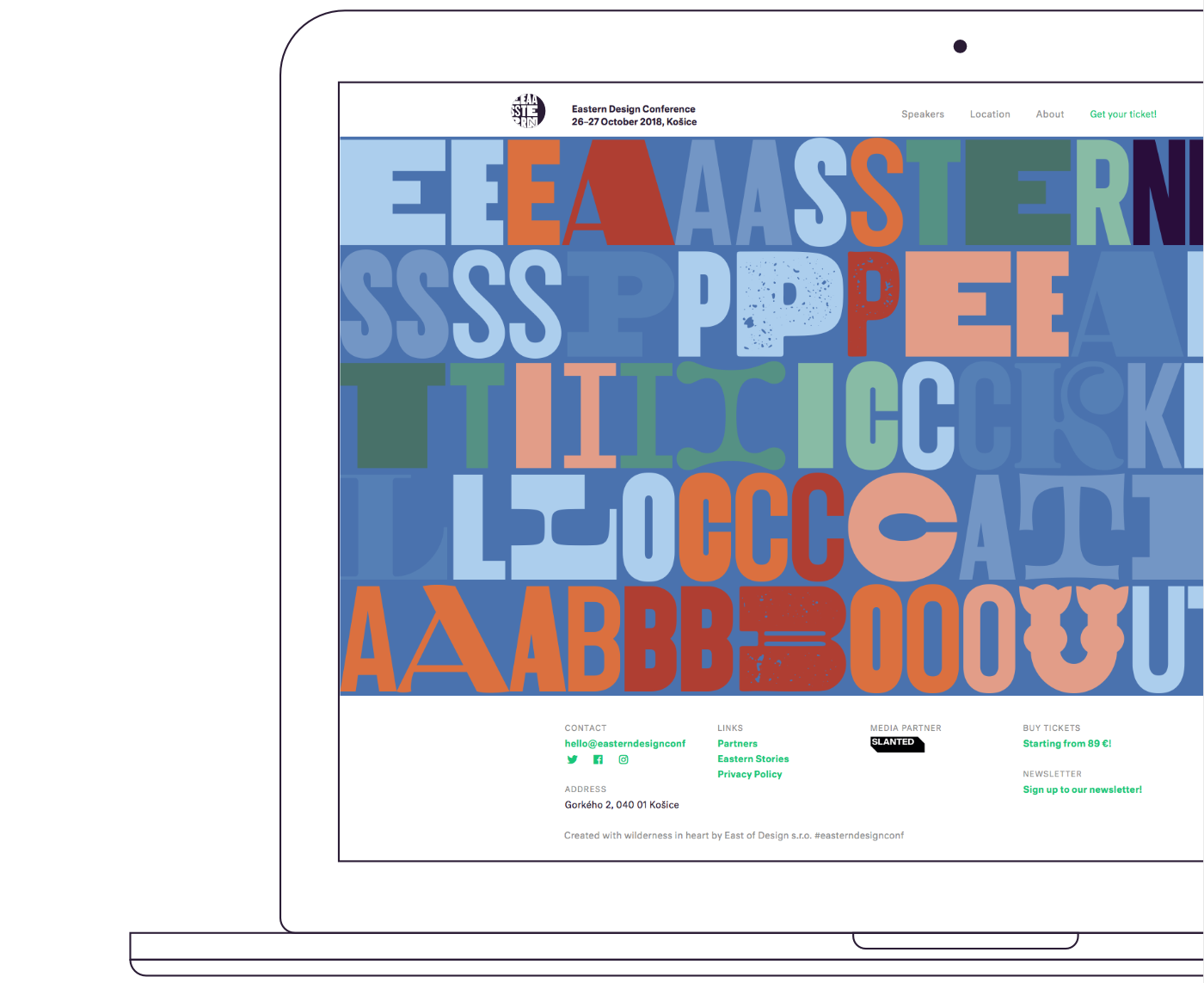
Eastern Design Conference website.


Colors – cool ceramics from Pozdišovce
The unique, characteristically colored palette is the second visible and decisive visual element in our identity. The inspiration came from a small village in Eastern Slovakia called Pozdišovce, the old producer of the traditional ceramics. We reuse 5 original colors (blue, red, green, white and dark grey) picked from ceramics and extended existing palette with plus one, yellow, which was never used in traditional ceramics from Pozdišovce.

Traditional ceramic plate from Pozdišovce, Slovakia.
Repetition – Tribute to Oldřich Hlavsa
The third element is reiteration and repetition. On one hand this refers to the endless experimentation and repetition present in the design process, on the other hand it is a secret, quiet tribute to the spirit of Oldřich Hlavsa.
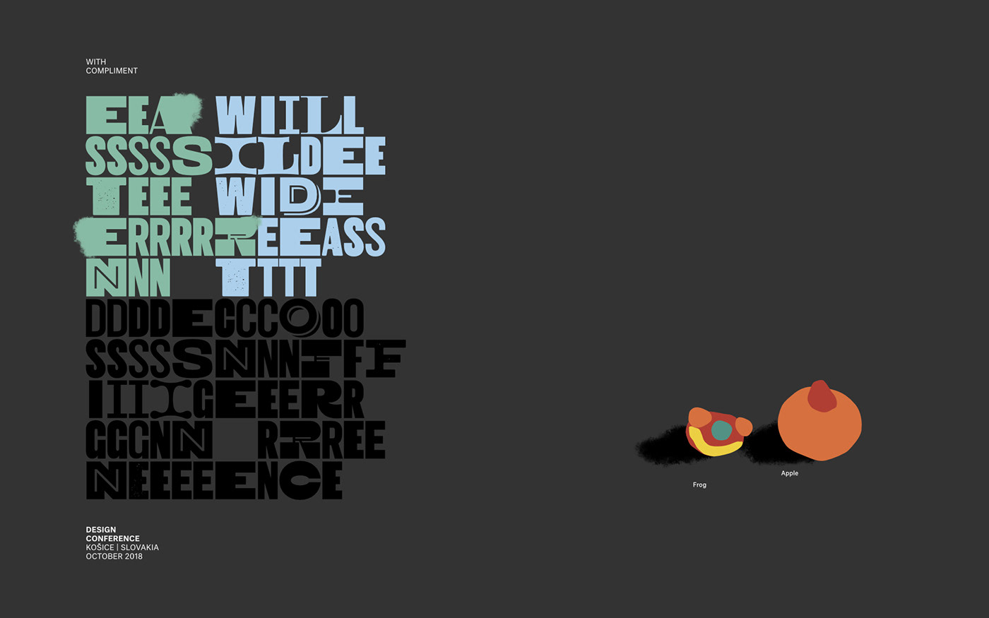
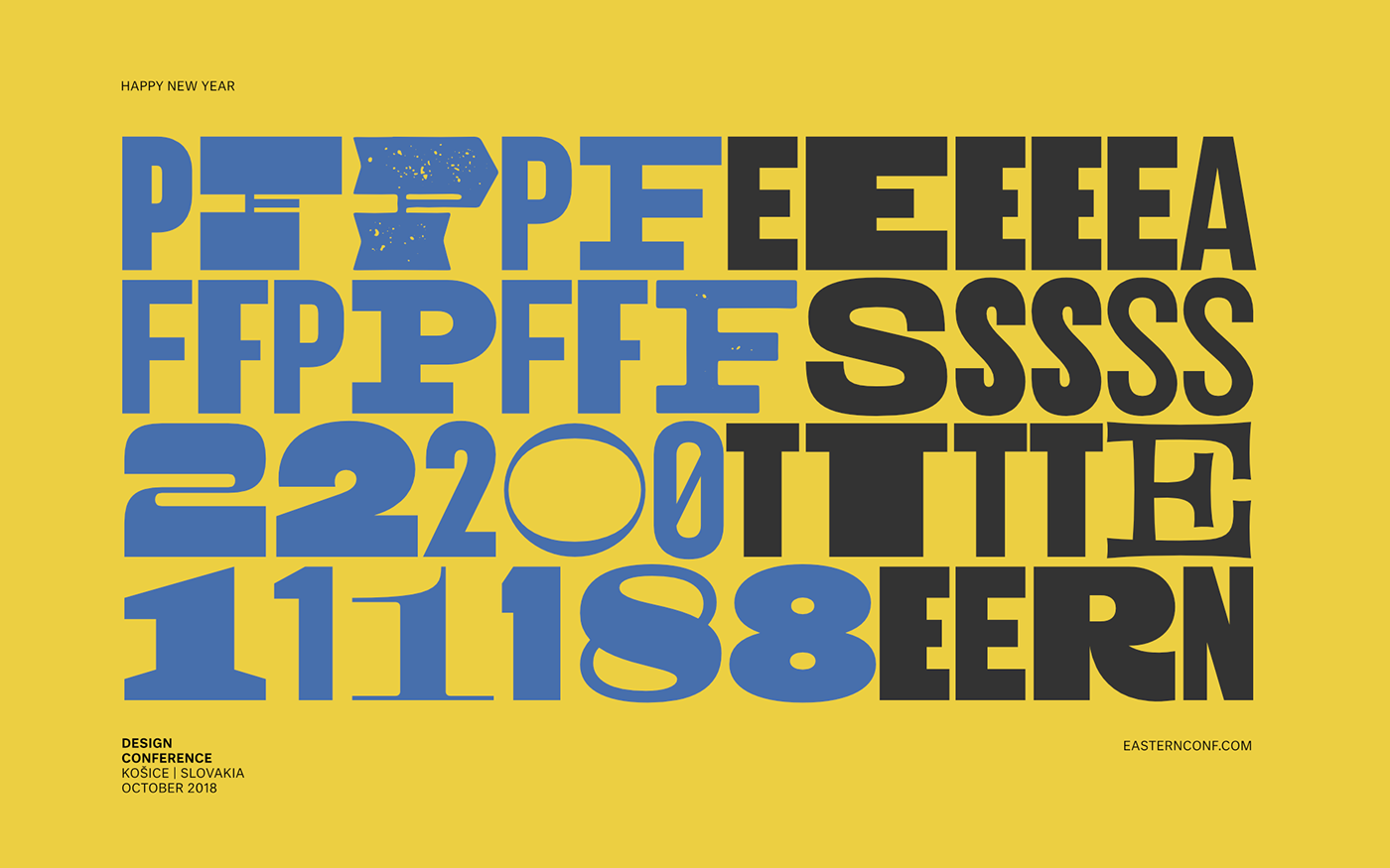
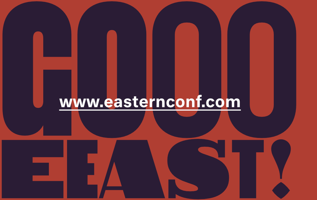
Various identity elements, email newsletter illustrations, Facebook graph, Instagram Story illustration, Twitter headers, speakers ID cards with T-shirt design.


Cards
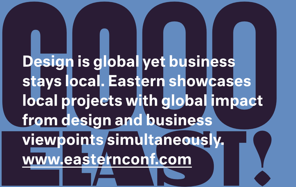


Teaser
If you want to know actual happening around Eastern identity, you should check and follow my Dribbble here.
Thank you for watching!
GoEast!


