The Potter Games
Process in Stages
Process in Stages

First, I started with a preliminary sketch based on an idea I had waking up one morning. It was almost too good to not make, so I went ahead and made it. Any self-respecting geek should get the reference.
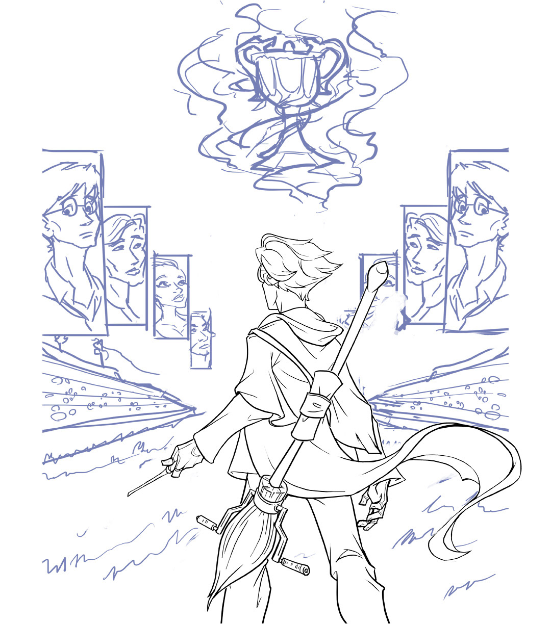
The very first thing I started producing clean lines for was Harry Potter in the foreground. He made the most sense to work out first, since he's right in front, despite my vision of him being mostly rim-lit from the front. I felt everything else was secondary to this.

I tend to just layer upon other layers when doing lineart, as most artists do. At this point, however, I run across a problem with the audience; I simply do not know how detailed or generic to get with them. I experiment with drawing crowds myself, but the end result looks sloppy, and I really don't want people's attention to be pulled there anyway. The main idea should be Harry in the front with his competitors on the flags and the Triwizard Cup up in the sky. Anything else is just a distraction.

As you can see, I opted for some generic crowds that I pieced together from clipart I found. I mostly just wanted the crowd "effect" and not so much a believable Harry Potter crowd.
At this point, I also put in the tagline for the Hunger Games, 'May the odds be ever in your favor,' and I believe anyone geeky enough could tie to two thoughts together.
Also by this point, I have finished all the lineart.
Also, ALSO by this point, I fleshed out another idea I had, and that was the idea of a "flame" encompassing the entire scene so that everything would only be shown through the "portal" of the flame, if that makes any sense... Although, by this point, the flame is mostly just a scribble and looks like crap.

Aaaaaand by this point, I have fleshed out the flame even more so... and it's starting to look more like an actual flame.

Colors! Also, I added effects to the tagline by using layer styles... because layer styles are cool.
At this point, the piece spoke to me, and it said it wanted to have a blue theme going on, similar to the blue flame that emanates from the Triwizard Cup itself.
At this point, the piece spoke to me, and it said it wanted to have a blue theme going on, similar to the blue flame that emanates from the Triwizard Cup itself.

Shadows! By this point, the piece is almost done... but it needs a bit more refining.
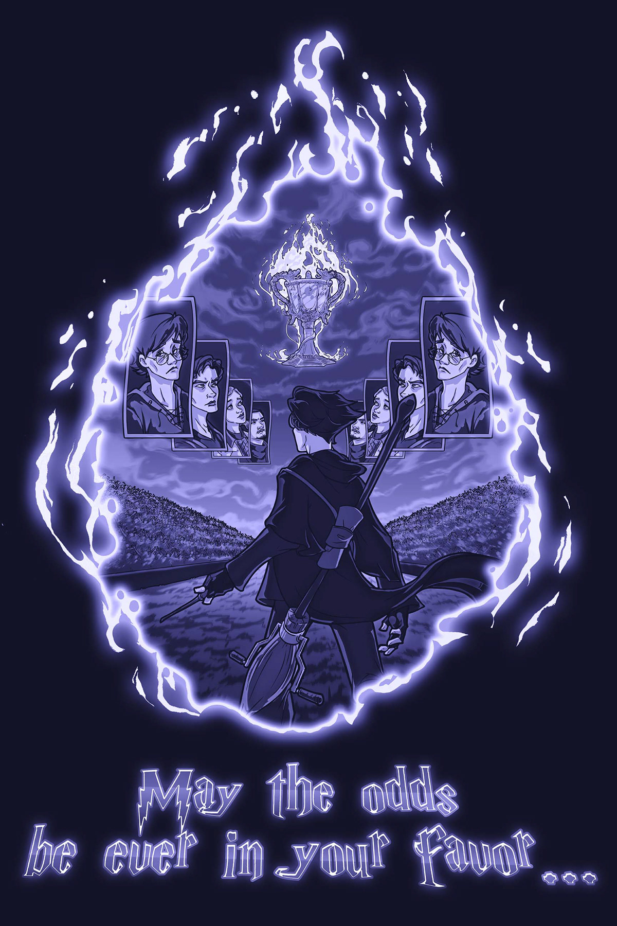
Clouds... because that sky was looking mighty bare before. Added a few more shadows, fixed up a bit of the flames... and this piece is finished! I think it would look awesome on a shirt. What do you guys think?


