BACK TO DA VINCI
"Dirt paths in the countryside? Where we're going, we don't need... dirt paths in the countryside."
This idea comes thanks to my fans on my Punksthetic fan page on Facebook. I was asked to make something Da Vinci inspired as well as something Steampunk-ish. I was always intrigued by Da Vinci's technological prowess, a style that seems to mesh well with the concept of Steampunk, even though they were centuries apart.
I tried to find a way to combine the two styles in a way that would make it awesome. The way I see it, if you're going to try to update Da Vinci to the 21st Century, why not do it with some STYLE?! So I used the Back to the Future Delorean, a thing of continual inspiration for me.

Started off with a VERY primitive sketch. Just blocking to get proportions right and the overall angle of the piece.
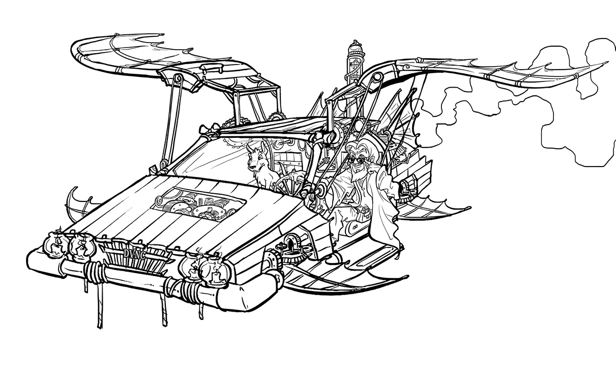
From there, I took creative license to just fill in all the details with things I had researched based on Leonardo Da Vinci's inventions. He had numerous ones, which all held sort of a steampunk/mechanical mystique about them. Da Vinci was way ahead of his time. He even built the first automobile, powered by nothing but gears and springs. It only went 30 feet, but hey, he's the father of invention.
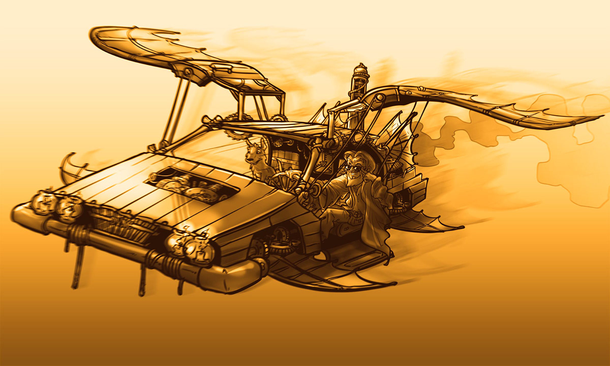
From there, I did sort of a shadow/highlight comp to capture the mood of the piece. I wasn't really striving for accuracy here, but just something that felt like sunset.
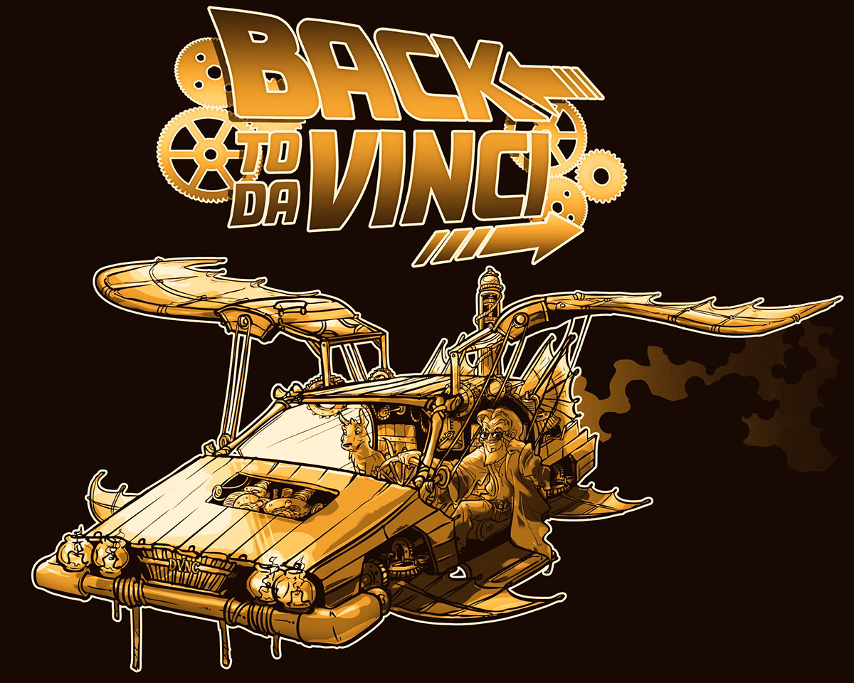
In this phase of the design, I did a logo that brings together the pun of the idea together, "Back to Da Vinci." I used the Back to the Future font and modified it in different ways, added the arrows myself as well as the gears.
In case you're not aware of it by now, that's Da Vinci in the driver's seat as opposed to Doc. I'm sure many people will assume it's Doc, but last I checked, Doc didn't have a beard. Strangely enough, though, Da Vinci also had a little white dog similar to Doc's... which is kinda cool.
In case you're not aware of it by now, that's Da Vinci in the driver's seat as opposed to Doc. I'm sure many people will assume it's Doc, but last I checked, Doc didn't have a beard. Strangely enough, though, Da Vinci also had a little white dog similar to Doc's... which is kinda cool.
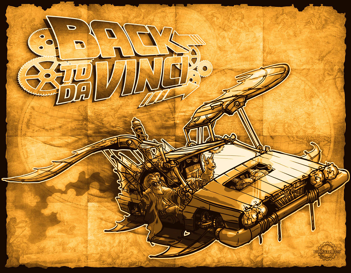
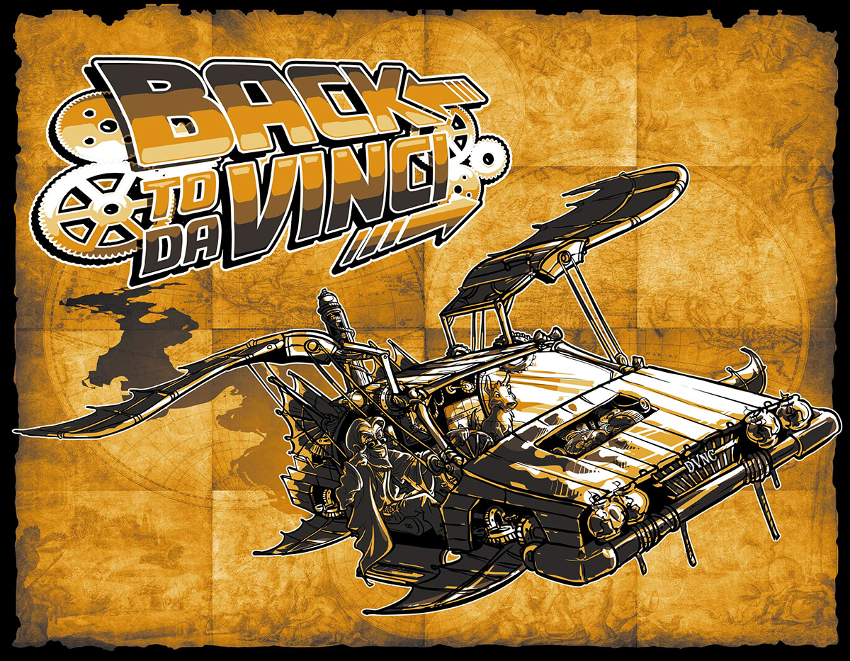
Here, I decided to create an adventurous vibe by adding a map of the world in the background. I also added some motion blur in the background behind the Delorean, which I would later remove because I found it simply too noisy. It didn't read all that well.
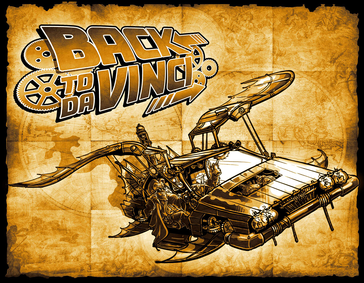
At this point, I added some black strokes around the logo and the Delorean. I also changed the smoke trail behind the Delorean for better composition. Lastly, I made more crisp and accurate shadows on the Delorean itself.
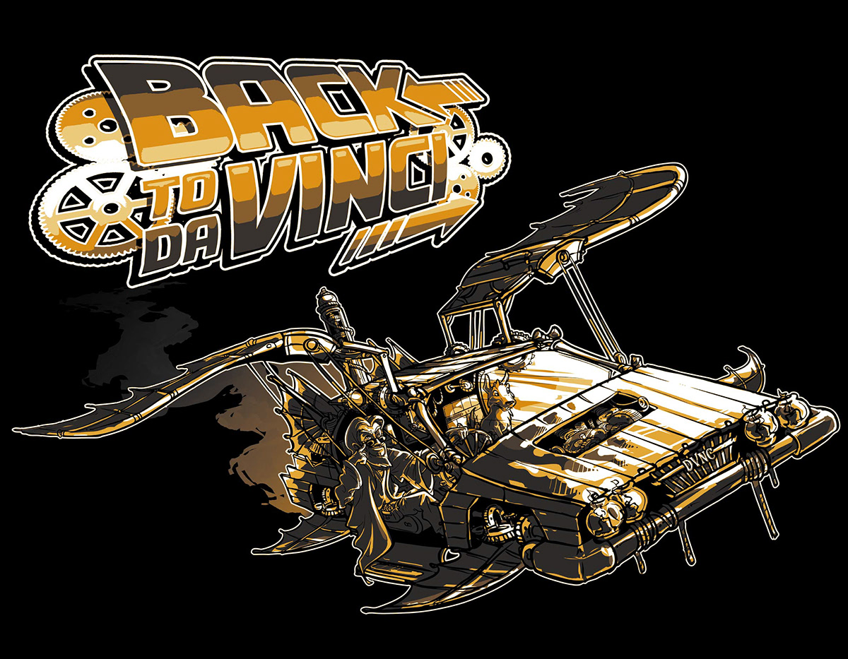
In this penultimate phase, I decided to go with a more harsh gradient for the logo as well as the Delorean. I wanted to maintain a graphic feel to it. Also keep in mind that I did this as a shirt design. Changed up the smoke once more as well.

This version is meant for prints as it has the map still in the background. I decided on going with a desaturated look for the darker parts while the lighter parts received a more yellow tone. I believe this makes the piece pop more, but I could probably be wrong about that.
THE END


