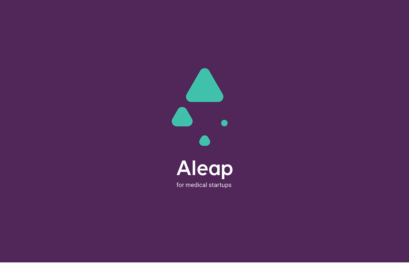
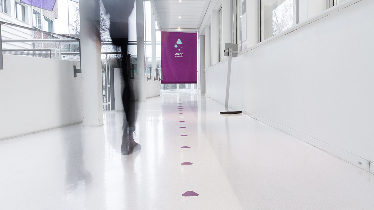
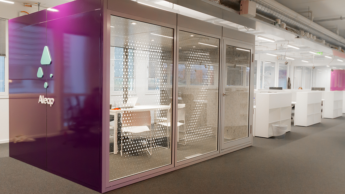
Aleap provides expertise, infrastructure, capital and network to startups in the health sector. Their mission is to help create expansive and successful businesses in Norway and globally.
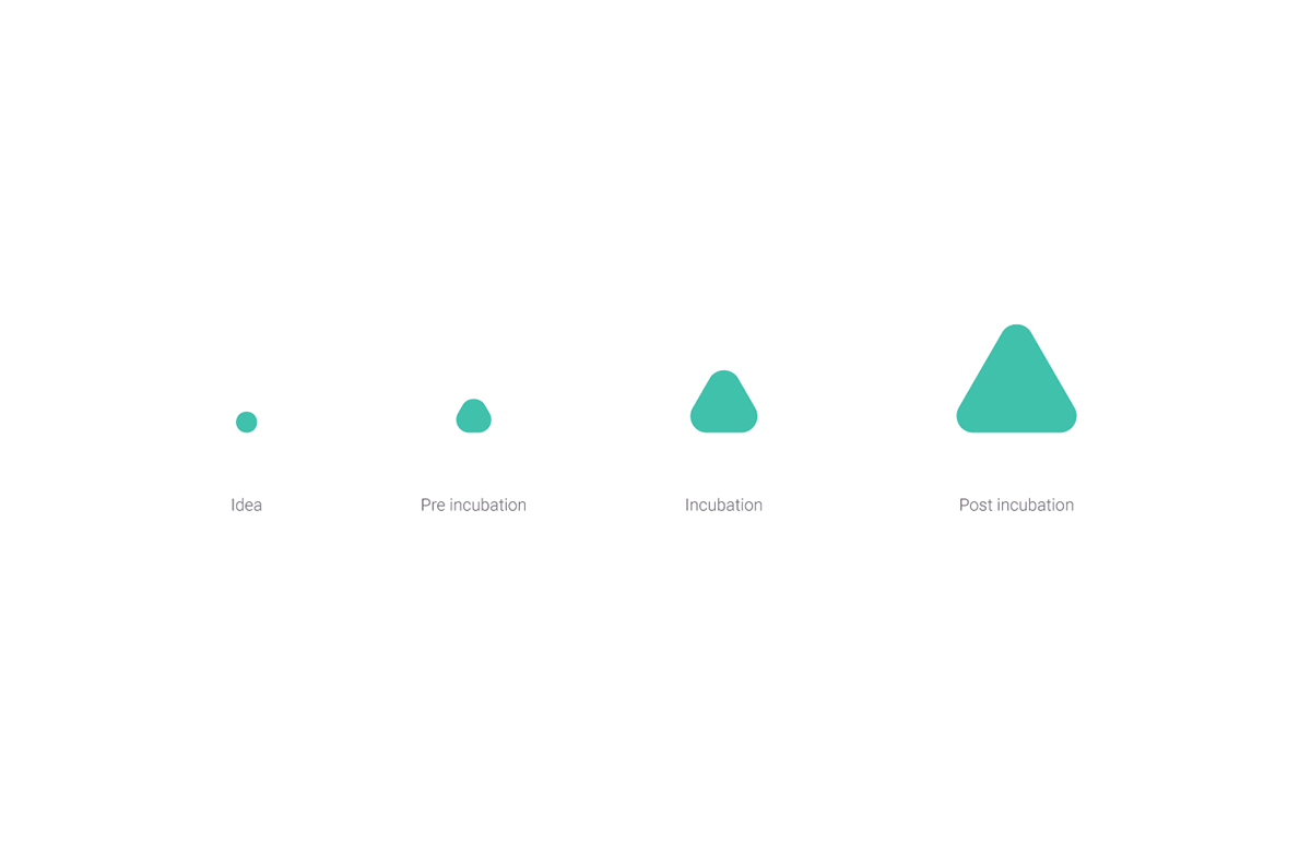
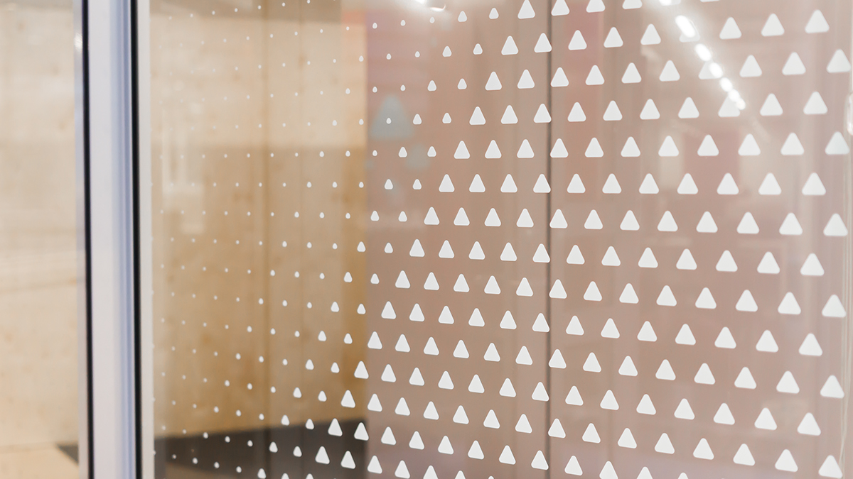
The visual identity is based upon the four stages of a startup, in which Aleap operates. These stages are visualised as graphic shapes, illustrating Aleap's mission and how something undefined and small transforms into something bigger and better.
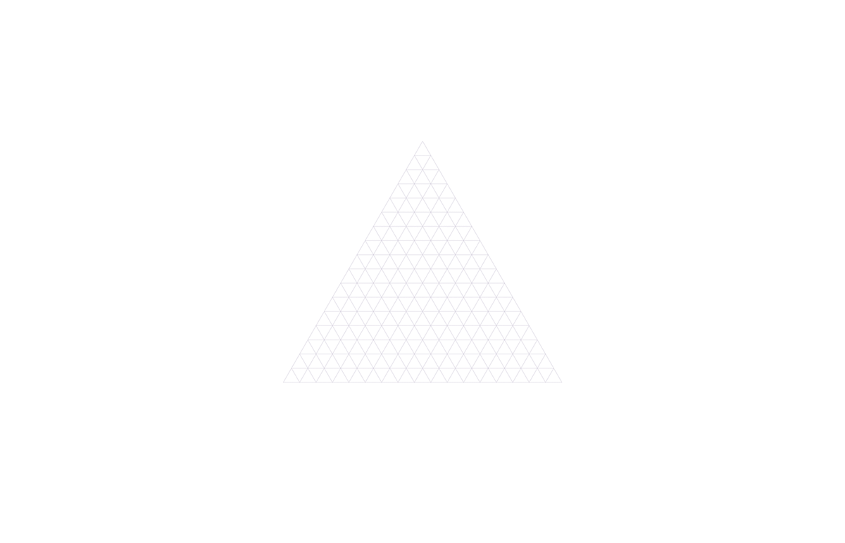
The process of building a startup is never streamlined. It´s a challenging journey with ups and downs. We wanted to capture that journey in the logo symbol, by using the golden spiral as the foundation for the composition. The goal was to create a symbol expressing an element of chaos, yet with a clear direction and progress.


Thanks for watching!

