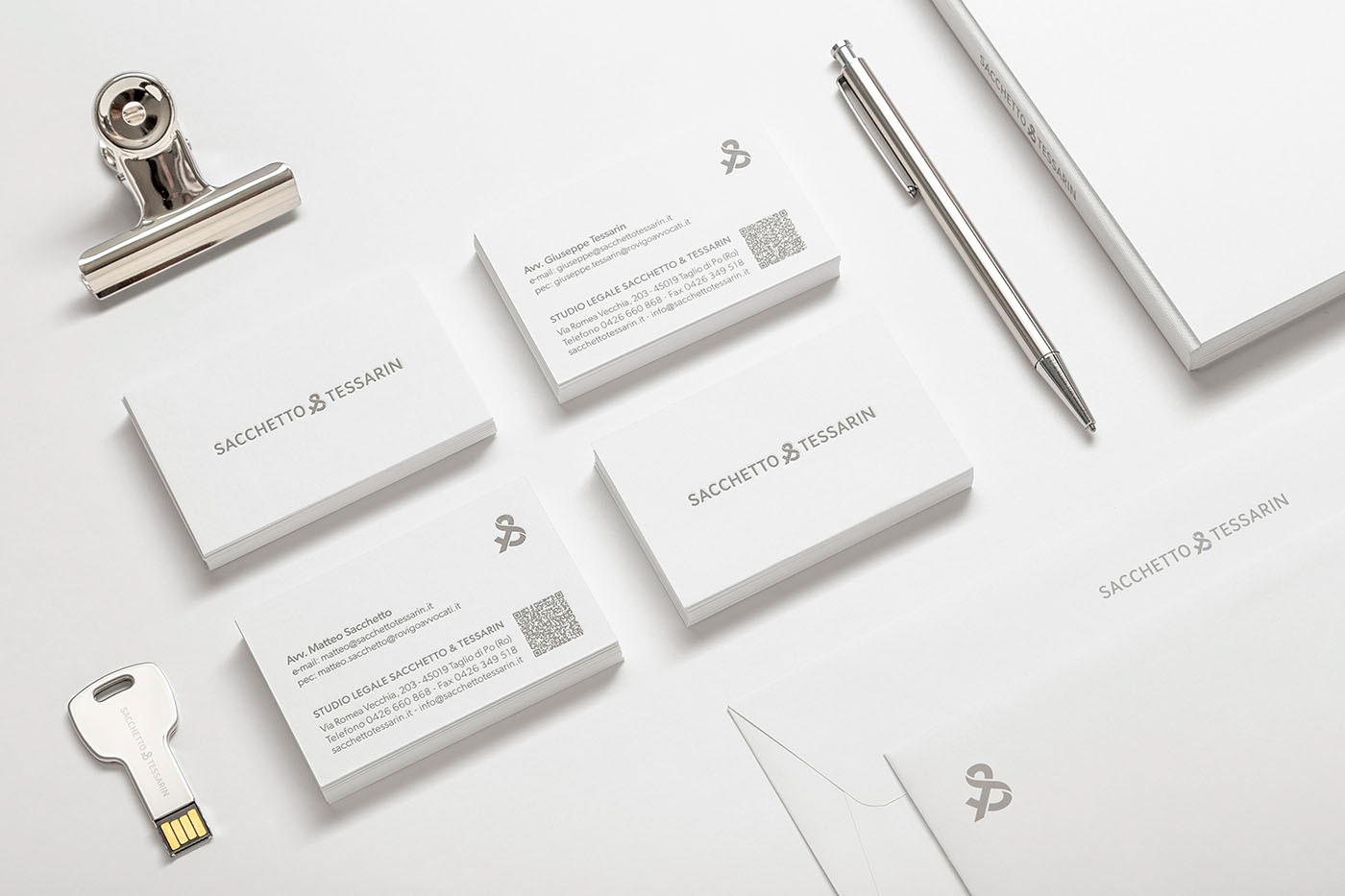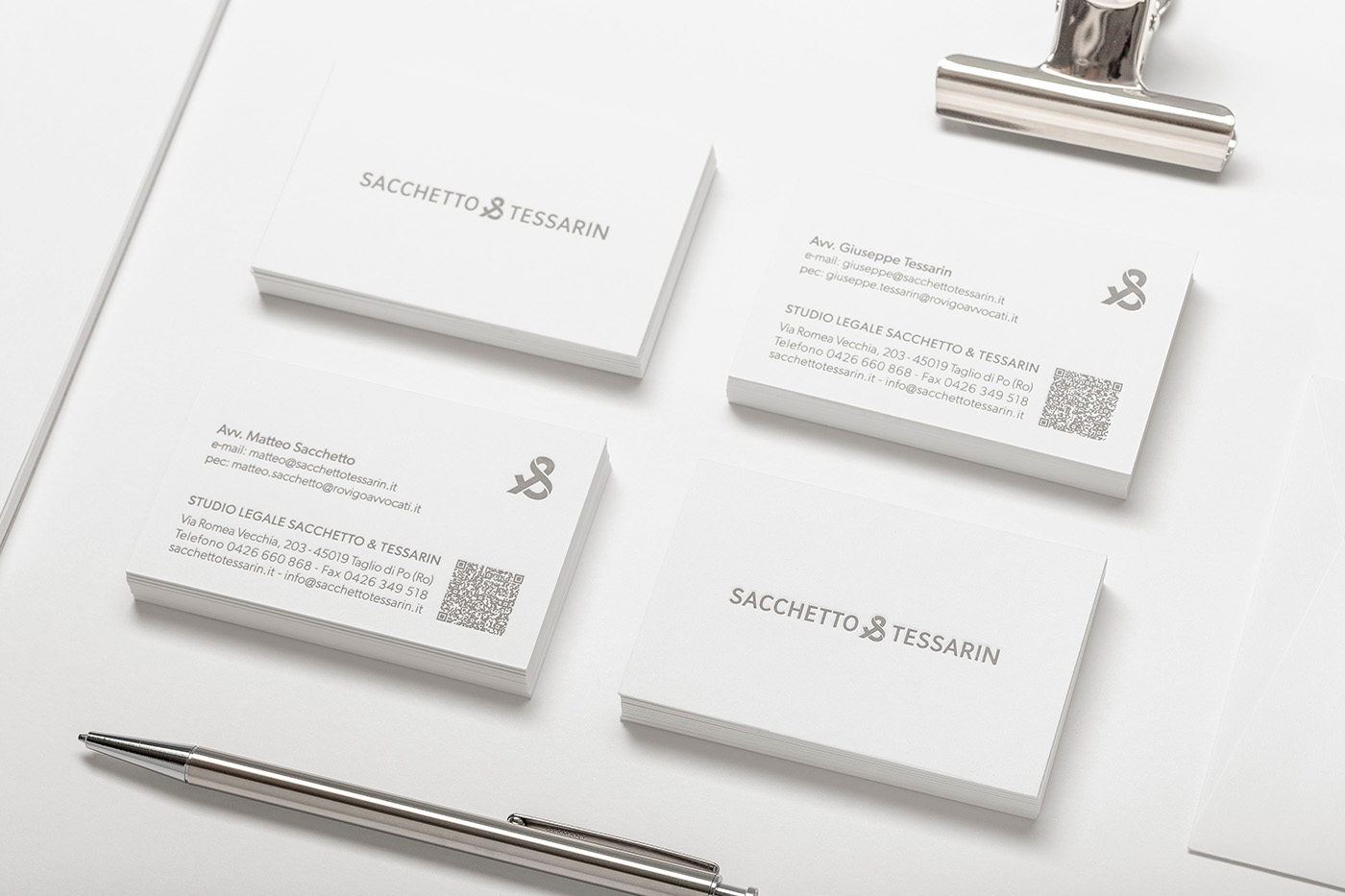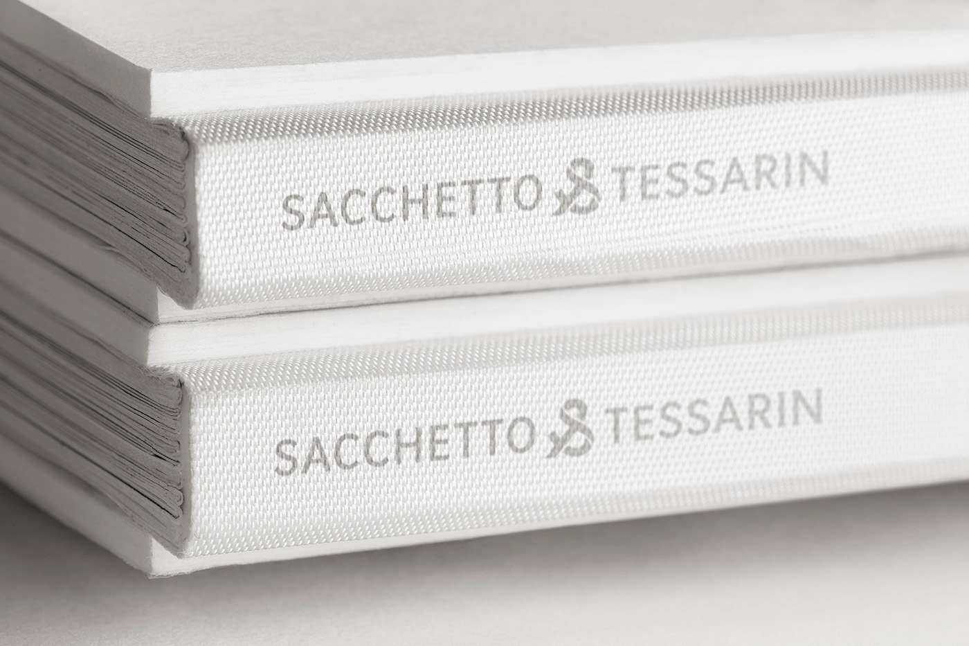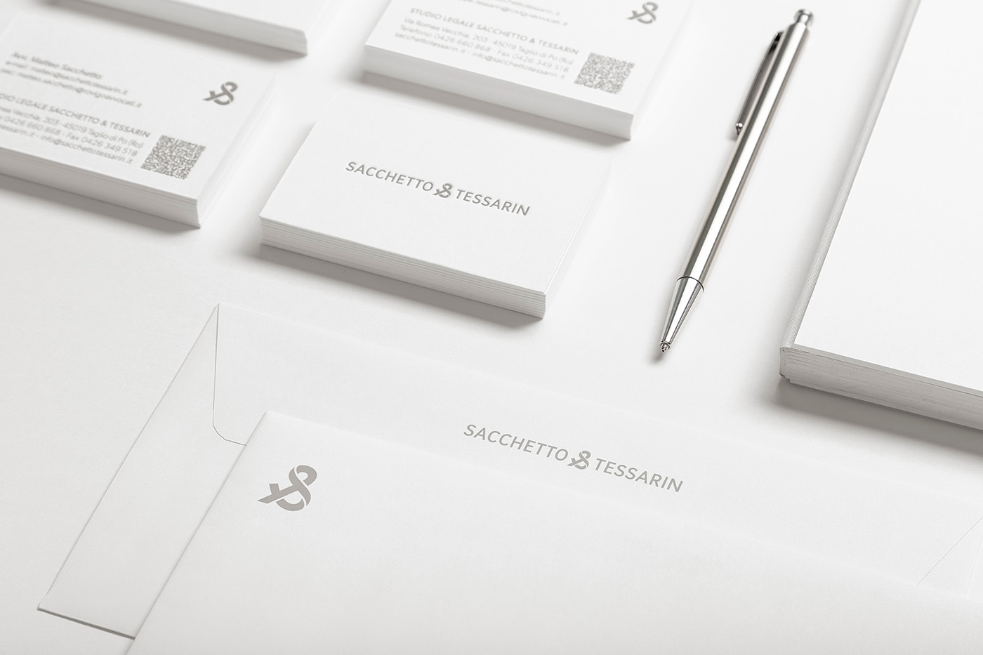
Sacchetto & Tessarin is a law firm based in Veneto (Italy) born from the union of two people, two friends, two lawyers: Matteo Sacchetto, civil lawyer, and Giuseppe Tessarin, criminal lawyer.
They asked us to create their new brand, starting with a new logo that could represent their strong bond and their incisive and dynamic style.
Sacchetto & Tessarin è uno studio legale veneto, nato dall'unione di due persone, due amici, due avvocati: Matteo Sacchetto, avvocato civilista, e Giuseppe Tessarin, avvocato penalista.
Ci hanno chiesto di creare il loro nuovo brand, partendo da un nuovo logo che fosse in grado di rappresentare il loro forte legame ed anche il loro stile incisivo e dinamico.
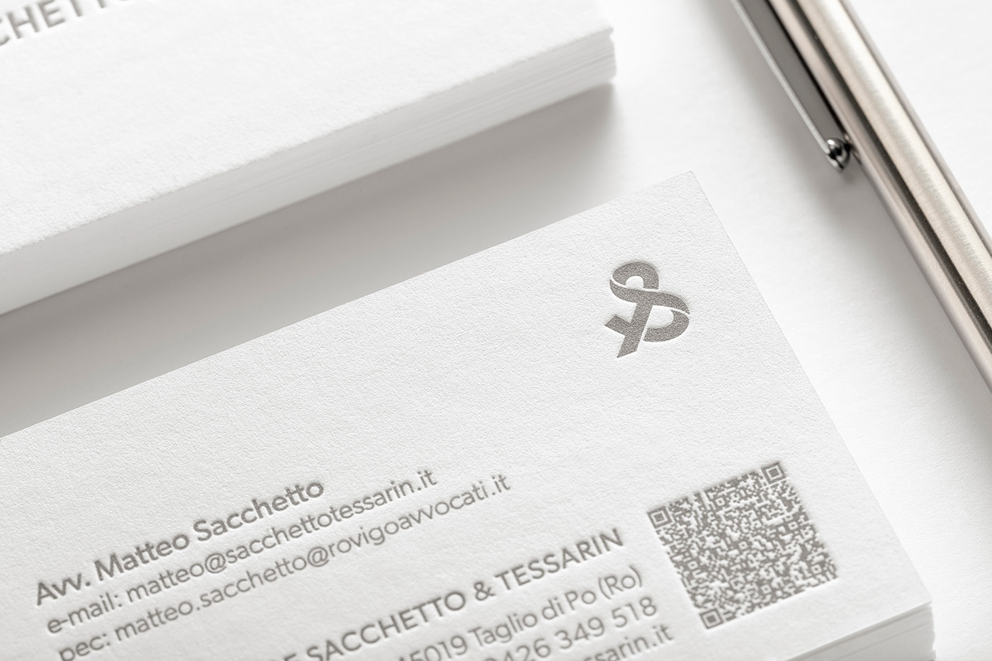
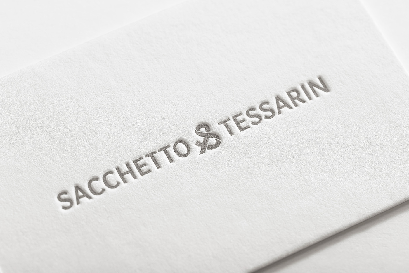
For this reason we worked on the ampersand, that represents the conjunction word "and". It originated as a ligature of the two letters "et", Latin for "and".
Flipping horizontal the "&", we could obtain their initials "S" and "T", designing an essential and evocative symbol, with a strong visual impact.
Per fare ciò, abbiamo lavorato sulla "e commerciale": un grafema che ha avuto origine dalla legatura delle due lettere del latino "et", che in italiano corrisponde alla congiunzione "e".
Riflettendo orizzontalmente la "&", siamo stati in grado di ricavare le loro iniziali "S" e "T", creando un simbolo essenziale ed evocativo, dal forte impatto visivo.
LETTERING, BASED ON GIBSON FONT

Manual Kerning

CLEAR SPACE
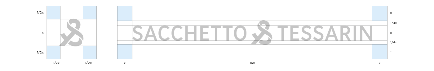
Typography: GIBSON

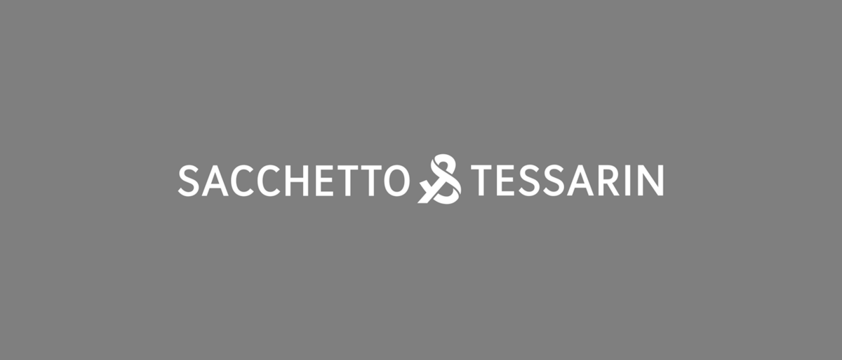
LOGO ANIMATION
Branding