Connock Typeface
Within a world where design seems to be at everyone's finger tips, many pieces of so called 'design' is being produced with no function in place. Instead many pieces of work are being produced to be aesthetically pleasing and nothing else. Design to me, means function. Function gives design, purpose, importance and will help produce an overall aesthetic which wouldn't been achievable without the background research. One of the issues where I see function as being a key importance, is within typefaces. Typefaces are at everyone's finger tips (since the birth of the computer). However due to this it means typefaces are being used against their original functions, this in turn will hinder the viewers overall reading experience. But this isn't just seen within amateur desk top publishing this is being seen industry.
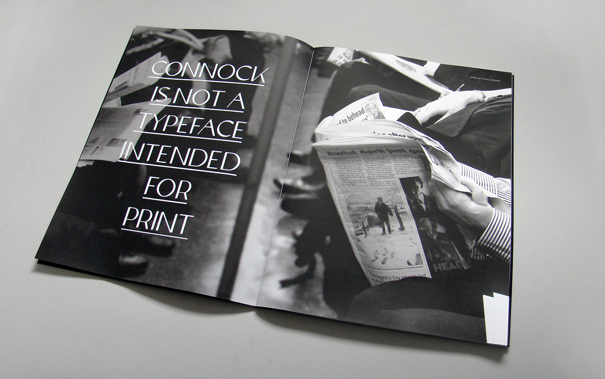
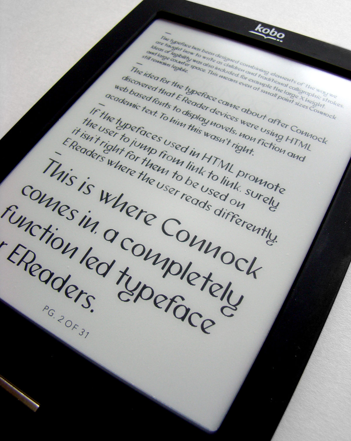
One of the main culprits for this is that of eReader devices. Due to the eReader having to keep up with products such as the iPad and which not only offers the customer the capabilities to read eBooks, but also browse the web, watch movies and listen to music. The eReader is having to give the customer extras to keep up with the demand. This includes web browsing and various different applications. Due to this eReaders are running on HTML. Due to this HTML web based typefaces are being used to display literature, novels and academic text. To me this isn't right. After researching the difference between reading online and reading text in books (what the eReader is trying to mimic) I discovered many differences between the two types of reading. On the web the eye is encouraged to jump from link to link and search, whereas within books the eye is encouraged to read on and take in information. So if the eye is reading the same typefaces it does online to jump from link to link within eReaders, surely this will hinder the viewers overall reading experience.
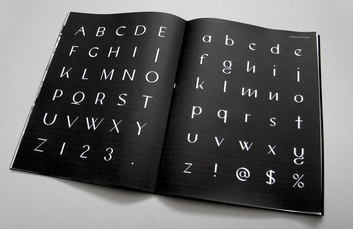
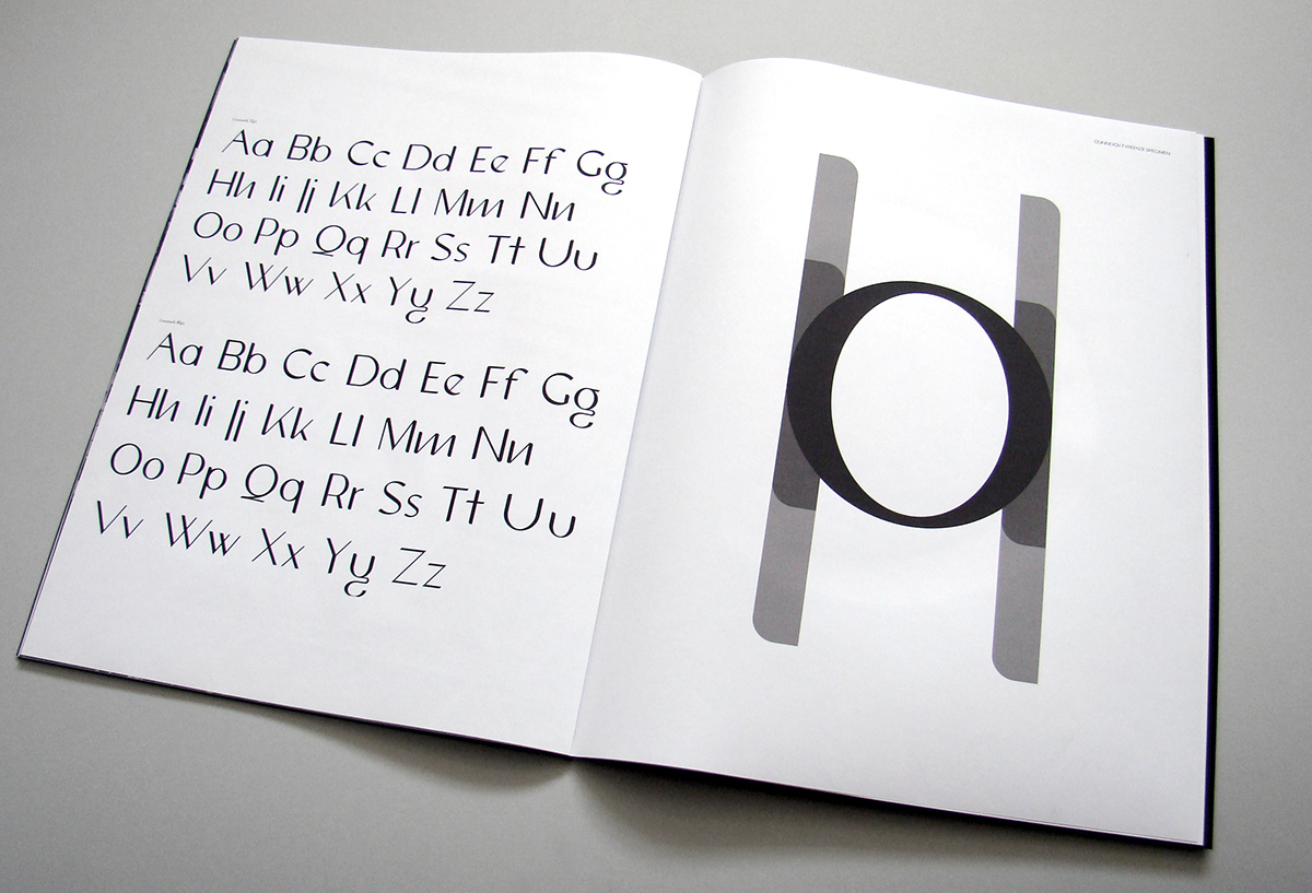
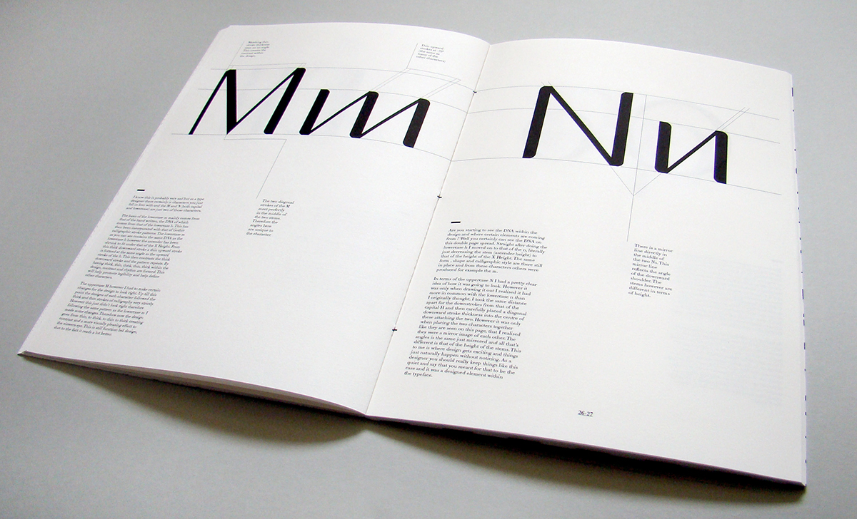
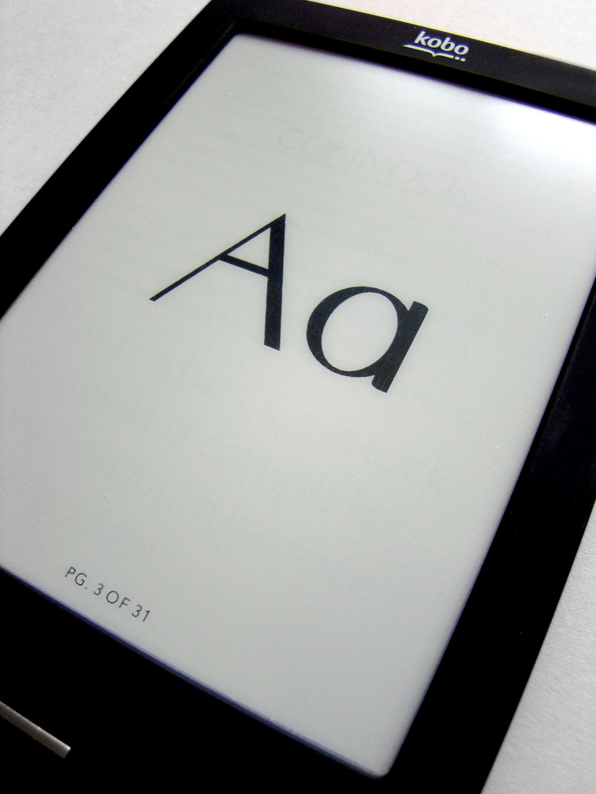
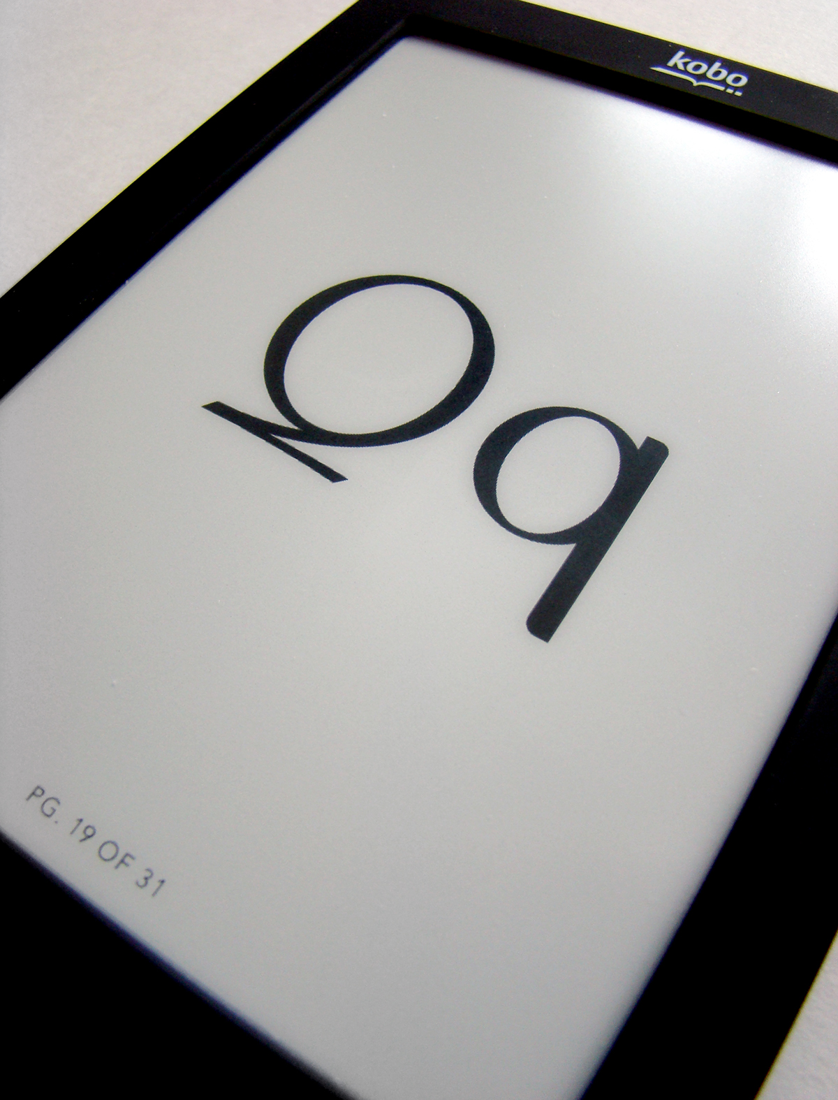
This is where 'Connock' comes in, a typeface completely designed with the sole function of being used on eReader devices. It has been designed by combining many different elements on legibility theory and how the eye reads. The basic form of the typeface comes from the of calligraphy strokes and the way we are taught as children to read. This has then been incorporated with the rhythm of hand writing. In terms of legibility the typeface has a very large X height with large counter spaces. This means even at small point sizes the typeface is still legible due to the counter space holding the form in place.
To promote and advertise the typeface and large format Type Specimen book has been produced, followed by that of a smaller insert called ‘The Function within the Design’, a step by step diagram book which breaks down the function led elements within each character.
An embossed poster of 60 characters of the typeface has also been created. This has been embossed to keep print down to a minimum as the typeface is only intended to be used on eReader devices.
A type specimen for the eReader has also been produced to show the typeface in situe.
The official launch for the typeface will take place at the Rag Factory, in London in Mid July.
For more information or an invite, please get in contact.
One of the main culprits for this is that of eReader devices. Due to the eReader having to keep up with products such as the iPad and which not only offers the customer the capabilities to read eBooks, but also browse the web, watch movies and listen to music. The eReader is having to give the customer extras to keep up with the demand. This includes web browsing and various different applications. Due to this eReaders are running on HTML. Due to this HTML web based typefaces are being used to display literature, novels and academic text. To me this isn't right. After researching the difference between reading online and reading text in books (what the eReader is trying to mimic) I discovered many differences between the two types of reading. On the web the eye is encouraged to jump from link to link and search, whereas within books the eye is encouraged to read on and take in information. So if the eye is reading the same typefaces it does online to jump from link to link within eReaders, surely this will hinder the viewers overall reading experience.
This is where 'Connock' comes in, a typeface completely designed with the sole function of being used on eReader devices. It has been designed by combining many different elements on legibility theory and how the eye reads. The basic form of the typeface comes from the of calligraphy strokes and the way we are taught as children to read. This has then been incorporated with the rhythm of hand writing. In terms of legibility the typeface has a very large X height with large counter spaces. This means even at small point sizes the typeface is still legible due to the counter space holding the form in place.
To promote and advertise the typeface and large format Type Specimen book has been produced, followed by that of a smaller insert called ‘The Function within the Design’, a step by step diagram book which breaks down the function led elements within each character.
An embossed poster of 60 characters of the typeface has also been created. This has been embossed to keep print down to a minimum as the typeface is only intended to be used on eReader devices.
A type specimen for the eReader has also been produced to show the typeface in situe.
The official launch for the typeface will take place at the Rag Factory, in London in Mid July.
For more information or an invite, please get in contact.