


SORT DESCRIPTION OF MONO
MONO magazine is an independent bi-weekly publication focusing on politics, finance, social and cultural issues. That’s if you want to sum it up in just a few words. What MONO magazine truly is... is something different.Starting out as a collective effort to fund and run a cutting-edge, content-heavy magazine, it has evolved into a magazine that stands apart on the well-trodden field of publications of its kind. A few of the things that set it apart are: It is co-owned by a group of 26 people who also comprise it’s editorial core, and who themselves are as diverse as they come in terms of political beliefs, educational and cultural backgrounds.
The task of producing such a great volume of content while maintaining the high standards set at the start is in itself one of this team's major successes, as is their determination to cultivate a creative and inspirational environment in which their work can flourish.
Another important factor is the completely new approach taken when it came to designing the magazine itself. With each issue, the idea of what a political and financial magazine looks like is blurred and constantly pushed down roads that major publications of its kind generally steer clear of. Running alongside editorial are graphics and ideas that are very closely knit with the content, creating a truly seamless experience - a significant accomplishment, as articles tend to be extensive and “content-heavy”.
In terms of management, content and design, MONO takes journalism and media production into new territory. The results, the print magazine and the website, are looking a lot like the spirit of this effort: Maturing and only getting better with each and every issue.
DESIGN PROCESS
ΚΕΙΚ bureau was commissioned to design MONO Magazine from scratch (logo, layout, color palette and in general, the ways in which the magazine’s content could be highlighted and delivered in a functional way).
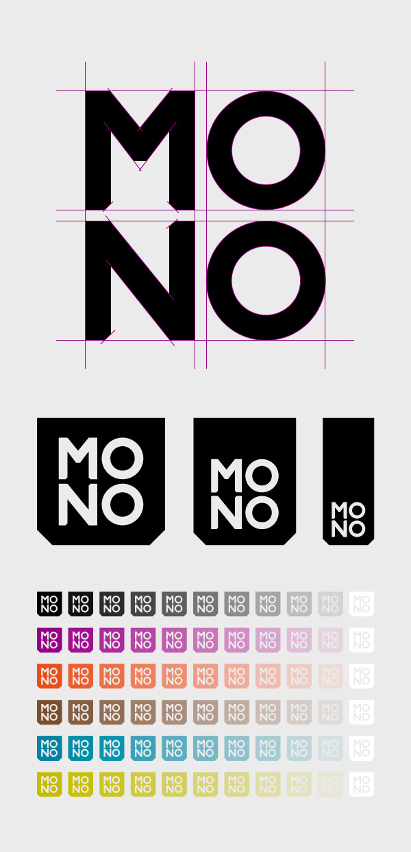
ΜΟΝΟ Magazine's logo was designed with the utmost attention to robustness and definitiveness, highlighting qualities possessed by an editorial team that function independently while remaining true to their values. The letters of the logo were designed in such a way as to function as modular shapes, and were inserted into a casing / bookmark that is cut in its lower corners, depicting a downward movement.
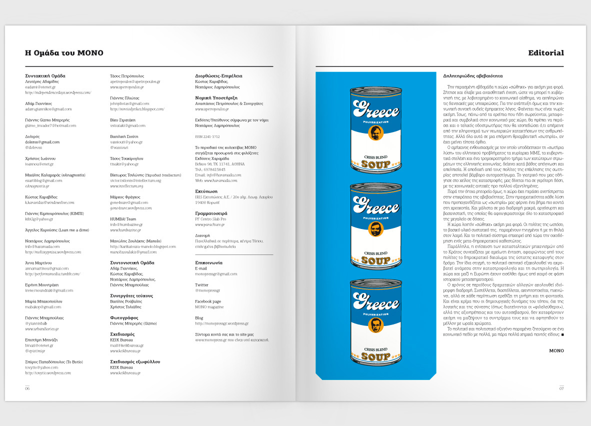
The main design element of the magazine is the octagon. The framing of the magazine is mostly three columned but also functions as a two column layout, depending on the situation and the size of the article / photos that comprise the full article set-up.
ΚΕΙΚ bureau was commissioned to design MONO Magazine from scratch (logo, layout, color palette and in general, the ways in which the magazine’s content could be highlighted and delivered in a functional way).
ΜΟΝΟ Magazine's logo was designed with the utmost attention to robustness and definitiveness, highlighting qualities possessed by an editorial team that function independently while remaining true to their values. The letters of the logo were designed in such a way as to function as modular shapes, and were inserted into a casing / bookmark that is cut in its lower corners, depicting a downward movement.
The main design element of the magazine is the octagon. The framing of the magazine is mostly three columned but also functions as a two column layout, depending on the situation and the size of the article / photos that comprise the full article set-up.


CREDITS
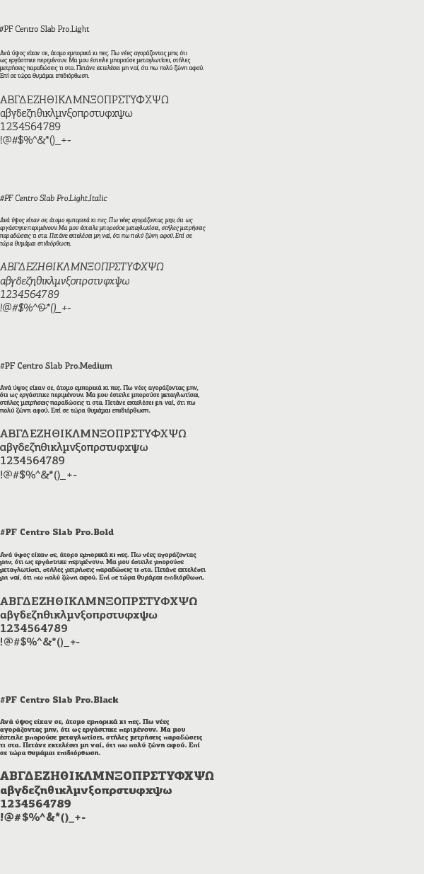
Font Used
MONO Mag Website
MONO Mag Blog
MONO Mag Twitter


